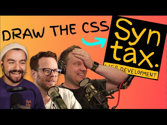
We Hosted a 16-Developer CSS Tournament | Round 1 | Right Bracket
Chapters6
Introduction to the March Mad CSS event, the bracket format, and the goal of winning the trophy.
A nail-biting Round 1 showdown on Syntax’s March Mad CSS, where Wes, Adam, Josh, and Kevin edge into the quarters after razor-thin 0.1–1% wins against fearsome rivals.
Summary
Syntax’s CJ hosts a high-stakes Round 1 of March Mad CSS, pitting 16 top CSS developers in head-to-head UI recreations. On the right bracket, eight battles unfold with two minutes planning and 15 minutes to build—first to 100% or the highest match wins. Wes and Ben kick off intense competition; Wes ultimately takes the win by a razor-thin margin as Ben teeters at the edge. Adam clinches the other close call, aided by clever tweaks like letter-spacing and sub-pixel nudges, to advance to the quarterfinals. Amy and Cassidy deliver a dramatic duel with near-identical outputs; Kevin nails the Tailwind setup and clean centering, but Josh edges him out by a fraction. Throughout, contestants wrestle with layout decisions (flexbox vs. grid), placeholder colors, and tiny CSS details that determine a few percentage points on the match meter. As battles wrap, CJ hints at the pressure and fast-paced decision-making that defines March Mad CSS, promising even tougher showdowns next week. This episode confirms: precision matters, even down to a single pixel, and AI-assisted tweaks aren’t rare in these live builds. By the end, Kevin, Josh, Wes, and Adam advance, while Amy, Cassidy, Ben, and Anya bow out for now.
Key Takeaways
- Wes defeated Ben by a 0.1–1% margin in a nail-biter where last-minute tweaks decided the winner.
- Adam’s win hinged on subtle style fixes (e.g., font rendering and drag/resize handling) that pushed him past the 90% mark.
- Josh narrowly beat Cassidy by refining background color, text color, and paragraph sizing in the final seconds, ending at 95.84% versus 95.4%.
- Amy and Kevin showcased different toolchains (Tailwind vs. vanilla CSS) and near-identical layouts, with Kevin pulling ahead by 86% after tuning colors and button placement.
- Participants repeatedly highlight the impact of sub-pixel differences and margin/padding nudges on final match scores.
- The format keeps all contestants on a level playing field by forcing the same UI challenge across battles, emphasizing precision over speed alone.
- The episode reinforces that small CSS decisions (placeholder color, text area sizing, drag handles) can swing a round’s outcome in live builds.
Who Is This For?
Frontend developers who want to see real-time CSS problem-solving under pressure, especially those curious about pixel-perfect UI recreation, flexbox/grid trade-offs, and Tailwind versus vanilla CSS approaches.
Notable Quotes
""The first ever trophy for the Marchm CSS tournament and only one of these 16 developers will win it.""
— CJ introduces the stakes and format of the tournament.
""My heart is pounding. Now that I'm here, I'm nervous, but excited.""
— CJ sets the competitive mood and personal pressure of the event.
""What a battle indeed. That was a nailbiter.""
— CJ rounds up the tense finish between Wes and Ben.
""The winner is Wes. Okay. So, Ben, yes... you changed one more thing right at the end.""
— The post-match reveal and frustration/fan reaction to a final tweak.
""This is March Mad CSS.""
— CJ closes the episode and tees up next week’s round.
Questions This Video Answers
- How do CSS tournament battles on Syntax work in March Mad CSS Round 1?
- What tiny CSS tweaks can swing a match by 0.1% in live builds?
- Which tools did contestants use most: vanilla CSS vs Tailwind in this episode?
- How do you optimize placeholder color and text area styling under time pressure in CSS challenges?
- Who advanced to the quarterfinals in the right bracket of this episode?
CSS TournamentMarch Mad CSSSyntax ChannelWesAdamJoshKevinAmy CassidyAnya / Anya
Full Transcript
one okay and Joshua back down to 93%. This is the first ever trophy for the Marchm CSS tournament and only one of these 16 developers will win it. We brought together 16 of the world's best CSS developers to battle it out in that CSS bracket tournament. Last time, the left side of the bracket battled it out. Why is there a gap at the end there? The guy is a machine. Oh boy, I'm about to lose. I'm about to lose bad. Oh, that solves all of my problems. That's almost as bad as centering a dude. And four competitors advance to the quarterfinals.
But today, we're heading to the right side of the bracket. That means eight new competitors, four new battles, and by the end of this video, we'll know who's advancing to the quarterfinals and who's one step closer to winning this trophy. My heart is pounding. Now that I'm here, I'm nervous, but excited. Let's go. I'm CJ from Syntax. Welcome to March Mad CSS. Contestants, meet your opponents. I'm so nervous. What are you talking about? It's the other way around. Perhaps I should have prepared just a little bit. The format is simple. We've got head-to-head battles where devs will attempt to recreate a UI with HTML and CSS.
They've got 2 minutes to plan and 15 minutes to build. The first player to reach a 100% match or the highest match percent when the time is up wins. And the UI you'll be recreating today is this. May the odds be ever in my favor. I'm feeling competitive now. Here we go. Getting rid of some of the nerves. Your planning time starts now. And if you watched last week, you might recognize this one. All of the round one battles use the same challenge so everyone competes on the exact same UI. I don't see anything too tricky, which is good.
I feel like there's something that might get in my way. There's some margins that we'll have to deal with. Spacing. I think I'm just going to margin zero everything and bring in spacing as I need them. I think it would be the easiest thing to do. Got placeholder text. That should be no biggie. Text area has a placeholder pseudo element, I think. Yeah, look that AI. Thank you. Yeah. And a really prolook icon there. We got the up icon and I I'm going to have to search the web for that. I don't know the button for that.
It seems pretty straightforward. Nothing too crazy. I know these are famous last words. Let's see. It's centered. We can do that. We can center a div. We got this. It's going to be fine. It's going to be fine. Okay, we've got like an H1. We've got the subtitle thing. And then we've also got the chat box. This doesn't seem too bad. It's rectangles. The one thing that I think is going to be hairy is this orange like up arrow one. That might be some positioning. I'm guessing these are supposed to be buttons. Although, I suppose for the purposes of this exercise, the buttonness doesn't really matter, right?
Like I don't have to make it a button. Might be easier make it a div. Uh, so just embracing the worst practices for this challenge. Yeah, let's look at the colors here. So, white, orange, purple. Where is dark purple used? Oh, it doesn't have a gradient on it, does it? Where's light gray used? Light gray is a text gray. Oh my gosh, there's too many grays. This is not even the Canadian gray. All right, here we go. Okay. All right. The incredibly anticipated battle. Wes versus Ben. And right out of the gate, Ben already with a higher percentage of West.
We're only 30 seconds in. It's not looking good for West. The container is display flex flex direction column. Want the vertical? I never understand what column and row. That doesn't make any sense. These are rows. Align vertically. Justify content. Dudge duty. Now always justifies center. Height. No, height is not that. Oh, maybe it is. So I want to say for now let's just play with input box here. Input footer. That's the button. So they're going to move that around. So it's like the text area is the main thing. Text area background dark gray. Great. And then we should have the color for the placeholder text inside there.
Although no, that doesn't look right. Oh boy. The font size is not What is that? That an H1. H1 font size 25. No. 20. Why is it not updating? Oh, it is updating. I just don't know how to write code. All right, screw that. Um, no. No. I want to I want to do it. What is this headline? Oh, there we go. That's why freaking AI autocomplete added a bunch of garbage I didn't even know I had. Yeah, Wes dealing with AI being a little too helpful. We've seen this from other competitors. Just adding code you didn't know was there.
The dark gray actually looks like is wrong. So, I'm going to go ahead and go back to the regular gray. That looks better. Again, the text seems interesting. So, let's go the height here. Wo! Went too far. Oh, I'm stressing out. Background. Light gray. No, dark gray. That's not it either. How many grays are there? Dark gray. Light gray. Just regular gray. Oh my gosh, Ben is kicking my butt. Yeah, early in the game here. 12 minutes left. Ben 44%. V just jumped up to 44% versus Wes's 30%. Now, we're going to see if Wes can come back in the late game, right?
We kind of saw him talk about this in his strategy, right? He's he's he mentioned he's going to go top down, get everything in the right spot. That could be the right way to go, but we're not going to see some higher scores till later in the game because of that. Uh 375. Still not quite right there, but okay, hold on. And then we will border radius 20 pixels. That looks about right. Yeah. And we see Ben going for the grid approach on these suggestions buttons. I believe we've seen flexbox from most competitors. Uh but I think this is a totally fine approach.
Essentially, you have a grid. It's going to have the same width as that uh input box above it, but you're just going to place each of these buttons into a separate cell. The input box is flex. So, I'm going to justify items end. No, justify items. Justify content. Go to the end. Bar dark gray. That should be working. All right. Well, see bar dark gray that I aha. Typo. I gray. There we go. That looks way better. Okay. Um, let's work on the buttons. I see Ben's working on the buttons. Okay. So, suggestions. Wes here heading to style those buttons.
Everything else has gotten in the right spot. But you can see as he starts to work on these styles, it starts to bump his layout. So, he should have followed his own advice and uh worked on these first. But we'll see how this works out for him. What's the width of the text area? 420. CJ, it's a family show. It's a little closer, but okay. And then let's position absolute. Yeah. And we can see Ben has gotten his suggestion buttons mostly the right spot. They're not exact, but they're in mostly the right spot. I think once he starts to get that orange submit button inside that input area, it's going to look a little bit closer.
He can dial in the width and the height. Yeah, Westbed to 87%. So, his strategy played off in the long run. Um, we can see his orange button's not quite in the right spot. He doesn't have the right color for the placeholder, but he's getting really close. I'm going to start pixel pushing cuz everything else is good. So, margin top 5px. Did that help me? No. Oh, man. The thing with flexbox is you change one thing and it is centered vertically. Oh Ben's catching up. Now I'm really loving Ben's solution right now. Everything's in the right spot.
He's just at this point getting it the right height, the right width. 86% versus 83%. Why is the color not changing on the text area? Color red. Why is that not applying? Yeah. And at this point, 2 minutes left. I think Wes should probably reach for AI if he can't figure out how to change that placeholder color text. Oh, it's placeholder. Is it a place text? He's figured it out. It always comes down to the end, folks. And Ben is just gradually locking this in. He's cool, calm, collected. Yeah. And Wes needs to be careful here.
Only 50 seconds left, and he's back down to 77%. I was at 90. I'm going back to what I had. Hold on. 30 seconds left. Wes just dropped out of the lead. This is going to come down to it. Wes has to get back to 86%. If he doesn't stay at that 86%, he's not going to win. 20 seconds left. Okay, 8. Oh there's so many little fussy things at this point. It's the meta game, right? Do you push things around? Only a 2 percentage point difference. 10 seconds lefteneath could take this little.1% difference.3 seconds left.
No, I did do a quarter. Oh my goodness, folks. What a battle. What a battle indeed. What a battle. That was a nailbiter. You guys were so close to each other right at the end. I'm going to reveal who the winner is and it's like a.1% difference. No. Incredible battle. Incredible. Incredible battle. All right. And the winner is Wes. Okay. So, Ben, yes. Oh my gosh. You changed one more thing right at the end, Ben. But Ben, at for a second, you were like 85.9% right at the end. I you if you would have asked me, I thought I had like maybe 10 more minutes.
Easily. easily flew by. Unfortunately, Vin, Wes is the winner. Oh, no. I I know. I'm so I'm so glad to be gotten to face off with you. This is a lot of fun. That wraps up battle one. Wes will be moving on to face Anna or Adam. Let's head over to their battle now. What's that? I'm getting word that this video is brought to you by Sentry. Just like everywhere else, we got to pay the bills here. We are sponsored by Centry. Everything we do here at Santex is brought to you by Century. The series, the podcast, everything.
They're the world's best air monitoring platform. We use it. I use it personally. You should definitely give it a try. All right, back to the video and we're off. Next, let's get the Is it H1? I don't remember. Uh, it is H1. Okay, I should have just gone with my gut. I feel like I've wasted time. Actually, let's do flex. Oh my gosh, I can't believe I'm so nervous. I forgot flexbox. How to initiate it. Oh gosh, what's wrong with me? Tagline color is going to be var light gray. Is that headline color dark purple?
I mean, they got the color there, so it's probably probably what that's there for. Dark purple. Sure. I barely could tell the difference on my screen. Is there a span there? Should be right, but I just want to be sure. Span. Yes. Color purple. I definitely should have drank some coffee. Uh, now I need to have some padding on top of like 30 pixels. Uh, 50 pixels. Uh, I guess some margin on top. Why isn't that pushing away? This is probably like a big money one, right? The text area. I feel like if you change this, it'll get you quite far ahead in the game.
So now I'm just being strategic about what I'm going to change. I should have just done that from the beginning. Oh, farts. I've broken something, haven't I? Cuz I had a decently gray looking box and now I don't. It's very suspicious. Then we need to change our style. So, this needs padding right of 5 pixels. Yep. And padding bottom of five pixels. Yeah. 5 minutes left. It's a close battle. Anna at 55%. Adam at 77%. Adam hasn't even started working on those buttons yet. It's He's actually done the job of aligning all of the other elements.
That that's gotten him higher. But I think if Anna can get her buttons into a better spot, we're going to see potentially a higher score than Adam. Oh, no. No. No. No. That will not do. I am going to have either a really good sleep after this or not be able to sleep cuz my brain is going to be killing itself. Uh trying to figure out what I could have done better. Oh my goodness. That even the placeholder text has some letter spacing stuff in it. You stinkers. That is just slightly off though, isn't it?
I think Adam has found a way to get to 100% via setting margin and padding. And it's with letter spacing. Like this is actually crazy. He's getting insanely close without using the preferred solution to the target. Uh, and letter spacing is getting him there. It's It's shifting things over just the amount he needs to bump up that score. Do I want to spend time on this? Well, yeah. I guess I have no option. So, short pan for in mad CSS forward momentum. Do I want to spend time on this? Yeah, you can finish the target.
Get as close as possible. Still just a little weird, but that What is the one I need to do on this tagline? It's got to be the letter spacing because it's fine later in the word, but it's not earlier in the word. This is funky. It's just some subtle stuff right here. And then look, the letter spacing is great for the rest of them. So, I don't even know what happened there. Same thing with this. Almost perfect. It's actually baffling to me that an 8% match difference would be just from that drag area. Okay, I see his mouse.
Is he f He found it. He found it. Is he going to realize what it is? All right, Adam pulling out all the stops. some font rendering settings. You don't need to do this to get to the final solution. Yeah. And Anna locking in. Right. A minute left. Forward momentum. She's going to work on this placeholder text. Get it the right color. That should bump her up at least past a 60% match here. That's half a pixel. We are in sub pixel aliasing territory right now. I'm just going to say it. I honestly don't know what I'm supposed to do different here to finish this.
Look at that little arrow. Yeah. 30 seconds left. Adam is baffled. I I keep seeing him moving his mouse. Oh, he might have found it. He's looking in the bottom right corner of the input box. Only 20 seconds left. Is he going to see the drag handle? It's the drag handle for the text area. He needs to hide that nuby. Oh, maybe they want us to get rid of the resize handle. Text area. Text area. Text area again. Margin. Okay. I don't know if that was part of the competition, but 10 pixels. I will I didn't see the bar move.
Okay. So, there's got to be something else. And that's it. Okay. Amazing. Um I am baffled, Adam, why you couldn't get to 100%. I actually don't know. It has to be sub pixel differences like 0.5. Yeah. And Anya, it's super close as well. It's like if you were to just look at this at a distance, it looks the same, but then it comes down to just those pixel differences of like where the elements are on the page. Okay. So, Adam is our winner here. So, I was supposed to let you win for your birthday. I I do feel terrible.
This is like a a victory that I don't wear with it's a heavy heart that I take this trophy. Take it. You deserve it. I'm going to go back to bed. Amazing. Looks like Adam will be moving on to compete against Wes in the quarterfinals. Let's move on to the next pair, Kevin and Amy. And we're off with probably one of the most anticipated battles. Okay. Uh the background color needs to be white. Okay, this is great. Got all my things. I'm going to say body. So background is needs to be white. Lock that in.
I've got to center this. I love flexbox. I'm going to jump over to the HTML and let's just start throwing some stuff over here. So I'm going to say class equals flex. This is my favorite item. Center. Justify center. That should center everything. Yeah, I love that Amy's going straight into this. She's already set it up as a flexbox. Yeah, this is right off the bat. Uh, setting up the layout. It's the way to go. Let's do the easy wins. Tag line. You always want to do these. So, that's my uh color. I don't know the names of the colors.
That would be the gray, I guess. Var Kevin var gray. That actually looks okay. Let's do the text area. Text. I'm guessing it's a text area. I didn't even look. background. Let's just see. Is that blue? That worked. Okay, but let's get the right color on that one. Gray. I don't know what color I want there. That's the wrong one. Yeah. And as we've seen, Kevin is trying to work out the colors here. One of the hardest parts is identifying which color goes where. Some of these colors are a little bit similar. You kind of have to mess around and and make sure you find and match the right colors to the solution.
Oh, I'm trying to go back and forth between Tailwind and um regular CSS. That's not helpful. This doesn't look like the Oh, because if it has Tailwind, I had to say import Tailwind. Oh my goodness. What in the world? Okay, if I say that, I think. Is that gonna help? What was the thing? It's import Tailwind. Oh, in quotes. Boom. Yes. And I didn't notice it, but Amy's using Tailwind. She's one of the first competitors to be using Tailwind here. And uh but the Tailwind classes weren't actually applying, so I was just looking at the initial styles, but there we go.
Her her styles have actually been applied. Okay, this that's not a span. That's my tagline. Tagline. Tagline. My CSS is not organized. A font size of 15 pixels. That look again. Oh my god. Look at the spacing is off. This is going to drive me nuts. Yeah. And we can see the pressure getting to Kevin. Even one of the greats struggles to organize their code when they're under pressure. I'm all over the place here. And then we need to center all of this. Flex item. Center. Justify center. That should work. I have this. Oh, we've got to put a height on here.
So, screen full. So that'll bring that guy in. Should Okay, height full. Height full. Width full. That's There we go. Nice. All right. We see Amy getting that center alignment on the flexbox. And again, this is one of the first competitors that's using this approach, which is the exact approach used in the target layout. There we go. Amy with 71%. But at the same time, Kevin with 86%. This is such a close game. Only 7 and 1/2 minutes left. Nice. Nice. Okay, I think Oh, all I have to do is the button submit button. Position absolute bottom 10 pixels.
20 pixels and then the right is 20 pixels. You got to spell right correctly. That is not what I wanted. Let me fix the submit button. Well, I know I keep jumping around, but the thing is that the good bad thing about CSS is that it's all relative and so then it's like if you change something then everything shifts. Those buttons are crazy. What happened? Oh, my text is missing. Yeah. So, Amy's locked in the wrong width on her button here. So, that this has dropped her percentage match way down. Hopefully, she catches that within the last 4 minutes.
But basically, she's turned her buttons into circles. And also on the diff, like what's happening here? Why do I have a change in the the corners? One second. Text area. Does this make this red? Like, I'm barely How am I off there? I don't understand that. This is frustrating. Okay, I've got to figure out why my text disappeared. What in the world? Okay, we have this pill. Oh, cuz look. I bet are these buttons and then Yes. Okay, so I need to change this to um where are we? This class the submit button. That's why it went weird.
Okay, there we go. There we go. Yeah, it's tricky little mistakes like this that on the job would be completely fine. And she was targeting Oh, I see what happened now. She was targeting the wrong element. Okay, so she she was actually working on the orange button. I didn't realize and had accidentally applied those styles to those buttons at the bottom. Let's go. I was mcking around with my margins and I thought I was buying on when I did my H1. This might be my downfall. No, but now I'm more off. Oh no. But why is Oh, my text is the wrong color.
I'm so confused. What colors do I have? Is it dark purple the text? What's dark purple? And I have dark purple, dark gray. Well, we're going to try both of them. H1. Oh, I did not realize this is either Kevin has just caught on to it. This is going to bump him up really high. So, he did not realize that the text is actually set with a color variable. It's just using the default black text right now. Yeah. Only 40 seconds left. Oh, wow. What an incredible I wish you were here, folks. I guess you are at home, but this is an incredible battle to watch live.
I hope Amy's struggling as much. I see her score like jumping up and down and I'm panicking uh that it's just going to jump right above mine any second now. I'm not right. Oh, it's cuz my browser is scaled 90 and 95. Oh no. What did I do? What? I don't understand what I'm doing there. Why is the Okay, there's 10 seconds left. I'm not touching it cuz I'm breaking stuff. I don't know if Amy's going to be able to pull it out. There's just a couple of alignment issues, right? That the tagline. Oh no, that was amazing.
I kept watching like I was stuck and I kept just seeing your score going higher and higher and I'm just like this is going to end in disaster where I'm stuck at this and she's just like like in the last 30 seconds you're just I was I was panicking. Incredible battle Amy. You you you brought it. You you this was a great showing. Unfortunately, you won't be in the next round. Um but thank you so much for competing. Yeah, thank you. Congrats to Kevin. You will be competing against either Josh or Cassidy. Let's tune in to their battle now.
All right. And we're off Cassidy versus Josh. Is there a span around the headline? There is. And let me scroll over. Highlight. Okay. Let's see. Highlight. Text color is the var purple. Gorgeous. Okay. Um Oh, and it's not text color. It's just color. Cassidy, what are you thinking? Okay, let's do the text area cuz the text area is interesting. I think I want my text area. And actually, right. Okay, good. The up arrow is uh the character code for that. So that's helpful. How do I want to do this? The text area is within an input box.
And input box is going to be how we do that. Oh, flawed. I guess added some stuff here for me. And we see the AI predicting some things for uh Josh's code. Uh some things popped up he didn't even realize were there, but it's pretty helpful, right? He's selecting the input box. He's going to start targeting that text area inside the input box class. And uh we do see kind of a top- down approach over on Josh's side as well. placeholder text color CSS cuz I don't know how to do that. Oh, it's this pseudo selector blammo.
That didn't do anything. Oh, because I didn't do it right. That would that would make sense. Okay, cool. And I love this approach from Cassidy. 7 minutes into the battle, she's gotten everything on the page. She's gotten everything the right colors. Now, she's just going to start dialing in sizing and position. Interestingly, there's like a slight like I'm not actually in exactly the right spot on these buttons. My text is too big and my buttons are not far enough over. Or no, there's maybe a slight amount of padding, which is makes me think I'm doing something wrong.
But let's see. H suspicious, but we'll come back to that later. Yeah, Josh is coming along. He's got the rounded boxes, but he hasn't set the background color yet. Is he going to set the background color? 10 pixels, 15 pixels. I don't know how close we are. Let me get the font size right. Font size. Okay. Oh, that is the correct font size. Let's go. Okay. Let me do margin top. I hate doing margin top. I'm upset that I've done this. And I ask for you all to forgive me. Yeah. And we can see kind of this cascading effect where you modify the margin of one, you have to go affect the margin of the other.
But yeah, we can see Cassidy dialing it in. She's now at 79% with 6 minutes remaining. It's just putting things in the right spot, right? to the layman. Looking at her output, it looks almost perfect. It's really just a matter of getting things the right size and in the right space. I just realized now like I've been assuming the weird colors are a like issue with the dipping tool, but no, I've just been doing it in the opposite color this whole time in terms of the background color. That's so much easier. My goodness. There we go.
4 minutes left in the battle. Josh has finally set his background color. That pushed him up to 90%. So, that's incredible to see. This is a really close race even though we didn't realize it because he didn't set the background color the whole time. I have my version. The placeholder text is too far down, too far to the right, and the wrong color. So, placeholder text. Let's make it white. Also, the background color is wrong. Maybe you need to be regular gray, not dark gray. Oh, I'm so close. There we go. 95.84 to 95.4. This is the closest race we've seen so far.
3 minutes 45 seconds left. They're pixel pushing. They're They're racing for percentage points. Cassidy Williams is winning by 0.1%. Wow, what a close race. It's so sad to see in the early rounds here. Two incredible competitors. One of them is going to have to go. These are some of the highest scores we've seen in this round one challenge. And one of them is going to be knocked out, but that is the name of a game. Margin bottom is five pixels. Let's do that. And then I'm going to do margin top is zero because that makes me angry.
I just made everything worse. Cassidy, why? Okay, the buttons are not all the same size. That is the key realization I'm having. So, I shouldn't be using a fixed size or even flex one. I should be sort of relying on them having their own size and tweaking the padding within. So, if I do that, it's too much. If I do 10 pixels, that looks better. It's literally just this. Your bugs delivered faster. Why is it like this? Okay. Okay. Okay. Okay. Okay. Okay. Okay. Okay. Cassidy. Cassidy, stop freaking out and do your job. Oh no, Josh pulled ahead with 96.24.
We're at ten of a percent that are going to decide this battle. 25 seconds left. Scoot it up. Scoot it up. Scoot it up more, please. Why are you like this? No, actually that's I don't want to do that. And there's only 8 seconds left. Oh, and Joshua back down to 93% with only 7 seconds. This is a nailbiter. 4 seconds left. That was insane. This You guys were.1% off of each other. Josh won by So close. So close. This is the closest battle yet. I'm I I'm so sweaty because it was just a few pixels on that stupid paragraph.
The problem with mine is everything was off by like one pix cuz I don't whatever the appropriate way to do this. I was not doing that. So like Oh yeah. No, I I fully lost best practices about halfway through where I was like, "Screw it. We're adding margin top. I don't care." Right. So Josh is the winner by.1%. I don't feel like Are you kidding me? Dang it. That wraps up the entire first round of Matt CSS. Kevin, Josh, Wes, and Adam, you're moving on to the quarterfinals. Amy, Cassidy, Ben, and Anya, unfortunately, your journey ends here.
Bye everyone. Next week, the faceoffs get brutal. That helped me. I'm so screwed. The margin for error disappears. No, that's going to break everything. One mistake and you're out. I feel the heat. This is March Mad CSS.
More from Syntax

Get daily recaps from
Syntax
AI-powered summaries delivered to your inbox. Save hours every week while staying fully informed.