My First CSS Battle
Chapters7
The host announces a live CSS battle, explains the goal and starts by framing the challenge and setup.
A breezy, funny plunge into CSS battles with Coding in Public tackling two rounds and learning through trial-and-error craftsman-style debugging.
Summary
In this casual session, Coding in Public jumps into CSS Battle live, admitting they’ve never tried one before and deciding to learn on camera. The video follows a hands-on, imperfect approach: they sketch out ideas, experiment with absolute positioning, grid and flex layouts, and repeatedly tweak sizes and box shadows to chase the target visuals. The creator wrestles with centering challenges, border-box sizing, and matching the exact look of the reference art, all while narrating their thought process and missteps. A blend of humor and practical trial-and-error unfolds as they compare approaches (absolute positioning versus grid/flex, pseudo-elements versus direct box shadows) and adjust on the fly. They also reflect on the experience of scoring and the meta of “pixel chasing,” acknowledging the sometimes maddening precision required. By the end, they loosely nail down the concept, admit the challenge’s difficulty, and consider trying a different venue (like Syntax’s version) for a more realistic feel. The footage is a candid snapshot of learning through doing, not a polished tutorial.
Key Takeaways
- Starting a CSS Battle live can feel chaotic but is a concrete way to practice layout and styling under pressure.
- Using absolute positioning for the two circles and a central shape is a quick shortcut, though it invites pixel-level chasing and debugging.
- Box-shadow layers combined with careful sizing can reproduce the target’s glow around circular elements, even when the geometry is imperfect.
- Box-sizing: border-box is a common fix when dimensions drift during iterative CSS tweaking, especially in live-debug sessions.
- Experimenting with multiple layout strategies (grid, flex, absolute) helps reveal which approach yields quicker, clearer matches in CSS Battle tasks.
Who Is This For?
Essential viewing for developers curious about CSS battles or those new to live-coding UI challenges. It’s especially helpful for beginners who want to see how to iterate quickly, make layout decisions on the fly, and deal with pixel-perfect tweaks under time pressure.
Notable Quotes
"Okay, so I’ve been hearing everyone do with these CSS battles. I’ve never done one myself and I need to record a couple of lives ahead of time."
—Opening frame where the creator reveals they’re attempting a live CSS Battle for the first time.
"I don’t know what the challenge is. I’m not going to read all that."
—Showcases the casual, beginner-friendly nature and the on-the-fly decision to just start.
"I’m not going to try to do this like more efficient or something like that than everyone else."
—Highlights the creator’s candid approach to not over-engineer and just try to match visually.
"Yeah, I guess we’ll do today’s, which happens to be November 22nd when I’m doing this."
—Timestamp that anchors the session in real-world, live content.
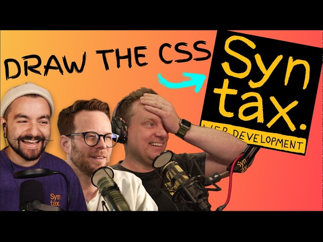
"I don’t know that I really like this kind of stuff. I think I saw that syntax guys like created one that’s more realistic."
—Gives insight into the creator’s reflection on the format and potential future paths.
Questions This Video Answers
- How do you get started with CSS Battle as a beginner?
- What are the pros and cons of absolute positioning in CSS battles?
- What’s the best way to chase pixel-perfect matches in CSS Battle challenges?
- How does box-shadow help replicate glow effects in circular elements?
- What are alternative layouts (grid vs flex) for aligning multiple divs in CSS challenges?
Full Transcript
Okay, so I've been hearing everyone do with these CSS battles. I've never done one myself and I need to record a couple of lives ahead of time. So, I just figured I'd jump in and do a CSS battle live. So, hopefully you're ready for that. Let's jump straight in. You can see over here I've got a CSS battle pulled up. I guess we'll do today's, which happens to be November 22nd when I'm doing this. Uh, so let's see what we can do. All right. Um, I don't know what the challenge is. I'm not going to read all that.
Okay. So, here here we are. Here's what I need it to be. And I guess we just start. So, um, these don't I don't know if these are full circles or not, but let's go ahead and start by setting up like I don't know. I guess I'll call this C. Uh, and let's grab this. And let's make it more like 200 by 200. And, uh, we will I guess we can do this in a couple different ways. Let's Let's go ahead and make it like border radius. Um 100 vmax and then we'll say background color.
Guess it could just be background. I'm not going to try to do this like more efficient or something like that than everyone else. Um but let's just see if we can at least make something happen on the page. Did I already lose this somehow? [laughter] All right, there we go. So, we at least got this on the page. Um, let's I don't know if [music] we should position absolute this thing. I don't think so. I think I should be able to just set these things next to each other. All right, let's put the whole thing in like a main tag.
And I [snorts] would always challenge you like if you ever are like, "Oh, this is super easy." Just do it yourself. Um, that's a real great way to know like is it actually easy or is it actually hard? and it just looks easy. Um, let's see. Background. Why is this Can I just change this like body to that? Okay. Guess I don't need to put everything in a main tag then. All right. Um, so the reason I want to do it this way and let's change this right now. Um, I guess my keyboard shortcuts don't always work.
Let's say FFF. We'll comment this out for now. Um, so what I want to do is Why is this thing not working? What did I mess up? Oh. U, what I want to do is just position this correctly first. So, we'll do that. So, we'll do like 240 or something. Let's come up here and do like display grid flex. I feel like this is an issue, but man height we'll do uh screen sorry 100%. Um view height I'm already in uh tail one land place content center. All right, that should work. Um now we're just going to add two of these things.
We'll call this D and D and C should have a lot of the same things. So, let's have them both be there. Um, D and C. All right, cool. Uh, now we're going to do uh grid auto flow uh columns row. It's just column. Okay, there we go. All right, so at least they're next to each other. Um, I think what I'm going to do is Let's get rid of all this. Let's just do absolute positioning on these. Should probably come back to bite me. The few of these I've seen, I've literally never done one of these challenges.
Absolute. Um, and then we're going to take just the C and let's uh say top um 50%. And let's see, let's say like 20%, negative 20%, negative 50%. On both of these and see how close that is. Not bad. Okay. So, let's do the same thing. Um, and I guess we can move this up here, too. And here, I'm going to take D. And I'm going to also take the right. Uh, let's see. How do I do this? Right. Zero. Want it to be all the way over. Why is that not going all the way over?
All right, that works. All right, so now we just want this to be 50% this way. Okay, over complicated that. All right, so that's a little too big. So let's drop these down to like 220 pixels. Pretty close. 15. 10. That looks close enough. Okay. They're not quite circles, though, huh? So, goodness. I don't like this kind of thing. It's just like dumb pixel chasing. But that's fine. 220. I don't know. That might be about right. And they're offc center, too. Okay, I'm already hating this, but um that's fine. Let's just do 51 or something.
It may just be that the size is wrong, but we'll call that good enough. Okay, so what I want for both of these is a box shadow on here. And here we do like 25 pixels. Um sorry, zero zero and 25 pixels. Um, and then we would use, I guess, white and change this background here. All right. So, that's kind of the idea of what I was going for. Now, we've got the middle section here. Um, there's a couple different ways to do this. We could do like a multiple divs. We could just do like a box shadow thing behind everything.
Maybe we should just do that. Um, so we'll [clears throat] just have a div. Actually, I mean, we could have whatever tag we want here. So, I'll just do a P tag. doesn't really matter. Um, and we'll grab this here. And why don't we position absolute this thing since we're already doing that. Absolute. And we'll say background is uh white. And I never even copied this color over correctly. So, let's do that here. All right. So, come on. All right. There we go. All right. So, we're going to put this thing. We'll say top is 50%.
We'll say height is, I don't know, 100 pixels. And we'll say width is 100%. Doesn't really matter. We're going to put it behind everything else anyhow. So, we'll say Z index is like negative one, something like that. Uh, is there way to like see your time on here? I don't know if this is a timed thing or not, but anyhow. Um, then we're going to translate this. Uh, I guess we'll just translate um transform. Let's just translate zero and then 50. All right. So, that's in the middle at least. It's definitely um way too high.
60% something like that. Are these things off center or am I just translated 50%. It's 50% from the top. What am I missing here? Shouldn't really matter, right? Somehow it is 50%. Put it back in the middle. I don't understand why this thing is not not in the center. Um, what am I doing wrong? The whole thing is just off. All right, let's take these back to like 210. 210. [snorts] That's what I have. Here's where it needs to be. The circles are way too small now suddenly 240. I don't know what I'm messing up.
Anyhow, let's let's figure out the box shadow on this thing because that's the other thing I want to do is box uh shadow. And I would probably just tend to do like multiple layers of box shadows. You could also do before and after pseudo elements here, I guess. But I think box shadow works fine because we're going to have two box shadows basically. Yeah. So 0 0 0 25 pixel and uh whatever this color is here. Um and then we'll do 0 0 like I don't know 75 pixels. And then we'll do whatever this color is here.
Obviously that's not right, but you get the idea. 45 55. This is probably more like 20. I got the idea. I feel fine by that. All right. Obviously, this is going to be a bad [laughter] score, but um I don't know that I really feel like chasing. I scored 368. Okay, whatever. Does it not tell you? I don't even think I have an account here. Okay, so should we try to figure this out a little bit more? Probably. So, let's at least get this a little more dialed in. Um, I don't understand why this thing.
Um, box sizing. Do I have to set this to border box? Padding is zero. Margin is zero. Is that it? So, probably do need box sizing. Uh, border box. Yeah, I guess I probably do. Okay, let's put the diff on here. Oh boy, I don't understand this diff. So, mine is the orange, right? I think so. Okay. So, uh, yeah, let's come over here and make mine a little bit smaller, maybe. bigger. Let me just get the left and right one. Right. So, it looks like 225. And then maybe the height is the difference here.
So, I need to go like 220 4.5. [laughter] Okay. I don't understand why this is helpful to make people chase this kind of stuff. Okay. Well, at least I got those done. All right. So, now let's go to this middle section here. Seems like the padding was the issue to start with. Uh, so if I go back here, this should be 50%. No. Why is this thing still low? What am I missing here? It's 50% from the top. Translate. Man, what what am I missing? Is it like line height or something weird? No, I don't know.
Let's set this to E or something just in case that is the issue. So, which I can't imagine that is an issue, but whatever. Okay, somehow the paragraph tag was messing messing it up. All right, at least we're in the middle. So, all we have to do is change the one border box. I don't know. I'm not sure I like this kind of stuff where you're like just chasing pixels. Like I said, obviously there was some issues with like the tag I used, but come on. Um Oh, this is the wrong one. Okay. 45 42 43 44 45 45 52 54 55 How am I over this?
Is that it? Did I do it? 84 89% match. Now it's thinking 601. Where does it tell me my stats? Isn't there like a a match percentage? I thought he just saw that. No. Okay. Anyhow, that was the thing we did. Um Okay. Well, now that I got did one, I kind of have the hang of the like weirdness of some of it. Um should we try this one? What are the other options we have? Oh man, all kinds of fun ones. Um I don't know which one. Maybe we should just do the last one so that I'm not like biasing myself off something I think I can do well of.
All right, so let's start with setting the uh body uh to the background. I wish I had like a timer. That would be kind of fun because I've seen like syntax and stuff like that do timers. Background. All right. And then we're going to have divs. Now I could just do like a some kind of repeat like a mirroring thing. I forget the name for that thing though, so maybe I shouldn't do that. All right. So, we're gonna have How do I want to do this? Probably I should just do the same kind of thing I did before.
Or just going to have multiples of these. I'll have B C D E. I'm just going to position them relative to some center and call it a day. I'm not trying to um scorny. fantastic points or something. Okay, so here we are. We're going to have a border radius 100 V max. Um, and then the height will be like 120. Hey, we did it. Um, and now uh let's just position them, I guess. So, a uh actually let's do all these will be uh position of absolute. That should work. And then we'll just put these in the middle basically, but they're not.
Oh, no. [laughter] okay. So, maybe let's do it this way. We could have columns and then just offset the columns. Let's try that. So, I'm going to wrap all these things in a section tag since I've already used the div um in my CSS like this. Uh, so we're going to have a section here. Yeah. And then, um, Oops. Come on. Section here. Same thing. Um, where we'll have three. And then I've got an extra one, I guess, here. So, we'll say uh section again. And I'll drop this one and do one more. And we'll have G there.
Okay. So, I think that should work. Then, I'm going to take all the section tags. So, we'll say section, we'll say display grid, I guess. And we'll gap like 20 pixels. I don't really know. And then let's remove this absolute. Okay, cool. So, I think that works. And then let's take all of this and put it inside of a main tag. I guess it can be whatever tag I want. I'll just call it M. I wish this thing would format, but uh we'll take the M and we'll set this as display of flex. Should set all those next to each other.
And we'll do gap of like 20 pixels as well. Okay, so I think that's close. Um we'll just do uh display flex align items start. is there a center? Yeah, center option. Okay, I think that works. And then let's take this whole thing and position absolute it. And we'll do left like 20, I don't know, 40 pixels. Who knows? And then top of zero. I mean, for a one shot, not too bad. Now, we get to play uh with the size of these things. And okay, so mine are too big. They're too wide. They're the right size.
Um so, let's do like 80 pixels, 90 pixels, 95 pixels. It's hard because they're off. So, let's just line up this edge first and then we'll go from there. So, I'm going to take this to like the 30. Okay, so the edge is lined up. Let's make this thing a little more narrow. Needs to be bigger. Wait, did I just solve it? [laughter] Let's see. Oh, no. I can't. Um, okay. Whatever. You can see it, right? Did I just solve it? We're done. Okay. [gasps and sighs] All right. Well, that was fun. Um, hopefully you enjoyed that.
I don't, like I said, I don't even have a an account on here. I don't know that I really like this kind of stuff. I think I saw that syntax guys like created one that's more realistic. Um, so maybe I'll try that. But anyhow, uh, thanks so much for watching. I hope you enjoyed that. I'll catch you in the next one. Happy coding.
More from Coding in Public


Get daily recaps from
Coding in Public
AI-powered summaries delivered to your inbox. Save hours every week while staying fully informed.