One Last Battle
Chapters8
Announcement of the final match and the two competitors, setting up the competition and scoring context.
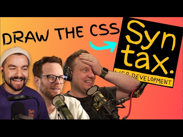
Two elite CSS competitors battle it out in Syntax’s Mad CSS final, with Josh Ko narrowly edging Scott Tinsky to win the inaugural championship trophy.
Summary
Syntax’s Mad CSS final pits Scott Tinsky and Josh Ko in a high-stakes, browser-crunching duel. CJ sets the stage, reminding us this is the culmination after 16 developers, four rounds, and weeks of battles. Scott immediately locks in CSS selectors and grids, showing why he’s been a force from the start, though Josh keeps his cool and climbs back with precise layout decisions. The two players trade progress as they script grids, flex columns, and a mix of gradients and colors to win favor with the scoring engine. The last minutes become a nail-biter as both contestants refine the header, sidebar, and content areas—dialing in gaps, padding, and even a gradient in the bottom left. Josh’s late surge—with strategic emphasis on the compose button and background color choices—puts him over the finish line. The broadcast captures the nerves, near misses, and technical chatter that makes CSS battles so enthralling. In the end, Josh Ko is announced as the winner, earning the inaugural MarchMad CSS Championship Trophy and leaving viewers buzzing about the tight, visually-led competition that just happened.
Key Takeaways
- CSS grid proficiency is the cornerstone of success in a CSS battle, with contenders like Scott and Josh constantly adjusting grid-template-columns and grid-template-areas to lock elements into place.
- Subgrid emerges as a potential game-changer when HTML structure restricts direct placement, a topic Josh Ko references in his live analysis.
- The final score hinges on small, visual decisions (background color, border radii, and button styling) that affect percentage match in the scoring engine.
- The format—two minutes to plan, 15 minutes to build—forces competitors to balance strategy with rapid iteration and visual polish.
- Josh Ko’s late-game adjustments (notably the blue compose button and gradient accents) demonstrate how momentum can swing a match in the last minutes.
- The event showcases not just coding skill but live debugging, prioritization, and the nerves that come with a high-stakes final.
- Viewers gain insight into how real-world CSS challenges can look under pressure, including layout quirks and the importance of alignment and readability.
Who Is This For?
This is essential viewing for front-end developers who want to see real-time CSS problem solving, grid and flex techniques, and last-minute polish under pressure. It’s also a must-watch for fans of CSS battles and anyone curious about how micro-details impact visual parity in a competitive setting.
Notable Quotes
""This is it. 16 developers, four rounds, weeks of battles, and it comes down to this.""
—CJ sets the scene for the final stakes of the Mad CSS tournament.
""Scott has been an absolute force in this tournament from the moment the clock started.""
—Opening praise highlighting Scott’s consistency and pace.
""Josh just jumped up to 47%... He’s going to take it home with the blue glow.""
— Josh Ko’s late push shifts momentum with a dramatic styling move.
""The winner of the Marchmad CSS 2026 Championship Trophy, Josh Ko.""
—Award moment that seals the dramatic finish.
Questions This Video Answers
- Who won the Mad CSS final on Syntax and how was the final decision made?
- What is CSS Subgrid and why does it matter in competitive CSS battles?
- What strategies did Josh Ko use to catch up and win the final?
- How do grid-template-columns and auto rows influence layout in a CSS battle?
- What can beginners learn from watching a CSS tournament final on Syntax?
CSS GridCSS SubgridCSS BattleSyntax (YouTube Channel)Mad CSS Final 2026Josh KoScott TinskyWeb Design Challenges
Full Transcript
This is it. 16 developers, four rounds, weeks of battles, and it comes down to this. Two developers, and only one will walk away with this trophy. I'm CJ from Syntax. Welcome to the Mad CSS final battle. Scott Tinsky versus Josh Ko. Scott has been an absolute force in this tournament from the moment the clock started. Now, Scott is immediately locking in the CSS selectors. This man knows how to CSS battles. Frantic in round one and one of the lowest passing round one scores, but he brought it in round two. Scott didn't just make it to the final.
He belongs here. I've gotten better every single round. My score has gone up every single time. Josh almost didn't make it out of round one. Less than 1% separated him from going home. Oh no, Josh pulled ahead with 96.24. But if that rattled him, you'd never know it. One piece, then the next, then the next. Calm, methodical, and consistent. His scores were among the highest scores in the whole tournament. The first two matches, by the halfway point, I thought I was cooked. Like, I was behind and I was struggling. So, at this point, like, I'm just glad to be here.
Like, it's all it's all win. Like, no matter what happens, this will have been a success beyond what I expected. One developer who hits the ground running and never looks back. One developer who never breaks a sweat no matter what's in front of him. And one of them wins this. How you holding up? Oh, it is stressful, right? I was actually like trembling slightly at the end of the last match. I'm like cannot I haven't stopped trembling since the first battle. So, the format one last time. CSS and HTML only. Two minutes to plan, 15 minutes to build.
The first to 100% or the highest score when the time's up wins this tournament. But the final UI, final battle. Wow. Let's just say you use it every single day and you never once wanted to recreate it. This is what you're building. So, I can tell you right now, this is not a 100%. So, I think my strategy for this, you know, it's going to be broad, getting everything in the right place. And I, you know, I was thinking before this, like the way that I actually work in my real work is very much like let me get this exact little thing right.
It's very detailoriented. I have to abandon that philosophy for this. I don't know. We're talking about nerves. I've been the coolest effing dude on this entire time. Um, okay. So, a little radial gradient in the bottom. Okay. We got a border radius. I don't see anything crazy tricky um beyond the fact that that's not a full light. I guess that is the full light. Um is there a gradient that you could put like how do you Ooh, that's going to be okay. Um how do you do a gradient that starts at some other position? Um ooh that's the thing that I don't know in terms of the plan, right?
So we're going to and I should look at the HTML. I have a header and a sidebar and a content. So we're going to use CSS grid. The header is going to stretch across both columns. The first column is going to be a fixed width. The second one's going to be flowing. I'll figure out that. I'll put borders on these elements. This is probably a flex column. This is a flex column. Goodness. 15 minutes is not enough time to do this. We have nav items. Fine. We have content. We have email row. Email row. Email row.
We have stupid checkboxes, which I don't even see those yet. 16 started. Two remain. The final battle starts now. And we're off here in the final battle. Scott Tullinsky versus Josh Ko. This is up in the air, folks. This is an incredibly hard target. By the way, we've got West Boss in the audience today, so you're going to hear from him every now and then. Okay, so container display grid grid template areas is going to be header header and then sidebar content. I think that's what it's actually called. Yep. The grid template rows is going to be I'm going to call this 100 pixels 1fr.
Use a semicolon grid template columns. 200 pixels sounds actually kind of right. So we're going to have grid template columns. We're going to have two columns. We're going to have two rows. The uh first row is going to be um we're going to give this a explicit height of like 100 pixels. That's way too high. Something like 50 pixels. And then that's uh fine. The next is just going to be auto to fill the rest of the space. Grid template columns. We're going to say this is going to be something like 150 pix and the rest is going to be auto auto.
We're going to say okay, what do we have next? We have the the header and the sidebar dot header and we have sidebar. Okay, so the header is going to be grid column and then it's going to go one uh I just like to go one to two uh like this. Sorry, 1 to three. 1 to three. And we can see both players immediately going into CSS grid. Um, if you're looking at the meta commentary of the competition, these last few battles, CSS grid is the name of the game. But essentially, they need to lock in that grid, get all of those things in the right spot.
Now, we'll see how they actually decide to implement this grid, but the target solution actually uses sub grids. Sub grid. If somebody busts out subrid, I will be very surprised. And when we were testing this thing, I tried to bring out CSS anchor. I know CSS anchor pretty well, and I just blank. The header itself needs display flex, and that does not look right, but we're heading in the right direction. 100 pixels is way too much for this. Incredible play. We're literally a minute and 15 seconds in, and Josh already has a a usable layout here.
Only a 7% match, but the things are in the right spot, right? Getting the stuff in the right spot is the name of the game. So, as you start to lock in these sizing, we're going to see that those percentage points bump up. But same thing for Scott. We see it. We just He just locked in where that search box goes. He's put that in the right spot in the grid. He's got the sidebar. He's got the email elements. This is good. This is good. Scott's not letting the nerves get to him. Do a line item center.
There we go. Cool. Okay. Okay. Okay. Okay. Is the dev the search thing search mail. Uh dev div. Okay. So, what is going on there? Is there a second header right? Oh, there's a header right. So, let's just go item by item. We have this icon and actually in header I want align items to be center. Oh, I already had that. So why aren't these items actually centered? Because this search thing. Oh, that's interesting. The HTML order is wrong. So within header, right? Oh, no, it's not. Profile is over here. So let's start with that.
Let's grab profile. Josh has identified. So with the incorrect HTML order, that is actually is what can make you use subgrid. Now, Josh actually has a a blog post on using Subrid on his website. Let's see if he reaches for Subrid, but essentially the HTML structure doesn't allow you to just pop those things into their grid spots. You're going to have to use Subrid based on the layout of the HTML or I mean technically it is totally legal to go in and rearrange those HTML elements, but the proper solution, the correct target here is CSS sub grid.
Okay, the search is going to be PG. Uh background, what color is this? Light gray. Okay. Var where what am I even typing here? Oh, okay. Var hyphen hyphen light gray. Light gray. No. Oh, light gray with an A. Okay. Border radius. No. What are you doing? Whoa. Scott 14. Major jump. What did Scott just do? Oh, he locked in the background color of the search box and that just rocketed him ahead. It is confusing to me that my color is wrong when I'm using the light gray color. Maybe it's light blue. Light blue. No.
Okay. So, that means that it's semi-transparent, which is quite the curveball to throw. There's like a fancy way to do it with a syntax I don't remember. I'm going to keep it as light gray. We can come back to that later if we have time for it. Josh has maybe chosen the wrong background color for the search area. We'll see. But, as you can see, this is a very lowcoring game. We're not really going to see these scores bump up until we get some overall layout, right? Until we get some stuff into the right spot.
Oh, no. That's not it. That's not it. We're just going to do a margin right. Do a diff on this bad boy. Perfect. Let's do the sidebar. We're going to do display flex. We're going to do flex direction column. Is it a compose button? It's a button. It's just a button in the sidebar. Button. Uh button is going to be background blue. No, not background transparent. You're crazy. vary blue. Okay. It's going to have a border none. I need to move faster. It's going to have a color of white. It's going to have padding, border radius, cursor.
I don't know why he did cursor pointer. I don't give an f about that. Yeah. And this is a visual challenge. So Scott's looking for like cursor pointer. He's AI. I think maybe auto completed that form. You don't need that because this is a visual challenge. But as you can see, Scott's percentage points bump up. He was at 19%, now he's at 22%. Dialing in this compose button is going to do wonders for his score, right? Cuz that's what the diff cares about. So once he gets the compose button in the right spot, it's going to be looking really good.
8 minutes left in the match, get that button aligned and then work on the alignment of all the other things. Now, obviously the big problem I have is that this thing has a gray background and none of the items are right. And that's the bulk of the area. So that's where I should be spending my time on these email rows. So within content, let's grab email row. I don't even know why it has a gray background. So let's make that white. Just hardcode that. The border bottom for each one should be light gray. There should be some padding.
That seems fine. I don't think I want email. I don't even know what that is right now. So, let's get rid of that. Josh is starting to dial in these email rows. And again, I mean, I I feel like I'm repeating myself here, but that's the name of the game. Get the things in the right spot. Look at that. He has flexed the elements here to for displaying on the email. And you can see that all of the text is now aligned much better than Scott. Scott's text is on the row below those checkboxes. That is already so much better.
Now, there is some weird padding. Oh, it's the gap that I included. So, I can't really have gap because there is a border that has to be touching. So, let's get rid of this gap and accept the fact that that is immediately going to make things look worse. Okay, I think the time I have left for 7 minutes, I need to focus on getting the items to be right. And oh, I see there's a gray background on parent or something that's causing that. Let's do the nav items. Nav item. Okay, it's not quite there. It's pretty close.
I don't know this with this diff where mine is. Oh, where? Oh, the image. No, each nav item needs to have a padding. There we go. We're going to do a display flex. Uh we're going to do a line item center. Yes. Okay. We're going to do a small gap. We're going to uh There's too much dang padding on these things. No, not that. Don't add -40. Oh, yes. Okay. Um margin 10 pixels. Brother, I did not ask for Again, AI suggesting things for Scott that's getting things out of order. Now, the first column that has the checkbox.
Oh, it's just a checkbox. That should be in its own div, but I don't have time to do that. So, we'll use some margin to give that a bit more space. And we'll put some gap on this. Now, my header is too small and doesn't have that border. So, the toolbar needs border bottom and height of 40 pixels. Yeah, this this battle goes by so quick. Only 6 minutes left. And Josh's overall is looking good, but he hasn't gotten them aligned in exactly the right spot. So, while it looks good visually, he hasn't worked on that blue button.
So, his match percent is a whole lot less. Oh, Josh just jumped up to 21. Josh is back in this game, ladies and gentlemen. The problem now is that the space between them. Like my first item, this item here, is kind of perfect, but then the next items are all wrong. Josh has started to lock in the text. You can see that his Stack Overflow is almost in exactly the right spot. Look at that. He just locked in all of the text for the inbox items. There's still a dark gray background down here. Yeah, get rid of that, Josh.
And I think you're going to get better than a 24% score. He's already at 26 in the last 4 minutes. 30% coming out of just by changing the background colors dead nuts. Now, if I were Josh in these last 4 and 1/2 minutes, you would want to focus in on the compose uh button, right? That blue background is really going to give you a higher percentage match. Josh coming out of nowhere, boy was hanging out at 11 for the whole thing. Uh this is not in any good here. I'm not doing good. Uh but uh padding.
We'll do padding 20 pics if I can get that line at least. Yeah. And I'm hearing now from producer Randy in the studio. Um the reason we're seeing that blue diff. So if you're looking at Scott's screen, that blue diff, they've actually chosen the wrong color for the search box background. Uh so if they dial that in, that actually will bump up their score a little bit. But 3 and 1/2 minutes left. This is where it comes down to it. You have to choose which of these elements are you going to focus on. Right now, I need this gradient in the bottom left.
So, the sidebar should have an after content of nothing. Width. This is risky, too, cuz it's going to make my score worse for a while. Height 100 pixels, border, radius zero, 100 pixels, zero zero, background blue. That should put a big blue square right in the bottom. Left zero, bottom zero. Oh, Josh just he just got half of the thing. And that brought him to 44%. He's going to take it home with the blue glow. It's bumped him up to 44.59%. That's exactly what he needs in these last two minutes of the game. Yeah, you love to see this from Josh.
Already at 50% match. 55% match. He's locking in that radial gradient in the bottom left. Only a minute and a half left. Oh, wow. All right. Um, everything is just a little bit off in these. I think the center needs a margin bottom of like 5 pixels. Okay, the padding for some reason on this keeps changing. Oh, this is going to be the death of me. My icons in the sidebar are too big. So, let's grab icon within sidebar, but not within the button. So, I have to be careful here. Nav item icon width 20 pixels.
That's better. Folks, we are in the last minute here. An absolute nailbiter. Okay. No, it's not the padding top and it's not the padding bottom. It's now the margin bottom of this. It's a house. One thing moves and the other thing moves. Oh, this sucks so much. So, this should be display flex flex direction column gap 16 pixels. Oh my god, no, don't do that. Or the nav item. I'm thinking of the sidebar itself. Okay, that looks better. And the first one, the nav item that is probably active. Yep, nav item. Um, what if we did um what if we did different padding uh 10 pix and what if we did different padding bottom value?
And let's set padding block to five pixels. Josh just straight up flexing now. Honestly, so impressive that these guys are able to do it. This is what was needed to take the game here. I don't Oh, wow. In the last 10 seconds, Scott has jumped up to 47%. Can he reach 50%. 5 seconds left. Um, wow. Incredible. Incredible. Good lord. Unbelievable. Scott early lead. just absolutely crushing it. Both of them getting the like complex layout in place way I would have thought. Out of nowhere, Josh was sitting at like 11% for like like 80% of the video and then out of nowhere he did something and boom.
What an incredibly close battle. Incredible to watch. I just want to thank both of you for for coming into this final. Josh, are we going to see you again next year? because I'm sure the viewers at home are just absolutely entertained by your your play here. It see it was it's been a ton of fun. I don't know that it was been it's been good for my heart. Same. But I think I'll probably be up for it. Yeah. Amazing. And what about you, Scott? This seems like it's really run your nerves through the ringer, but how are you feeling?
The battle's over. You were so close. I think this could have been anybody's game. How are you feeling? Yeah, I mean, I'm gutted, honestly. I I despite my outward appearance occasionally, I do feel like I could have had this and that's what makes it worse. I I wish Josh would have kicked my ass is really what I wish. Uh I wish it wouldn't have been close. The fact that I let it slip away is going to haunt me. It is going to haunt me. And it is my absolute honor to present the winner of the Marchmad CSS 2026 Championship Trophy, Josh Ko.
My goodness. I mean, it's it's unbelievable to me, right? The first couple of matches, I thought for sure I was going home. Uh, somehow I still I'm still here. It's a tremendous honor to receive the inaugural award. It's my pleasure. It's my honor, and I appreciate everything. All right, that's it for us here at Syntax. We'll see you in the next one.
More from Syntax


Get daily recaps from
Syntax
AI-powered summaries delivered to your inbox. Save hours every week while staying fully informed.