Simplifying CSS animations
Chapters4
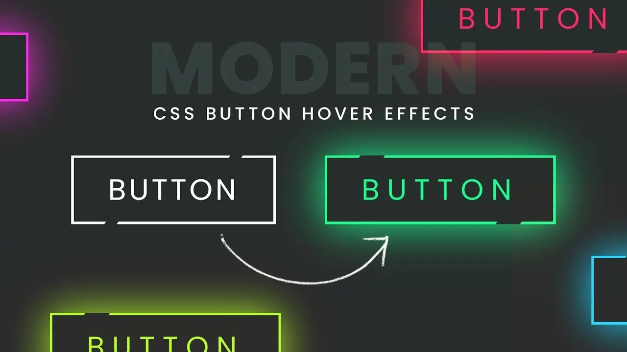
The speaker introduces front-end animations and demonstrates a simple hover-based bell animation using three buttons, explaining the basic sequence and the goal of keeping the effect manageable.
Three practical CSS animation tricks from Kevin Powell: condense keyframes, avoid starting/ending frames, and combine transforms for reliable hover effects.
Summary
Kevin Powell walks through simple CSS animation tips using a small demo with three buttons and a bell-ring hover effect. He shows how to keep animations smooth by avoiding unnecessary starting and ending keyframes. The key idea is to condense keyframes with comma-separated values so you only adjust one spot when tweaking timing. He also explains how combining translate and rotate within a single transform keeps behavior consistent across elements. A common pitfall is when elements start with non-zero rotations, which can cause glitches at the start of the animation. Powell demonstrates that starting from the default zero state and using midpoints can prevent those glitches. He reinforces that transforms can layer on top of each other without conflicts, preserving the original position while applying rotations. Finally, he emphasizes practical debugging tips and credits his community while sharing his milestone moment of approaching a million subs. The video balances approachable explanations with concrete code adjustments you can apply right away.
Key Takeaways
- Use comma-separated keyframes to condense animation steps, reducing the need to manually edit each individual keyframe when tweaking values.
- Eliminate starting or ending keyframes when possible; midpoints can produce smoother, more reliable animations, preventing awkward starts.
- Combine translate and rotate into a single transform sequence so rotations and translations don’t conflict and can be adjusted in one place.
- Start from the default state (zero) for transforms, ensuring predictable behavior as the animation progresses from the initial frame.
- Be mindful of elements that begin with non-zero rotations or transforms, which can cause the first frame to appear stuck or glitchy.
- Keep the original visual anchor (the default position) and apply rotations from that point to preserve expected motion across multiple elements.
Who Is This For?
Essential viewing for frontend developers who want reliable CSS hover animations without overcomplicating keyframes, especially when mixing rotate, translate, and scale.
Notable Quotes
"Eliminate key frames if you can. Don't have the starting ones. Combine key frames makes it easier."
—Powell explains why trimming starting/ending frames and consolidating keyframes helps maintain clean, adaptable animations.
"So I might want to have these as rotations. And that would mean over here I'd probably want to do this with a translate instead."
—Demonstrates the idea of reorganizing transforms by combining rotate and translate for better control.
"I've not been using transforms as much as I've been using the translate and the other things uh of late."
— Powell notes his shift toward using translate in conjunction with other transforms for smoother results.
"And now, when I hover on this one, it works as you'd expect."
—Shows the desired outcome after applying the combined transform approach.
"it's starting at 25° and then it stays there because the first key frame at 25% is there"
—Illustrates a common pitfall when a starting keyframe causes the animation to stall or appear non-fluid.
Questions This Video Answers
- How do I condense CSS keyframes without breaking an animation?
- Why should I avoid starting keyframes in CSS animations and how can I fix it?
- Can I combine translate and rotate in CSS transforms without causing conflicts?
- What are practical tips to debug CSS animations that start glitchy or stutter?
- How do comma-separated keyframes affect maintainability of CSS animations?
Full Transcript
Hello, my front end friends. Animations are one of those things that can feel a little bit like black magic, especially when you see really cool stuff people are doing. But there's some really simple tips and tricks that I've been using to create effect that I want to share with you today. And we're going to be using this demo uh right here where I have three buttons. They're all similar. We have a button with just some text and SVG in there. Uh and you can see I have this ring the bell animation on there. And I'm just doing this with hover effects.
You'd probably want some clicks to trigger things, but we're keeping things simple for today where if I hover on top, you can see my bell goes back and forth. And I have this slow just so we're not doing too much. It'd be nicer if it was a bit longer. Uh, so yeah, a nice simple one right there. And if we take a look at my ring the bell animation, we have starting at zero, going to 25, going to - 25, going back to 25, and then back to zero. If ever you're doing something like this, one of the annoying things is if you want to change these uh you know this one maybe you want this to be 50.
So you have to change this key frame and change this key frame. We don't actually have to do that. We can condense things. So shared key frames can get comma separated. So I can say this is you know these two are going to be the same. Oops. And we can take this one off. Uh the 25 and 25 are the same. So we can do a comma 75% and take those two off. And we're gonna have the exact same thing we had before. It's working perfectly fine right there. Uh, and this is great. There is a big problem with this though.
[laughter] And what that is, while it's working fine for this one, if we go onto this one that's leaning, you'll notice the animation's a little bit weird. And if I move myself up here and we look at this one, we get a glitchy animation at the start. And the reason for that is I have my lean left and my lean right classes on here that are starting these off with rotations. So this is add a - 255 and this one's add a 25 but as soon as the animation starts it has to go to zero.
And this is one of the things that I learned along the way that's really important is you often don't need a starting or ending key frame on something. And if we don't have those we just have some midpoints. Sometimes I might only have a 50% key frame and that's it. So, with that done, now let's go back over to here where if I do this one, it works perfectly fine because we're going from the default, which is zero. There's there's nothing there. So, it just doesn't do anything. Uh, and then it's going to use these key frames that we see right here along the way.
And it works. If I go onto this middle one, it's also working. It looks a little bit different because it's swinging more than the other one, but it's not so bad. Where things are now completely broken is this one. where it just goes back and forth. And the reason for that is it's starting at 25%. Then it stays at 25% until or 20 sorry it's starting at 25° and then it stays there because the first key frame at 25% is there and then it goes there at the end as well. So we're basically staying still then going to - 255 going back and then just sitting there as the animation ends.
And it's kind of awkward compared to this one. It starts right away and it does the full swing. And so the first tip for the animations is to, you know, do this. Eliminate key frames if you can. Don't have the starting ones. Combine key frames makes it easier. So if you're changing things, you only have to change it in one spot. Now that we have things like rotate, scale, and translate as separate properties, and we have them still as part of the transforms. We can combine these two things together, and they don't uh conflict with one another.
They just layer on top of one another. So I might want to have these as rotations. And that would mean over here I'd probably want to do this with a translate instead. So let's update both of these. We can select those and say these are translate. And then here we'd have to then add our rotate in. So rotate rotate. Open up our parenthesis there. And then yeah. So we have the full rotate on here now. And what that means is if we start with the first one once again. Oh, I did. I was like, it's not working.
I hope you're all looking at this going, you can't translate and then rotate. This should be a transform. You can see I've not been using transforms as much as I've been using the translate and the other things uh of late. So, yeah, we can do our transform of rotate. And now, when I hover on this one, it works as you'd expect. If I do this one, it works as you'd expect. And if we go on over to the last one, it works as you'd expect. And the nice thing with this is it's keeping the original place, the - 255, the 25.
That's the sort of the the default of where it's at. And then it's just saying, okay, and from here I'm going to do a rotation like that. And the other one's doing I'm here. I'm going to do a rotation from that point. And the original one, you know, this one at the top was starting here. So it's doing the rotation based on uh it's its default. And it's working exactly as it was before. So that's why on this one, you can see when I first go on it, it's doing the swing to that way. Whereas this one, when it swings, it's only getting down to that center point because it's rotating the - 255 from there.
So, a few quick tips on animations that have helped me out. I hope these help you out with yours as well, especially if you're debugging some AI weirdness that they're doing. They like adding too many key frames and just going kind of crazy with things. So, I hope you enjoyed this video. If you did, you probably enjoyed this other one that's on the screen right now. And with that, I want to say a very big thank you to my enabler of awesome Johnny as well as all my other patrons and channel members for their continued support.
And of course, until next time, don't forget to make your corner of the internet just a little bit more awesome. And thank you for helping me get to a million subs. I don't know if we're there or not. I'm recording this before we are. Uh but if we're not, we're really close. And it's been a heck of a journey to get to this point. So, thank you so much just for watching and sharing and all of that as well. Bye.
More from Kevin Powell


Get daily recaps from
Kevin Powell
AI-powered summaries delivered to your inbox. Save hours every week while staying fully informed.