Blind UI Challenge
Chapters6
Introduce the blind CSS recreation challenge and the goal of matching the design while watching only the code output.
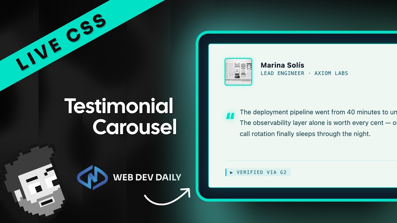
A playful blind CSS challenge where three devs try to recreate a World Cup card design solely from code, then compare approaches and outcomes.
Summary
Syntax’s Blind UI Challenge drops three designers into a no-rendering feedback loop: they code CSS blindfolded to reproduce a World Cup card layout, while the actual output is revealed only at the end. Scott, Wes, and CJ wrestle with positioning, borders, and typography in real time, trading nerves and humor as they improvise color schemes, flex layouts, and border radii. The trio debates whether to absolutely position the top tab or wrap it in a new container, and they experiment with large, chunky fonts to mimic the scoreboard-like header. They bounce ideas about z-index, overflow, and border effects, often pausing to measure widths and heights by eye and even debating whether to look up pixel-perfect values online. The result is a lively, imperfect scramble that highlights both the creativity and the friction of live CSS prototyping under time pressure. In the end, the group compares their approaches, acknowledging what worked, what didn’t, and what tiny tweaks could shave seconds or sharpen the visuals. It’s a friendly duel that emphasizes method, iteration, and the shared challenges of translating a design into code without immediate visual feedback. Creator Randy and his teammates deliver a messy-but-educational celebration of experimentation over perfection.
Key Takeaways
- Starting with color decisions first (dark blue, regular blue, light blue) helps anchor the visual theme before layout work begins.
- Centering the card on screen via body { display: flex; justify-content: center; align-items: center } is a reliable early move for a balanced composition.
- Absolute positioning vs. wrapper strategy for the top tab is a design trade-off; moving the tab outside the card and using a wrapper can simplify layout visualization.
- Border radii and font sizing are highly sensitive to pixel/percentage choices; some players expect pixels (e.g., 14–25px) while others experiment with percentages (30%) for softer curves.
- Flag and image styling require careful separation of classes (country vs. flag) and consistent border rules to avoid misaligned visuals.
- Time pressure pushes quick, heuristic decisions (e.g., measuring widths by eye, dithering on z-index), which is common in live-coding contests.
- Final comparisons show that even with similar layouts, small deviations in radii, font, and color can dramatically change perceived accuracy in a blind attempt.
Who Is This For?
Frontend developers who enjoy code-first design challenges, especially those curious about live-coding dynamics, flexbox layouts, and border-radius experimentation. Great for viewers who want practical takeaways on rapid styling decisions under time pressure.
Notable Quotes
"I think what I'm going to do is start getting the colors in place, then the layout, and then I'm going to fuss on everything."
—One of the first strategic decisions: color-first, then layout, then fine-tuning.
"We’re going to see who can get the closest without ever seeing the rendered code that we're actually writing."
—Core premise of the Blind UI Challenge and the show’s tension.
"I’m going to put it outside the card and then give it a new wrapper. I just have to do this if I’m going to visualize this correctly."
—Concrete workaround discussed to manage tab placement without breaking flow.
"The final challenge is to dial in the border radiuses and font sizes exactly to match the target."
—Highlighting the precision struggle and the iteration loop.
"Let us know in the comments who did better."
—Engagement cue and reflection on the competition outcome.
Questions This Video Answers
- How can I recreate a card layout with a top tab using flexbox and absolute positioning?
- How do border-radius values like 50% or 30% affect card corners in CSS?
- What are effective strategies for rapid UI styling under time pressure in live coding sessions?
- How should I structure CSS for country flag cards and keep image vs. background flag styling consistent?
- What are common pitfalls in visually matching a design when you can't render until the end?
CSSFlexboxBorder-radiusTypographyZ-indexOverflowAbsolute positioningWorld Cup designLive codingSyntax
Full Transcript
In our last video, we had to draw CSS without seeing it rendered. This time, we got challenged to write CSS blindly and try to hit a target without actually getting to see its output. So, you'll be able to see the output of what we're writing as we're writing it. And we won't be able to see anything except the code. CJ, Wes, and myself will have some time on the clock here. We have a design in front of us and we're going to see who can get the closest without ever seeing the rendered code that we're actually writing.
Guys, how are you feeling? I'm so nervous, but so excited. Horrible. This is such a great idea. Yeah, it's going to be a beautiful train wreck. Okay, here we go. I have no idea how I'm going to do on this thing. Uh, but this is what we're trying to recreate. It's from the World Cup. Uh, USA is in group D. We've got a tab up here at the top and then some interesting border radiuses on each of the cards. We'll have to choose like a big thick font and then these shapes at the bottom are going to be interesting or tricky to get.
Um, okay. But, uh, we all are starting from the same base HTML and CSS. I think I'm going to go ahead and put a white background on the body. Actually, instead of a white background, I'll use like this dark dark blue. All right, here we go. I think what I'm going to do is start getting the colors in place, then the layout, and then I'm going to fuss on everything. So, I'm going to go to my color picker. Going to grab the dark blue. So, let's go to We'll just do it on body. Um, dark blue is that color.
Um, I'm going to pick another color. This is the regular blue. And then we're going to have light blue. I think those are the only like colors we really need here. Okay, so we got this thing. We got this thing. We got a card width of uh 320 and this card. Let's do a little color picker on this bad boy. Um color picker. Come on. Oh, codeex. Why are you opening? Oh my god. Okay. Already off to a great start, Scott. And I think the card is just at the top of the page. So, I'm going to go ahead and center the card.
So I'm going to set up the body as uh display flex justify content center align items center. So the card itself should be in the center of the page. And then I'm going to give this body a height of 100 view height and overflow hidden. Okay. So the card I'm going to display flex on it. I'm not going to do any margin cuz that's going to goof me up. Um, but the flex is going to be column. Is that right? Rows column. Why? I never understand it. But yeah. Okay. So, we've got the card. Um, the funny thing is this group D is extending out of the card, right?
And then we have each of the countries here. And I actually want to see like group D positioned on top of the card because that's like this little tab here. So, uh I may regret this, but I'm going to put it up here. And um no, you know what? We we'll actually we'll absolutely position it. I think that's the way to go. It won't be centered on the page, but we'll absolutely position it. But let's work on that first. So, um okay, let's look at the HTML. We have a group which has a uh a div within the card.
Okay. So, we need a position relative on this bad boy. And we want the group like this. The group is going to have a border radius of like 50% top right bottom left 0 0 like this. Okay. So, I think what I'm so hung up on if we like absolutely position this or not. I actually hate the way that Wes set this CSS up. This is horrible. Okay, I'm I'm gonna put it outside the card and then give it a new wrapper. I I just have to do this if I'm gonna be able to visualize this correctly.
That way I don't have to absolutely position anything and it'll just show up on this entire thing. We're going to say font weight. We're going to go 900. Nice and extra chunky. Extra chunky. We're going to do something on this bad boy. Uh we're going to do text align center. And is that a capital D? It's a capital D. You don't even have to do that. Let's do some measuring here cuz measuring is the name of the game here. Let's just see the total width. The total width is somewhere in the neighborhood of 145. You know, the bummer about this is that we got to mess with effing zindex.
Um z-index of -1, I believe. And who knows? I hate stupid z-index stuff. What are these things called? These are countries. So let's do the country and the background is going to just be regular blue color white display flex align item center align it's vertical justify content judge Judy never has justifies. Yeah, we want that to be center as well. Okay, got about 10 minutes left. We've locked in the colors. is we need to lock in the background color of each of the the country cards. So, um this has a class of country and so now each of the countries um will have this other blue color.
Okay, so we've locked in all the colors. At this point, I want to start working on the border radiuses or the border radii. So, let's work on the tab at the top. Did I do everything right? country white display flex their default going to be inline. Oh, the image the height of the image is going to be what is that? 40 px 35 35 px. Okay. Um, those are inline. We are displaying flex. Let's put a bit of a gap on there. That's probably going to be 20 px gap. All right, let's let's do the border radiuses.
So like by default let's let's take every single country and say border radius 999999 px. Okay. So everything will be perfectly rounded. Then what we need to do is each one oh I forgot I put the margin top on the wrong one. I'm glad I caught that. And then does each country have its own thing? Does each country have its own? No, we have to do nthchild at nthchild 2. Um, top left. Okay. Okay, co-pilot, you kind of nailed that, I think. And then this one, it it absolutely did not nail. If that is, of course, if if if my assumptions about the this is correct, which that's doing a lot of work for me.
Um, we'll do actually we'll do display flex. Uh, justify judge duty doesn't justify. Judge Judy justifies uh jud uh let's do we'll do justify content center baby. We'll do align items center. If I'm thinking about this right, the whole container should be centered on the page. The card will be below it. Card has a card has these styles on it though. So, I actually want to move these card styles to the container. And then I can start to position everything else. And it does look like there's a slight border on the inner card. It's this like light bluish color.
And I get it. It's one pixel. Okay. Now, we need to dial in the border radius on the inner card. And I have no idea. Let's do Would it be cheating to say border radius visual guide? Is am I cheating right now? If I if I if I look at if I Google and it tells me how many pixels this isn't cheating, right? Oh, our card needs a border radius on it as well, which is going to be Oh, what is that? 100 px. Can we figure out what the border radius is? It goes from here to here.
Um, that's about a 50px border radius. Is that how that works? Which time we got? 7 minutes. I think we're doing pretty good here. I I wish I could see what this is going to be. And then likewise, these all actually have a border radius kind of not dissimilar to what we're going on here. And I'm just riding with 30 p 30%. I I I've made my bed. I'm going to line it with this 30% here. I'm going to say 30%, 30%, sure, why not? Um zero. So, the border radius is going to be zero and then the top right, which is 30%, and then the bottom left is going to be 0%.
And then the Okay, if this isn't right, then uh I am fed. The team is going to be text align center. The image on the team is going to have a height. What? How height 20px? Oh, shoot. There's border radius on the on the flags, too. Okay. Um, let's go back here and just say to-do border radius on flags. Got to remember that. Oh, and these um country flag HTML and then the other one is the order of these country flags need to be swapped. And I will say that the country flags and the flags are are different than the image.
So they need to be um yes this middle one needs to be image and flag. And as as as far as I know here um you should be correct. But each of the country cards I am going to make a flexbox. Yeah. I'm going to set the inner card to also be a flexbox. And now I should Okay. And then we also need a gap. So on the inner card we're going to do a gap. Let's just call it 10 pixels. And that should separate each of the cards. However, I just realized that not all of the countries have the same border radius.
So, um, okay, five minutes left. Okay, let's go back to the flags. Um, image. Okay, so we say border radius is 12 px border radius on all the flags. You know what we're going to do? We're going to make some say uh top say border 1 12 px border two border 3 border 4 and we're going to go to our image and just say var border one border two border three border four. Okay, good. And then this way what we can do is we can just unset them. So the first one is border one 1 2 3 and border three.
Second one. Oh, they're all the same. They're all the same. I don't even need this. Why am I doing that? They're all the same. So, I I'm feeling pretty good about this. Am I really good at this? Um, the thing I didn't think about is that each country needs a margin bottom. And how many pixels is that going to be? Why? Because we can't use display flex on these. Why? because it looks like it's around like 12 pixels, which is just, you know, I'm just just hunting them with pixels here. Well, I could do a display flex on these and do a gap, but instead, actually, it's going to be the same as whatever Wes set for the card padding.
Did he set a card padding? He didn't set a card padding. So, if I'm imagining this right, everything should be in the right spot. Everything's the right height. Everything's separated, pushed in a little bit. I think I'm going to lock in the border radiuses in the right way for each of the cards. So, um, we have country. I'm going to give it a class of France. So, I Well, that one actually stays the same. I'm so nervous. I I feel like I'm doing good, but I don't know. I I feel like I'm doing good. Border.
Oh, the whole card has a very slight border on it. What color is that? Let's grab that border. 1 px solid. very light blue color. Uh, do we do we dare try to get this gradient? How would you even how would you even do that? If I did everything right, everything is roughly in the right spot. Our tab at the top is just the full width and we want that tab to be a little bit less wide. Um, and the tab at the top is called group. Let me just also imagine, did I do this right?
So, the card is the parent. It has a width of 320 pixels and a white border. Why does it have a white border? Wes did that, too. What the heck? Get rid of that. Now, the real challenge of this entire business. This is going to be a major challenge, folks. Oh, I don't want to do this. Um, we're going to do overflow hidden on this bad boy. And then we're going to do a position relative on it. This is like the worst. Um, we're going to do an after on this bad boy. And then we're going to do content.
And I'm going to just No. Codeex. I don't want to open Codex. I don't even like codeex. Country. So margin block 20. Oh, no. No. I want the other way around. Margin inline is 20. Margin block. Oh, and margin block. So, six on the top and bottom. Okay. I'm going to put a parent container on the group. We'll call this the tab. And then the tab uh should be a display flex justify content center align item center. So now the tab should center the group and then we can just set a fixed width on the group.
So, the group area here should be 143 pixels. What could this possibly be here? We're going to measure out a div. And I'm going to do something crazy, y'all. I'm going to go crazy on this thing. It's going to go nuts. We're going to go wild. We're going to go insane on this thing. 155x 55 tall. So we'll say we'll just do uh 155 pix wide by we'll just say 60 pixels tall. Okay. And this is positioned absolutely it's going to be in the right of zero and it's going to be the top of zero.
So okay the first Oh my gosh. I'm now I'm I'm secondg guessing all my margins. That's okay. Half a minute left. Margin bottom. Um, is everything good? San Sif font size 22. I don't think that's right. Let's Let's take the country and font size. For some reason, I think font size 25px is the move. I think I probably need to add some padding, too. Like literally 10 seconds left. I think this is this is the last thing. I'm just going to add a little bit of padding on that group at the top. And the time is up.
Um, yeah. Time's up. We don't look at them yet, do we? Did you look at yours? Do not do not do not don't look. One at a time. One at a time. Can we Can we share them one at a time? I think I'm in a funny a funny order for this. Oh my god. I feel like I did good. I'm so nervous. I feel like I did so good. I feel like I did great, too, but ran out of time. Can CJ go first? Oh, man. Is mine is mine that bad? Come on. Can we leave the edit first?
Okay. Three, two, one. flex direction. Yes. Okay. Okay. But Okay, guys. All Oh my god. Everything has to be flex. Now I'm second guessing. I did that wrong, too. Yeah. Okay. Uh don't don't have flex direction issues if you didn't use flex for the vertical layout. Um I didn't even think about that. But if I set it to column fixing it, no. I'm just I'm I'm just showing you what would happen. direction column and then I don't think I dialed Did I not dial the heights in? Oh no, the countries. Oh, I set them to 285 pixels.
That's way too much. Yeah. Oh man, I'm second guessing everything I just did. Yeah, me too, man. Wes, there were some things you did in the HTML. You put one of the countries in the wrong spot, and now I'm seeing that the flag at the bottom has a different class. It doesn't have the same class as all the other flags. Attention to detail is required for this experiment. Wait, did I put the wrong You called it team flag where Yeah, it's a different flag. No, it's a different flag. It has very different styles. It has a different aspect of the It has very different styles.
I will say that. Yes. I love this. All right, Randy, ready to reveal the the next one? Yeah. Who uh who who should who should go next? Can we can we reveal it and try to guess whose it is? Yes, that's all right. Three, two, one. Not bad. Actually, it's really bad. Those border those border races are horrible. But who's it? No, somebody didn't set the font size. If this was mine, I will quit. And they also absolutely positioned the tab. Oh, I did that. Oh, I see it. This was mine. No, this is Scott's.
Okay, good. At least I had border radiuses for all three of them. That's Oh, we didn't have a font fan or we didn't have a font set for the sand sif. And I will say this isn't terrible. If the font was serif, it'd be looking a lot better. Border radiuses are rough. Those are you guys. I have the border radiuses on each one. No, Scott, I'm going to give you this, too. Take the font. Oh, wait. take the font and the border radiuses out of it. The layout is bang on, Scott. You nailed the layout.
Yeah, layout's pretty good. Thank you. And that's the hardest part. And I got the flag the with the border radius. Is it because I used percentage instead of pixels? Oh, the outline on the border on the flag. I turned Well, also there's a white outline on the card. I turned that off cuz that's not how it was in the original. You can see there's a white border right now. But okay. So, if I if I do pixels, then they're fine. I just should have done pixels. You were doing percentages. Yeah. I don't know in the comments whose border radius was better, though, cuz that these are the non-existent one or the existent one cuz what is going on in there was better.
No, I had border radiuses, Mr. Attention to detail. Show Show my tab. Show my tab, Randy. I have B like beautiful border radiuses. You actually won. No, all three of them had it. They just got overridden. They just weren't there. They just got over yours was better. Only one of them has it. CJ's font was better as well. Yeah, I just missed that you had to set the font. I was thinking that would be in the reset. Let's Let's see mine first, CJ. Okay. I'm just so mad at myself for the the border radiuses. Okay.
Beautiful. The countries are all out of whack. Your your last border radius is wrong, but the other ones are spot on. The America flag is all goofed up. It just needs to be centered. It just needs to be centered. I even have the slight drop shadow on it. Oh, I need a overflow hidden on my card. I think Wes clearly wins, but I think with some twe if I think I go percentages instead of pixels, I think I'm giving him a run at least. All right. Can we compare all three just real quick? Yeah. Look at that.
I don't know, guys. Wes didn't even get the background color right on his wins by a mile. Scott's Are you kidding? Yours looks like Didn't even get the background color like a dog vomited on the thing. I would say in the comments. I would venture to say CJ's looks better than Scott's. That's insane to say that. Yeah. Randy. Randy, what's the final word? Obviously, I win, but who's second? I I think Scott's second. Look at the direction of CJ's bars. They're going vertical. I think mine would wait. It's modern art. This is mine with three properties changed.
I removed the fixed heights and I set it to text direction column. I think that's pretty close. I'm going to change mine to pixels and we'll see how close I get. No, Scott, you can't get start fixing after the fact. CJ's fixing. I'm going to fix. CJ is fixing. I'm fixing. I'm going to change three properties. How many properties you got to change, Scott? I'm just changing. If I do a How many command Fs do I have? Find and replace percentage to pixels and then Oh, that's too much. Yeah, I don't know. Let us know in the comments.
Yeah, let us know in the comments who did better. That was super fun. Let us know. Give us more suggestions because you guys have way better suggestions for videos than we do.
More from Syntax


Get daily recaps from
Syntax
AI-powered summaries delivered to your inbox. Save hours every week while staying fully informed.