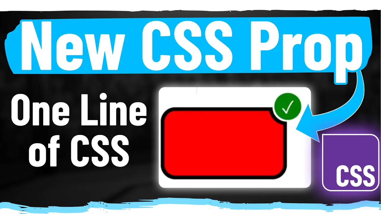
MadCSS Semi Final Breakdown and Solution
Chapters6
The host outlines the video’s plan: presenting the official solution for the Mad CSS semi-finals, analyzing competitor approaches, and exploring tweaks to potentially improve scores.
Insightful breakdown of the MadCSS semi-finals: the official solution, why competitors’ tricks worked or fell short, and how to push to 100% with precise grid, flex, and typography choices.
Summary
Syntax’s CJ walks through the official MadCSS semi-final solution, detailing how a 2x2 grid with explicit grid areas yields the intended layout and how each element—image, thumbnails, description, and controls—fits exactly. He then deconstructs Wes, Josh, and Scott’s approaches, highlighting where font sizing, spacing, and color choices affected scores. The video emphasizes the importance of precise pixel values (gap, border radii, and gradient accents) and shows how Josh’s 98% score was achieved with near-perfect alignment and innovative thumbnail sizing, while Scott’s margins and misconfigured grid cost him. CJ also teases the final battle between Josh and Scott, points to the gradient top bar as a potential tiebreaker, and invites viewers to try the challenge themselves at synhacks.synax.fm. Overall, it’s a practical, high-signal critique of CSS layout gymnastics under time pressure, not just theory.
Key Takeaways
- Explicitly mapping grid-template-areas for a 2x2 grid ensures predictable placement: image (top-left), description (top-right), preview (bottom-left), and add-to-cart (bottom-right).
- Small typographic finetuning matters: locking in 25px title, 10px description, and bold 20px current price can swing scores by multiple percentage points.
- Competitors’ alternative strategies (Josh using near-45px thumbnails and precise margins; Scott relying on margins and mis-spelled grid-columns) demonstrate how different CSS approaches converge on a close visual result but cost precision-based scoring.
- Attention to subtle color vars and gradients (the dark title color and a five-pixel orange gradient top bar) can differentiate top scores in a tight competition.
- The gradient at the top, while tiny, is treated as a non-trivial score factor—these micro-details often separate winners from runners-up in fast, high-stakes CSS challenges.
Who Is This For?
Essential viewing for front-end developers entering CSS layout competitions or chasing pixel-perfect UI in constrained time. Learn concrete grid and typography techniques that translate into higher scores in timed challenges.
Notable Quotes
"This container, of course, is a grid. We have two columns and two rows."
—CJ introduces the grid structure for the official solution.
"I'm going to put each of the elements into their specific cells so that way we can work on things one at a time."
—Strategic workflow for assigning grid areas to components.
"Wes did not dial in the font sizes. And there were a lot of comments talking about this."
—CJ critiques Wes’s missed typography refinements and their impact on score.
"Josh got four percentage points higher than Wes. It’s crazy what locking in font sizes would do."
—Highlighting the potential impact of typography on scoring.
"That gradient at the top is one of those tricky things, but it’s what separates the winners from the losers."
—CJ highlights micro-detail gradient as a scoring factor.
Questions This Video Answers
- How does grid-template-areas affect layout stability in MadCSS challenges?
- What tiny CSS details can swing a competitive score in a time-limited challenge?
- Why do competitors prefer explicit grid areas over natural flow in CSS grid competitions?
- How did Josh achieve a 98% score in the MadCSS semi-finals—what were the key differences from the official solution?
- What role do border radii, object-fit, and gradient accents play in pixel-perfect UI scoring?
CSS GridGrid Template AreasFlexboxObject-fitBorder-radiusTypographyColor VariablesCSS GradientCompetitive CSSSyntax MadCSS
Full Transcript
In this video, I'm going to be showing the official solution for the Mad CSS semi-finals as well as break down some of our competitors solution to show what they potentially got wrong or what would they could tweak to get a higher score. Now, if you're new to all of this, check out the MAD CSS bracket tournament that's been happening here on the syntax channel. We've been releasing videos every week. Started off with 16 developers. Now, we're down to just two. And if you don't want me to spoil who those are, go watch those videos because in the semi-final battle video that just happened, Josh and Scott uh made it through to the finals.
But in this video, I'm going to break down the official solution and show how you can get to 100% as well as take a look at some of our competitor solutions and talk about what they could have done better and maybe tweak some of their CSS to see if we can get that that score up a little bit. If that sounds good, let's dive in. My name is CJ. Welcome to syntax. All right, let's look at the official solution. So this container, of course, is a grid. We have two columns and two rows. The first row takes up all of the extra space, and the bottom row is a static 50 pixels.
There is a padding of 40 pixels on the container. You can see that that makes the image here line up perfectly. And then we're going to set up grid template areas. Now, this is going to be the easiest way to put all of the cells into the right spot. So, we're going to have image in the top left, description in the top right, the preview thumbnails in the bottom left, and then the controls, that add to cart button in the bottom right, and then the grid itself has a gap of 25 pixels. Now, I'm going to put each of the elements into their specific cells so that way we can work on things one at a time.
So, the product image is the top left. We're going to give it a grid area of image, and I'm going to set an overflow to hidden. That way, it'll be much easier to see where these things are in the grid. For the product thumbnails, I'm going to put these in grid area preview and also set overflow to hidden. Now, this is one of the tricky things about the HTML setup here because the product thumbnails were the second thing. And so, with the natural grid flow, they would want to be in the top right, but by using the grid areas here, we're putting them in the bottom left.
And then the other two automatically will flow into their space. But I'm still going to explicitly set the grid area, set overflow to hidden on both of them. And now we can see we have four little areas that we can start to dial in. Um, and this is nice because if you look at the diff, it's these explicit areas, right? And I can work on them one at a time. So first up, the product image, width of 100%, height of 100%, and then a border radius of 15 pixels. And then we target the image inside of that container.
Width of 100 100%, height of 100%. You'll notice it's almost perfect, but then we set object fit to cover and it snaps into place. Now for the product thumbnails, this is going to be a flex row just by content center, align item center, height of 100%. There is a 10 pixel gap in between each thumbnail. And then for each thumbnail, it has a width of 45 pixels and a height of 45 pixels. And the background is set to light orange. And I'll show you in a second why I do that. Essentially, I'm using the background to display the light orange around these ones.
And then I'm going to set the border radius to 10 pixels. And then give it a 5 pixel transparent border. And by doing this, the background is going to shine through because the border is set to transparent. Now, for each image, width of 100%, height of 100%, border radius of 5 pixels, and object fit cover. So that locks all of the images into the right spot. Now all we need to do is target the preview thumbnail and set its border to be orange. So this is an active class. Border color set to orange. And now that one has the correct border color.
Now let's lock in the description area. So I'm going to set this to be a flexbox flex direction column justify content center and a gap of 15 pixels between all the elements. Now by doing this it pushed some of the text out of view because we do have overflow hidden. So, I'm actually going to lock in the text sizes uh of everything so that way we can see it before we start dialing in all the other properties. So, the brand is 10 pixels. The title is an H1. And so, we need to remove that default margin.
So, we're setting margin to zero. Font size of 25 pixels. The description, it's a paragraph tag. So, again, remove the margin. Font size of 10 pixels. And then for the price row, this is going to be a flexbox and it has a gap of 10 pixels. And the current price has a font size of 20 pixels. And then the discount badge, which is that resale text, has a font size of 10 pixels. And then lastly, the original price, has a font size of 10 pixels as well. So with that, everything's mostly in the right spot.
Now we can start dialing in colors and letter spacing. So the brand up at the top is bold with a letter spacing of 10 pixels and a color of orange. You see that locks in. Product title is bold, which it already has cuz it's an H1. And then it has a color of dark. And this is one of the things that could trip someone up because it looks like it's black, but it's actually this CSS variable here. And I've seen some comments on some of the other videos that they think there's too many colors and they're too close.
This is one of the things I introduced to make it just a little bit more tricky, right? Because if you didn't get the color, you'd still get a decent score, but getting the exact right color and getting the thing the exact right spot is what separates the winner from the loser. So, I stand by making things tricky like this because uh yeah, like I said, in the heat of the moment, the person that does figure out what the color is should be the winner of that battle. Okay, the description has a color of gray. You can see that that locks in.
For the current price, we're going to set that to bold. And again, use that dark color. And then the discount badge is bold. And we essentially want to add some background color and padding to make it look like that. So, we're going to set the color to orange, background color to light orange, and a padding of five pixels with a border radius of five pixels. So, that locks in as well. And then, finally, the original price. The color is light gray with a text decoration of line through. So, overall looking really good. Now, we just need to dial in the button.
So, that has a container, which is a flexbox, these purchase controls, and we're going to do align item center. And then, we'll style the button itself. So, we're going to give it a flex of one. That way it fills its parent flex box. Give the button itself a display flex so we can center the text inside. So we'll do align item center. Justify content center. This has a height of 40 pixels. And I also saw people in the comments complaining about this like why did you set the height of the row here? I think again this is all about in the heat of the moment.
It's a battle. The person that figures this out is going to be the winner. And you can see that all four of our competitors had upper 90% scores. So they are the best of the best. Yes, some of this stuff is tricky, but they were able to figure it out. So I I stand by the these these pixel values here. All right, background of orange, no border, border radius of 10 pixels, and then we'll lock in the text. So font size of 10, make it white, make it bold, uppercase it, and give it a letter spacing of 5 pixels.
With that, everything looks fantastic except for that little orange gradient at the top. And this is a linear gradient. So for that, we'll do background linear gradient. And it's a gradient that goes from orange to white. And it's only five pixels tall. So nothing crazy about this linear gradient. And Wes was the only competitor that figured out or even saw that that little gradient was at the top. And again, this is another one of those tricky things. You might complain about it, but it's what separates the winners from the losers, right? If you're able to lock this stuff in within the time limit, you deserve to win.
So, that's the official solution. I want to hear all about it in the comments. What do you hate about this? What would you have done differently? Um, but again, I stand by some of these tricky things because it's a competition. You got to make it interesting. All right. Now, the first competitor solution I want to dig into is Wes's because he did not dial in the font sizes. And there were a lot of comments talking about this, like he spent the last few minutes working on that gradient on the top, but if he had spent time locking in these font sizes, would he have gotten a higher score?
Right. So, he was competing against Josh. Josh got four percentage points higher than he did. So, let's see if we lock in the font sizes of all of this stuff. Will that give him the 4% he needed to actually win the match? But for whatever reason, Wes did not care about the font sizes at all because we we don't even have the selectors for these elements. So, the very first one is the product title and there is no selector for that. So, we're going to select it and it has a font size of 25 pixels.
That brings him up one percentage point. And then the product description, which he also didn't target, has a font size of 10 pixels. And that brings him up just a little bit more. So it would have been really close. I think the other thing is we should set the color of the product title, right? So it's that dark color. If we set that color here, just a little bit more. So it's the tiniest things. Now, I will say the overall layout isn't perfect. Let's actually lock in these bottom font sizes and see if that shifts things up a little bit.
But that also would have been something that he was up against, right? The overall product details needs to have the correct container and spacing. So that could have thrown things off, too. So the current price has a font size of 20 pixels and font weight of bold. The discount badge has a font size of 10 pixels. And then the original price, original price, original price has a font size of 10 pixels. So let's see, we're at 96. We set this font size to 10 pixels. Where are we at? 96.8. Okay. So, Wes would have had to have done a little bit more work.
You can see that the top text here is a little bit too low. And that has to do with the parent container. So, he set a gap of 20 pixels. If you look at the official solution, there's a gap of 15 pixels. So, if we lower that down, that actually decreases his score. So, we we'd have to fuss a little bit with the overall spacing of everything. Um, but it's safe to say that even if Wes locked in the font sizes, he still would have had to finagle some things to get them into the right spot to to catch up to Josh's 98%, right?
Cuz this only gets to him to like 97%. Maybe he could have gotten there, but he did spend quite a bit of time towards the end of the battle on that gradient at the top. Okay, the next one I want to look at is Josh's just because he's so close. 98%. Now, overall Josh's solution is pretty different from the target solution. We see a lot of margins. cuz we see a lot of fixed pixel values and there's a few things to nitpick, right? He didn't add the border radius on these and the image isn't exactly centered inside of there.
You can tell from that if it's not perfect, but he did lock in the uh top left image almost perfectly. Um, but overall, one thing that was really impressive to me was his product thumbnail. So, if you look at the official solution for product thumbnails, the container has a width and height of 45 pixels. Now, if you look at Josh's solution, he set the images to be 35 pixels with a border radius of 10 pixels. So, the overall math is very close to working out, right? Like 45 pixels total. Uh, but he got there in a different way.
So, that's actually really impressive to see. Now, I think one of the main issues that we've seen throughout this competition is when you're trying to just use margins and padding instead of a flexbox, it's really hard to get things aligned, right? So this product details over here in the official solution is a flexbox. But if you look at Josh's solution, he's basically just setting margin top on each of these elements to try and get them into the right spot. Um, which can work, but you're probably going to have some like half pixel values or fractions of a pixel to get it perfectly lined up with the way that Flexbox lays things out.
But overall, Josh's solution fantastic. The fact that he got to 98% in 15 minutes is just crazy. Also, big shout out to Scott. He was only 1% away from beating Josh's score. He got a 97%. So, if we look at Scott's solution, one of the things I saw instantly is he actually didn't specify columns here because it's spelled wrong. This should actually be columns like this. Um, but you'll notice when I do that, that actually drops his score down. So, even though he made that mistake early in the game, he was able to push things around with margin.
Basically, everything has margin on it to try and get it into the right spot. And one of the reasons is his grid was not set up perfectly to begin with. Now, I played around a little bit with his product image to try to get it lined up because if you look at Scott's solution, he's essentially dialed in like a fixed pixel value instead of just using the width of that column. And again, there's a lot of cascading issues because if you look at at the target solution, the grid itself has a gap of 25 pixels, but Scott's grid has a gap of 17 pixels.
So, he essentially made it work by setting this value early, but that means anything else we try to do will just cascade and actually lower his score, right? Like trying to set up this product image to be perfect. I tried, but if you change the grid to be perfect, then everything else gets off. So, to get Scott's score higher than 97%, we would really just want to play around with some of the margins and also set some of the colors. We can see that in Scott's solution, the dark color wasn't used anywhere. In fact, did any of our competitors use dark?
No, they didn't. I looked at at all four of them, none of them identified that that dark color variable. I still stand by it. I think if there had been other people in the competition that got closer, like 99%, you'd be searching for why the heck am I so close? And you you'd figure out that that color was missing. So, overall, the two that made it into the finals, Josh and Scott, deserve to be there. the highest scores and incredible play to be able to pull off a score like this in 15 minutes. It's just fantastic.
So, that's it for this breakdown. Like I said, if you don't like my solution, let me know in the comments. Let me know how you would do it. If you want to give this a go, head over to synhacks.synax.fm. You can try this exact challenge. And on Wednesday, the day before the finals, you can try the final battle before the video is released. So, we're actually doing a Thursday release instead of a Friday release. So, be sure to tune in to the final here on the channel on Thursday morning instead of Friday. But Josh and Scott, final battle.
Who's gonna win? I'm excited. Are you excited? Okay, that's all I got for you in this one. See you on Thursday.
More from Syntax


Get daily recaps from
Syntax
AI-powered summaries delivered to your inbox. Save hours every week while staying fully informed.