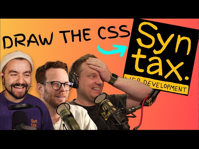
The Internet’s Best Web Devs Compete in CSS | Quarter Finals
Chapters7
CJ announces March Mad CSS, the bracket setup, and how the battles will proceed.
Eye-popping CSS battles unfold in the quarterfinals of Syntax’s March Mad CSS, with grid layouts, clever positioning, and last-second cleanups deciding who advances to the semis.
Summary
Syntax’s March Mad CSS returns for the quarterfinals, where eight coders crunch under pressure with CSS and HTML only. CJ introduces a fresh, higher-stakes setup: the four quarterfinal battles use a new UI, two minutes of planning and 15 minutes of coding, aiming for 100% or the highest score when time runs out. In the Chris vs. Scott match, Scott’s mastery of CSS grid earns him a dominant lead as he choreographs a 3x3 testimonial grid and precise row/column placements, while Chris leverages class-based targeting and careful typography adjustments. The Kyle vs. Julia round showcases two distinct approaches: Kyle uses grid template areas for a clean, named-layout, whereas Julia tests color, font sizing, and a mixed flex/grid strategy, with both pushing toward 90s percentages and final minute refinements. The Wes vs. Adam duel emphasizes avatar sizing, box shadows, and a race against a near-perfect finish; Wes chips away at the details (including a Unicode quote workaround) to clinch a tight victory. Finally, Josh vs. Kevin delivers a tense match where fixed heights, grid rows, and careful typography push Josh to a razor-thin 97% victory. The episode culminates with the left-side semifinal pairing: Kyle vs. Scott, while Wes and Josh survive on the right, setting up a buzzy final four. Expect grueling diffs, last-second font tweaks, and a healthy dose of dev-tools wizardry. — Presented by Syntax's CJ and featuring insights from competitors as they chase the trophy.
Key Takeaways
- Scott’s 3x3 grid with explicit grid-row and grid-column placements earned him ~90%+ matches against Chris, proving grid areas and precise placement win when time is tight.
- Kyle’s use of grid template areas and a focused color strategy helped him reach high 80s to mid-90s matches, highlighting the power of named regions over ad-hoc row/column tweaks.
- Julia’s round two faced typography and spacing bottlenecks; final adjustments to body text size and card sizing were pivotal to cracking the 90% threshold.
- Wes’s strategy leaned on avatar sizing, box shadows, and careful gradient/mask tweaks; a Unicode quote workaround saved time when the HTML image route diverged.
- Josh’s challenge underscored the importance of fixed-height grid rows and consistent typography; a late alignment push nudged him to roughly 97% and a win.
- Every matchup underscored that minute diff deltas (font-size, line-height, gaps, and shadows) can swing the final percentage dramatically in CSS battles.
- By the end of the night, Kyle, Scott, Wes, and Josh advance to the semifinals, while Julia, Chris, Adam, and Kevin bow out—setting up a stacked final four.
Who Is This For?
Essential viewing for frontend developers who love CSS challenges, grid layouts, and UI trickery—great for fans of CSS battles, layout nerds, and anyone who wants practical grid and typography tactics under pressure.
Notable Quotes
"Four head-to-head battles, CSS and HTML only. 2 minutes to plan, 15 minutes to build. First to 100% or the highest score when the time is up moves on."
—CJ sets up the quarterfinal format and scoring rules.
"Scott just jumped up to 92%. This was looking really good for him."
—Commentary on Scott’s strong performance in the Chris vs. Scott round.
"The box shadow was diabolical. I can't believe you guys did that."
—Competitors discuss one of the trickier visual details during Kyle vs. Julia.
"Wes advances and Adam's tournament is over."
—Wes defeats Adam to move on to face either Kevin or Josh.
"Josh just jumped up to 97%."
—Josh seals a razor-thin win with a late accuracy push against Kevin.
Questions This Video Answers
- How do CSS Grid areas help in arranging multiple testimonial cards in a grid?
- What tricks were used to reach high match percentages in Syntax's March Mad CSS quarterfinals?
- How important are typography tweaks (font-size, line-height) in CSS battles?
- Who advanced to the semifinals in Syntax's March Mad CSS quarterfinals?
- What were the biggest diffs between Kyle and Julia's approaches in the CSS battles?
Full Transcript
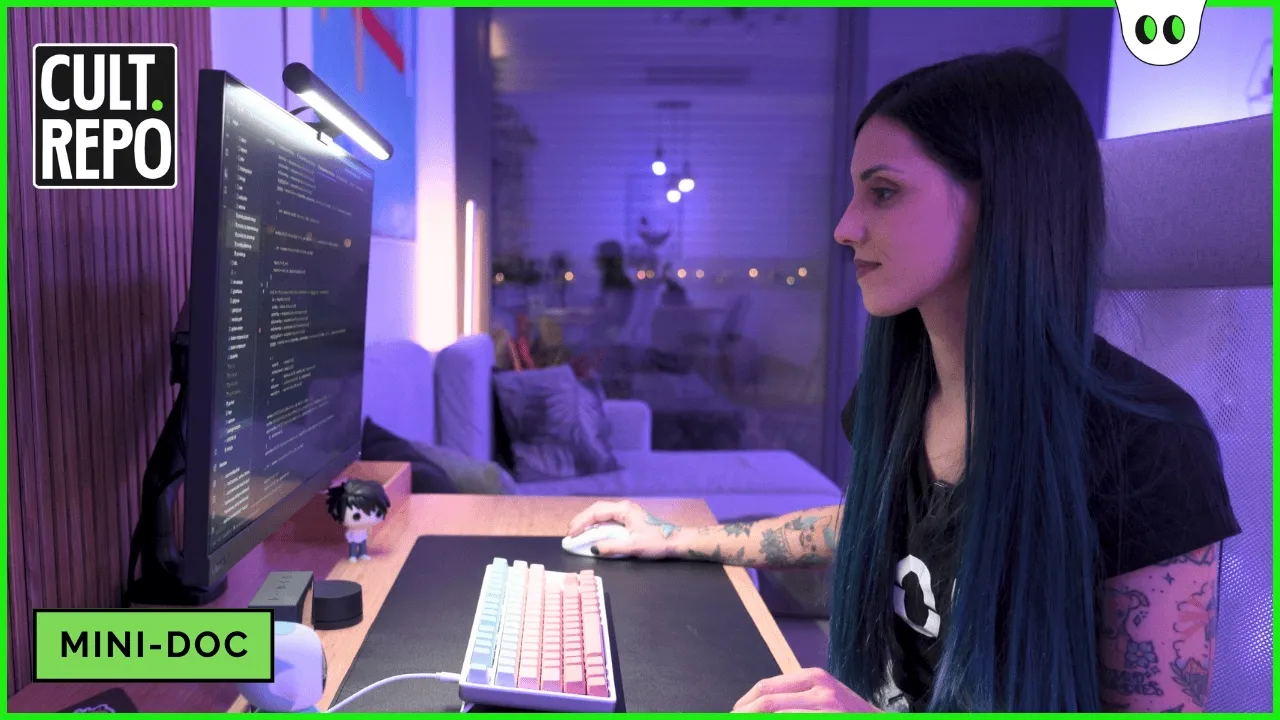
16 developers entered the mad CSS bracket. Eight went home. If you missed it, be sure to check out the round one videos here on the channel which show exactly how these eight developers made it here today. Kyle and Julia, Chris and Scott, Kevin and Josh, and Wes and Adam. Eight coders, four battles, one trophy on the line. I'm CJ from Syntax. Welcome to March Mad CSS. First two rounds were a warm-up. Both sides of the bracket have been tested and the ones who made it through are not messing around. But here's where it gets interesting because this week the challenge changes.
Every round one battle use the same UI, same layout, same rules. Everyone on a level playing field. The quarterfinals, same idea, but a whole new UI. A harder one. I'm not ready for this. The format you already know. Four head-to-head battles, CSS and HTML only. 2 minutes to plan, 15 minutes to build. First to 100% or the highest score when the time is up moves on. I'm going to hit 100. I believe in you. It's just going to be after I get 100. So, you know, it's all good. And this is what you're building. All right.
Uh, looking at this, wo, this one is definitely going to use grid 100%. Uh, we have fixed rows maybe so we can have the overflow going on those. One thing that's really interesting is that all the cards are kind of the same. They got the same border radius. They got the same box shadow, the same padding. I mean, this box shadow is going to be a pain to narrow down. That's probably the last thing I'm going to do cuz I don't think it'll change the percentages too much. What else is weird? Any like tricky? The hell is this image here?
Should that be a background image? It's an image tag. Boy, the pull quote is the thing that catches my eye at first where that's going to be a little bit interesting. I'll either do that with a float or with absolute positioning. I'm already thinking that's going to be where I spend some time making very small adjustments. I'm going to beat Kyle. And uh for this purpose, I'm going to use something uh something super stupid. Uh not like position absolute, but something super similar to this. So, we've got a bento grid. Yeah. Two rows. got firm sizes.
Yeah, I mean it's obviously just a grid that should be very fairly simple to describe in CSS. I can describe that in a CSS grid easily. Little gaps, little box shadows on each of the things, different colors. So, the avatars need to get clipped, border radius, they have images. Eight players left. Only four move on. The quarterfinals start now. First up, Chris versus Scott. Left side of the bracket, quarterfinal number one. Let's see who survives. All right. Is it actually a white background? Yeah, that's fine. We'll do the padding 10 pixels here. Push it in a little bit.
We're going to have a grid, a container. And so, let's see the HTML. One, two. They're all just testimonials. And there's exactly four of them. So, it's the container itself that is the grid, right? So, display grid is what we need. Um, well, let's just do it 3x3, I guess. And they look equal to me. So we'll say grid template columns and I think we'll just go repeat 31FR for sure. We can see Chris is pretty cool and collected. He identified right away this is a CSS grid and that is the intended solution. Right? You've got some interesting layout here where you have an element extending across two rows.
You have some elements only taking up one column. This is a perfect use case for CSS grid grid template rows. Uh, no. We want one FR, one FR. And we can see Scott immediately jumping in. He's set up the grid. He's set up two rows, three columns. That's what you need. This is how to do it. We can see over on Chris's side, same thing, but with a little more interesting syntax. He's using that repeat function. U, but they set it up the same way. Two rows, three columns. Ah, crap. Chad's is a little bit more complicated, isn't it?
Do I have a class just for Mr. Chad? I'm going to call give a class called the Chadster on this one in case we we need to do something um extra special with with Chad. Yeah. And Chris adding some CSS classes to the HTML. Totally legal play. It's going to make it easier for him to target the things that he wants. So that's totally fine. Copilot's actually helping me here. Brenda's number two, I think. Uh Brenda 3 to negative one or negative one. Her her row grid row needs to be one to two. Oh, yeah.
Thank you, Brenda. Yes. And I like to see what Scott's doing here. So, now he has the grid. He's placing each of the testimonials into the specific grid spots. So, you can see that first testimonial spans across two columns. And then the next one only spans across a single column, but two rows. So, that's what he's setting up here with grid column and grid row. Um the Chadster specifically has this it's got a um what is the what is the command to make it um grid column is starts at one and ends at three. Is that going to kick Chad over?
Oh heck yeah it's going to There we go. Chris, he's got things lined up perfectly. You can see Chad's in the right spot. He's positioned these in the right spot. It's looking good. It doesn't look as good as Scott's, but looking back over at Scots, this is fantastic. Right. He's dialed in the height of these rows. Everything's in the right spot. Right. We've got a 73% match with 10 minutes left to go. This is looking really good for Scott and his nerves. Maybe we should do all the all the all the colors quick. We'll call the Brenda stir.
Brenda the Garyster. I love people named Gary. All right. Now, Scott's working on the alignment of this double quote. And this is nothing crazy. It's just going to be fixed position inside of the container. Resizing that quote and getting it into the top right corner so that it appears in the right spot. I don't know if I'm getting cocky here, but I feel like I'm doing really well, but at the same time, I'm concerned. I think that should just pop into place, and that's going to remind us that we're going to need Oh, look at we squished her head a little bit.
We'll have to fix that. That's funny. It's cuz flexbox is just winning and it's be like, "No, too bad." So, Chris is going to need to dial in the width and the height on these elements, right? These elements have an automatic height. So, unless you dial in the height, you're going to get that weird stretching. So, they need width and height. Let's see if we can pull it out. Okay. Align items top. I want to align items. Top align items. Uh, flex start. Okay, that's pretty good. But the font size is not right. What is different about Oh man, the diff is brutal.
Uh, the font size on mine is too small. 15. Diff, baby. Yeah, there we go. Scott found the 15 pixel font size. Yeah, and Scott has just passed 90%. This is looking really good for him. But the game isn't over yet, folks. We have three and a half minutes left. Chris, it's ever so slightly off as well. So, just the most minor adjustments are going to see some changes in this overall percentage score. Is my Chad too big? I think it is. What size is it supposed to be? Font size 15 pixels or Oh, that that smooshed it down.
Ooh, that went a long way, didn't it? Only 2 minutes left. 90% match% match for Scott. Chris has a 79%. This game can be decided in the last 30 seconds. And Scott just jumped up to 92%. Let's see if he can keep it. Yeah, 91.75 and Chris at 81.79. Now all of the sudden mine needs a margin bottom of like Yeah, like something like 3 pixels, but not margin. Oh yeah, baby. Oh yeah. Uh line height is still not correct. And if I adjust this line height, it's going to throw everything else off. Yeah, Scott has misspelled margin bottom twice.
Now I have to have to go HTML body height 100%. Yeah, this is so close. 15 seconds left. Let's see if Chris can push it over 90% in these last 12 10 seconds. Um 95 99%. So close. Did that hurt my percentage overall? No. This push Chris to 81%. Yeah, this was brutal. Uh you both were so close. like this is I wasn't close. I was nowhere near I got stuck. I got really lucky that I remembered the grid row and grid column. I like was panicking cuz I couldn't remember that syntax. I was just like, what is it?
What is it? And I tried it and it just worked and I was like okay. I have that same moment where I'm like what what is it again? Like is it just column or uh great job Chris? Oh my god. Likewise. That was fun. Thanks for having me and I look forward to watching the final video. And Scott takes it. Chris is out and nobody saw that coming. Less than 2% of you thought Scott would win. And now Scott moves on to face either Kyle or Julia. What's that? Yes. Yes. Oh, I'll absolutely let them know that uh this video is brought to you by Sentry.
Just like everywhere else, we got to pay the bills around here. This video, this series, the podcast, every video we put out on YouTube, brought to you by Sentry. Head over to centry.io/sintax to learn more. They are application monitoring software considered not bad by millions of developers. So definitely check them out. We'd really appreciate it. All right, back to the video. Kyle and Julia, one of them ends their run here. Let's find out who. And we're off. I personally could not pick or predict a winner. This is going to be completely up in the air.
Both Julia and WebDev Simplified very seasoned in CSS battles. They've been doing this for years. I'm going to do this thing. And uh now I need um body something about this looks fine. And we see Julia already locking in some color. And we learned that this diffing algorithm really takes in account color. So she's already at 49% match just by locking in a color here. And I think I need to specify my grid template columns. This is going to be one FR. Yep. Three times. And grid template rows is just going to be one FR twice.
There we go. Copy this down. So our right one is right. Bottom is bottom. Middle is middle. Uh let me make sure I got my classes correct. TMT tbt trt. Yeah. And I like to see that Kyle's immediately jumping into CSS grid. This is the correct solution, right? We have three columns, two rows. Uh the way that Kyle is working this out is with grid template areas, right? He gets to actually give them names. Top, top, right, bottom, middle, right, and then for each of the testimonials, he's going to be able to place those in the grid.
Fix with gap and also the half avatar. And it should be super small, 50 pixels maybe. Yes. Uh Julia's taking a a different approach here, right? Instead of setting up the grid first, she's really just locking in the avatar sizing, locking in the text sizing. Each one of these has their own background, I guess. So, we'll say that this one has a background color. Let's see what color that is. That is blue or it looks like it's navy. Yeah. And we can see there once Kyle locked in that color two colors up to 64%. Uh once he locks in those bottom two colors, we're going to see that bump up again.
We're going to probably looking at 70 80%. Yeah. And this is the crucial error. Setting up margin. You can see that when he set the margin, it pushed the cards off the page. I'm going to just write pixels for this. I don't know. Um and see child one should be background color for navy. Uh also it should be testimonials container. It's a grid um grid area. I don't remember how to write grids. Yeah. And we see Julia maybe not so familiar with CSS grid cuz she's actually locking locking in fixed widths for these testimonials. This could work for her if she finds the exact widths.
But the purpose of CSS grid is to automatically give you those widths once you've set up the layout. So if she can lock in the widths exactly, this is actually going to be incredible to see. We'll change this to be a display of flex. There we go. I want to have my content. So, we have avatar and then we have info. Okay. Yeah. So, align those items in the center. Info. And inside the info, we have name and title. So, we'll just go with name here. Let's see. We need to change that to be bold.
And the font size on that is maybe 20 pixels. Uh, actually looks a little big. Yeah, it's definitely too big. Let's try 10 pixels. Way too small. So, we will try 15 pixels. Yeah. And we can see over on Kyle's side, uh, his images are stretch stretched a little bit, but now he's starting to lock in the font sizes of the person's name and their title. Uh, we need to have our quote info, I think is what it's called, or no, it's full. Font size on that is 15 pixels. There we go. That is perfect.
Oh, it has an inner box shadow, too. This is That's just mean. That is just mean. The bottoms of his testimonials, for some reason, are extending just a little bit too far. I have five more minutes, and this is my solution. So, I'm going to play with the greet from here and uh I'm going to have Yeah. So, Julia reaching for the dev tools with 5 minutes remaining. Perfect play, right? We saw her maybe start to panic a little bit. She collected her thoughts and she's going to figure out why are these things not in not in the right spot, right?
Yeah. Margin is definitely not there. Let me just inspect the element here and see what's going. Yeah, Kyle reaching for the uh the dev tools as well with four and half minutes remaining. This is what you have to do when you're so close to uh to getting 100%. You really have to start dialing things in in the dev tools here with error um A. This one is B and this one is C and this one is uh D. But it's not working things. Um okay, looks good. There we go. Julia has locked in a grid that's brought up to 79%.
H there's definitely something about this spacing that I just cannot get for the life of me. Well, we'll just narrow this down. 185 185. That gave us the correct Oh my gosh, that actually is the correct spacing. Okay, that's the worst CSS I've ever written in my entire life. But we're kind of in the right spot with only one minute left. 89% match. Wow. Yeah, Julius is looking really good. I think it's just a matter of the font sizing, right? The font sizing of the body text needs to be brought down a few pixels. That would actually bump her up.
I don't think it's going to get her to 96%. Maybe maybe higher than like 90, but she does need to dial in the font size of the body text on those cards there. Oh no, she's changed the color with only 30 seconds left. Let's see if she can fix it. Yeah, and Kyle with a 96% match, 20 seconds left. Let's see if he can figure out this box shadow. Mine's like almost too dark. Theirs is Theirs is more spread out than mine. Yeah. 10 seconds left. What can Julie do in these last 10 seconds? Five pixels.
There we go. That pushed our box shadow. Incred. That was tough. The box shadow was diabolical. I can't believe you guys did that. Yeah, really close battle. Like if you look at this final result here, like you're so incredibly close. It's just a matter of I think Julia had the wrong sizing on the testimonial card for the like the body text need to be brought down a little bit, but so close. Unfortunately, Julia, this is the last we'll see of you in in this year's Matt CSS, but definitely please come back next year. We're going to do this again.
I would like to try it one more time. And Kyle moves on. Julia's tournament is over. The left side of the bracket is set. Kyle versus Scott in the semi-finals. But first, the right side has to settle things. Wes versus Adam. Let's go. All right, let's hit the ground running. Here we go. Uh, let's switch this to the HTML and let's see what we got going on here. So, our container is containing the testimonial, all the testimonials, so I can start doing my display grid here. Now, listening to their planning phase, I think they both have a good plan, right?
Set up this grid, set up the background colors, and then go from there. Right? That's going to honestly get you a really high match percent already. You can see that literally Wes just setting the color to blue on everything already got him to 73%. Okay. So now we're going to take Brenda. I don't know which one. Brenda's the second one. So we'll say like uh and nth child 2 and it's going to be a grid uh see uh grid row span 2. Okay. Testimonial. Um we need nth child 2. Yeah. And we see Wes using inth child.
Other players have specified or added new CSS selectors for those elements. Yeah. And Adam doing the same thing using in child. This is probably the quickest so that you don't have to add a new class name in the HTML and add it in your CSS file. Um Oh man, I'm actually% I'm hitting 100% for sure for hitting 100%. Okay, like 2 minutes into the match. All right, Brenda display flex. I saw that align items is not in the center. We do have a gap and then the child of So the info is going to be display grid.
No. Well, okay, whatever. Who cares? Yeah, we'll just do that. 5 pixels. I prefer grid wind surf, but I'm just kind of going with the flow right now. Hey, Wes is doing pretty good over there. That's annoying. Okay, so I'm taking a look at the diff view over in the ref view. And we can see I mean these diffs look good, right? There's just a little bit of a positioning that needs to happen in terms of of where things go on the page. I guess that's CSS. I don't know why I'm saying that, but you can see it from the diff here.
The red areas are the ones that are not in the right spot yet. And that just has to do with with Wes's gap. And you can see the same thing happening on Adam's side. So really just looking at the diff, these two are both look 75.58 75.5 still with 11 and 1/2 minutes left in the in the battle. Border radius 100%. It's probably 50. Now, I'm seeing some very weird issues with the avatars on Wes's side. They're long longfaced. And I do believe he needs to dial in the width and the height on those avatars if he wants to get those lined up.
I think it just so happens the aspect ratio, the sizing of those other two testimonials, um, they've got it in the right spot. We've got a gradient fade out at the bottom here. I might have to do a mask. Let's do a box shadow on our testimonial. Is that the container? Yeah, it's the testimonial container. That's not what I want. I want X Y. It's darker than this. It's going to be 30%. Something like that. Maybe 50. Yeah. And we can see Adam dialing in this box shadow manually. There actually is a CSS variable set up that has the color of the box shadow.
Oh no. What happened to Brenda? Brenda's head is squished. Oh no. Where's my image width? I bet the height has to just be explicitly set. That's a quick trick. Brenda, you're looking good. Oh, look at the back. Why is my box shadow so messed up? Okay, let's shoot. What do I This is so close. Wes, what do I do next? Locking in the size of render brought him to 95. Look at this div, folks. Wes's div almost solid black. Font size, I don't know, 50 pixels. Let's see. Smart quote. Unicode. Smart quote. Where are you?
Smart quote. Uh, and unfortunately, Adam is creating his own quote. He didn't realize that in the source HTML there is just a quote image. You don't have to identify the font. You can just reposition that image. So he's gone off and and you can see that's why his quote looks a little bit different. Nailed it. Okay. 99.68%. So I'm simply just missing whatever is causing the text to fade out. It's got to be an inset box shadow or I don't know if I want to mask it. I have a minute left. Oh, it's this one.
Give it to me out of that. No, I don't want that direction. I want the other direction. Come on. Give me the A. Just take this whole thing. Okay. Pop it out in here. Get rid of that. That's probably going to shift my positions around a little bit. Yeah. And my font size. Oh, one minute. I feel the heat. I feel the heat. It's on like Donkey Kong. Okay. Like here, let's do this view. Oh, shiza. I do have typography issues again. Look at the letter spacing is off. They did a thing. It was me.
Mine is different than theirs. I'm not I'm not going to do it. I'm just going to sit here. I'm going to win it. Yeah. 50 seconds left. Looks like Wes is taking the right route. Just let it lock in because Adam 87% did this. 87. I don't think that's it. Come on. Okay. I think it's just time for me to bail with like what I got here. How much What is our percentage? Did I win? Hot diggity, dude. You did great. Where's that quote? Tell me the quote right now. Where'd you get the little quotes?
Look at It's an image in the HTML. Oh, son of a Were you trying to like recreate it with CSS? He found a really close. Oh, he's using a Unicode character. Well, there's the guy props for using a Unicode character. Please, a huge upset. 28% of you thought Adam would win the entire tournament. But with that, Wes advances and Adam's tournament is over. Wes will face either Kevin or Josh. And that battle, it's next. All right. So, container, you are going to be display grid. Uh, let's also add a margin of 10 pixels on there.
That's looking better. Uh, that's all testy mo. Uh, oh, you know what I'm gonna do for now? We're going to do a grid template rows as well. Grid template rows of 1 FR 1 FR cuz they look equal. All right, we're we're rocking and rolling. All right, we're off. The battle of the Canadians, Josh versus Kevin. This is going to be a really close battle. We saw the really high scores from Josh and Kevin in round one. This is the paddle of the Titans. Uh, border radius of 100BW. That's close, but it looks like my my padding is off by a bit there.
Is maybe 15. Oh, perfect. Oh, and my images are the right size. The name is really close to um, so author then that's the title. Is that just title? Just title. Author title will be a display block. So, like right away I'm a little confused because my container is set to be 400 pixels tall. It is 400 pixels tall, but it's way taller than the body. So, that's like if I make you 200, then you're cut off. Okay. So, the grid is the right height. Like that tells me that the grid is the right height.
Yeah. And we see Josh struggling a little bit with the grid layout. Now, this actually has to do with where he's set his grid template rows, right? He set them to two fraction, but you have to lock them in with the exact height if you want them to be contained within that container. Oh, it's font size. Font size. Font size is 15 pixels. I probably should have set this everywhere. Nope, that didn't do it either. Okay, we might take that one off then. Or is it that with some letter spacing? This is going to drive me nuts.
No. Okay, let's just take both of those off for now. We're going to quote snippet is and we had the quote full. Why is mine so different? Font size 15 pixels. Oh, okay. That's bang on. Nice. I guess I can put some padding on this container. Okay, your grid row one and your grid column, let's just say you should be like span 2. That is like truly bizarre that my grid container is the right height. The grid children are spanning way beyond that. And there's like no other way to do this than CSS grid. So, it's not like I can switch to flexbox for this.
Let's say forget one fr 200 pixels 100 pixels. Okay, thank God. There we go. So Josh has identified you have to set a fixed height on those grid template rows, right? And you could calculate those fixed pixels or you could use percentages here. Josh has it and I don't. I'm freaking out right now. Why are my sizes wrong? Yeah. And unfortunately, we see a very similar error here that Kevin has as Chris Cory. Whenever you set the uh the margin or the padding on the body, it's going to essentially extend past past this viewport that's visible here.
And so that's why his Binda is cut off and his Linda is cut off on the right side. All right, Chad is looking good. His name is one pixel too tall, but that's probably because the title needs to be its own. We'll set you to display block, so you move to the next line. We'll set your font size to 10 pixels. The text still seems a little big. It needs to be itallic. Mine is too high up and needs to move further down. I wonder if this is a flexbox alignment thing. Okay, I don't have time to worry about that.
And this is looking good for Josh. He's bumped up to 60%. I'd want to see him set the background colors of these testimonials cuz that's actually going to jump him up to probably 70% match. I'm going to lose this. Okay, lock in Kevin. Uh testimonial nth child 2 grid template row. Uh no, grid row span two. Oh crap. 1 FR 1 FR grid template columns. I need three columns. Maybe that was the problem from the beginning. Now colors I need. What are the colors? The blue, the dark blue, which I guess we're calling navy. Chad.
Where's Chad? Where are you, Chad? Background. Navy. Yep, that looks right. Let's get some of my colors set up so I feel better, even though it's not really going to help. Uh, the first one, nth child one. My background is the navy. The second one is a background that is purple. Plum purple. Uh purple. Yeah. And Kevin locking in those colors now because like I said, seeing that progress bar from your opponent really plays with your nerves. That's interesting. The fact that there is this slight gradient on the text. I think what I'm going to do for that is a pseudo element.
Yeah. And Josh has identified this tiny little bit. Right. There's a little bit of gradient on the bottom area. And this was, you know, is added by me just to make things a little more interesting. Oh my god, I got destroyed. I have I'm just lost right now. I made a stupid mistake along here somewhere. What did I do wrong? 96% match. He actually might take this over Kevin. Looking at these two diff views, like clearly Josh is much much closer. Yeah. And hopefully Kevin doesn't throw in the towel. Only 20 seconds left. Let's see if he can pull it out.
Author to be I have 17 seconds. Author is display flex. If that's display flex the image. Oh, I did aspect ratio of one. Uh, turn that off. Is that better or worse? I think I fixed or Yeah, Josh just jumped up jumped up to 97%. I mean, that's still not right, but at least it's better. And that's what he needed to take the game. And that's it, folks. That was close. That was very close. That was Oh my goodness. Kevin, I thought you were like I spent the first half of that not get able to get my grit in the right spot.
And like you were like it looked like you were almost done and I was still of my half of my place. Things were in the wrong order. I had one problem that I couldn't solve and it just completely flustered me and well that's exactly yeah that's how it tends to go in a way I was lucky that my train wreck was in the first half because then once I figured that out I still had like seven minutes and I was like okay all hope is not lost unfortunately Kevin we won't see you in the next round but hopefully we'll see yeah the next time we do this yeah yeah definitely let me know if ever you're doing it again I'll be happy to be there another upset 18% of you picked Kevin to win it all but That wraps up the quarterfinals.
Kyle, Scott, Wes, and Josh, you're moving on to the semi-finals. Julia, Chris, Adam, and Kevin, your tournament ends here. Four developers left. Two battles stand between them and the final. No more warm-ups. No more second chances. This is Marchm CSS.
More from Syntax


Get daily recaps from
Syntax
AI-powered summaries delivered to your inbox. Save hours every week while staying fully informed.