Vibe Coding BEAUTIFUL Landing Pages with Codex 5.3 (new model / opus 4.6 comparison)
Chapters7
Intro and background on Oliver's projects and goals, including Roseorld.dev and Papers.co, and context for the landing page experiment.
Oliver compares Claude Opus 4.6 against GPT-5.3 Codeex and Gemini 3 Pro by running a full landing-page test against Firecrawl, revealing design gaps and cost trade-offs.
Summary
Oliver, from roseorld.dev, revisits his landing-page cloning experiment to test AI design quality across several models. He previously used Claude Opus 4.6 to craft a visually rich Firecrawl-style page, and this video benchmarks that baseline against GPT-5.3 Codeex and Gemini 3 Pro via Cursor. The experiment starts with a blank page and the same PRD and screenshots fed into each model to ensure a fair comparison. On initial pass, GPT-5.3 Codeex produces a decent page but falls short of Claude Opus 4.6’s elegance, with a flat feel and less enterprise-grade texture. When Codeex pushes into “ex thinking high,” the output deletes and rewrites a thousand lines of code, costing about $1.03, and still misses the polished grid backgrounds and textures. The Gemini 3 Pro attempt is described as uninspired and ugly, lacking the distinctive grid design and motion seen in the Firecrawl reference. Oliver notes that the best results came from the original Claude Opus 4.6 iteration, which had working code blocks, smoother animations, and the grid layout that echoed the target design. He hints at future videos focusing on making AI-generated designs more beautiful and design-driven, rather than relying on raw AI reshaping. Overall, the video frames a pragmatic view of prompt engineering, model choice, and cost when trying to produce enterprise-grade landing pages with AI.
Key Takeaways
- Claude Opus 4.6 outperforms GPT-5.3 Codeex on the initial pass, delivering a more polished Firecrawl-like landing page.
- GPT-5.3 Codeex with ex thinking high rewrote a thousand lines of code and cost about $1.03 for that run.
- Gemini 3 Pro produced a noticeably uninspired page with no grid background or textures, highlighting the variability between models.
- Codeex’s later attempts added a grid layout but produced oversized sections and random texture-like artifacts, undermining design quality.
- Oliver finds the original Claude Opus 4.6 iteration still the cleanest, with working code blocks and appealing animations, suggesting design-centric AI outputs require more nuanced prompting.
- Future videos will explore how to coax design-rich, enterprise-grade pages from AI instead of relying on generic “AI slop.”
- The experiment underscores the importance of having a strong PRD, reference designs, and careful prompt control when evaluating AI design tools.
Who Is This For?
Essential viewing for frontend developers and product designers experimenting with AI-assisted landing-page creation. If you’re comparing AI design models or trying to replicate a reference like Firecrawl, this video highlights practical cost and quality considerations.
Notable Quotes
"this is officially the exact same test that I ran with Claude 4.6, but I'm using GPT 5.3."
—Oliver explains the side-by-side testing setup comparing Claude Opus 4.6 with GPT-5.3 Codeex.
"the codeex thinking the high thinking instead of it just going through the original file and like adding things instead completely deleted the page and then rewrote a thousand lines of code"
—Illustrates how the ex thinking high mode operates and its impact on the page structure.
"it's uninspired ugly. Looks like vibecoded trash. It's all thick and globby and font is awful."
—Oliver criticizes Gemini 3 Pro’s output to contrast with Claude Opus 4.6.
"the grid layout only persists and then fades out before the first header here"
—Notes about how some AI outputs briefly include a grid but don’t maintain it in the final result.
"I think the initial version of this was the best because you've got all the working code blocks here."
—Affirms that the first Claude Opus 4.6 iteration was the strongest in the test.
Questions This Video Answers
- How does Claude Opus 4.6 compare to GPT-5.3 Codeex for AI-assisted landing pages?
- What are the costs and limitations of using AI to rewrite large sections of a landing page?
- Can Gemini 3 Pro produce enterprise-grade landing pages, and if not, why?
- What prompts or PRDs help improve design quality in AI-generated pages?
- Is there a reliable workflow to combine AI-generated blocks with manual design polish for landing pages?
Full Transcript
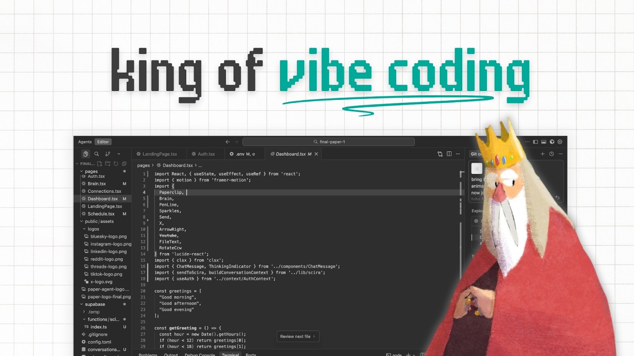
What's going on, guys? This is Oliver, formerly from Response AI and now running roseorld.dev, where I teach people how to vibe code and build their own software and then make money from it. And running papers.com, which is my new SAS that helps people scale their content creation across X and Reddit and LinkedIn, that kind of thing to get customers. In the previous video, um I actually built um a landing page. Um, this is the one. Um, I built a landing page that was meant to be uh a basically a clone of Firecrawl's landing page. Right?
So, if you go to the Firecrawl um main homepage, turn websites into LLM ready data, that kind of thing. There's all of these beautiful designs and layouts and grid style layouts and beautiful animations, that kind of thing. It's one of my favorite landing pages of all time. Inside the previous video, um, I used Claude Opus 4.6, six, which is Claude's um newest model. Um, and as you can see, if I just mute this and we go through the through the sort of like results here, this is obviously Fire Call's actual landing page. And I started to go through my own creation and you could sort of see that mine was sort of like quite uninspired.
Like it wasn't too bad. Um, I found that it was quite flat, that there weren't the sort of like um the kinds of designs that I wanted. There was no grid layout. We had this general sort of like really prettyl looking website, but it didn't look exactly like Firecrol, right? So then what I tried to do um is kind of like do some final fixes with um Composer and we found some pretty brutal sort of like uh mistakes with Composer when it made this ridiculous grid. Right. So, what I'm doing in this video is talking to you about um the uh PRD that we made.
So, we're just going to completely copy paste the same PRD into um uh Claude, sorry, into Cursor. And the model we're using is GBT 5.3 codeex, right, which is the brand new model that was released on the same day as Opus 4.6. So, [clears throat] we've completely made um the page blank. So the test page is completely blank right now. And basically what I'm going to do is to provide a completely fair test. I'm just going to post exactly the same prompt in. And then I'm going to have to use the same screenshots that we gave um Claude for this.
So I'm just going to copy the images. Um I'm going to paste that in. Copy this one. Paste this one in. I'll probably just speed this up, guys, actually. So, we've got all of the um images in and the entire prompt, and I'm just going to go ahead and post that in as the agent. So, I'm going to skip ahead to when this is done, but this is officially the exact same test that I ran with Claude 4.6, but I'm using GBT 5.3. and we're just going to see how it fares against the original. Um because 4.6 was pretty good, but it wasn't amazing.
Um so I'm just going to go ahead and wait for that to complete. Okay guys, so um it has loaded in. Um at face value, I don't think this is as good as Claude Opus 4.6 was on the first attempt. Right, we've got all of the landing page. Like if I just go up to the top and um refresh it, we've got like a nice sort of like animated landing page. Um this looks pretty like it kind of looks like AI slop though. Um that's pretty like clunky how that works. Um you haven't got anywhere near as much sort of like beauty to it as the Clawudus 4.6, excuse me.
Um but obviously you've got this nice little um sort of like area by here. What I'm going to do is I've switched to the super extreme like expensive model from 5.3 codeex and I've said thanks but there is no um beautiful grid background or any textures in the page. If you see you've got all these like nice sort of like grid layouts and stuff inside the original fire page. Um, also the style just needs to be softer and more and more gorgeous enterprise grade. It feels like AI slop right now. So, I've just I've just asked a very expensive version of codeex to um do this.
So, I'm just going to skip ahead to when this is done and see what it says. Okay, [snorts] guys. So, that is um that is finished, right? Um just to sort of go through what it actually did. Instead of like this is interesting. So the the codeex thinking the high thinking instead of it just going through the original file and like adding things instead completely deleted the page and then rewrote a thousand lines of code right which I don't really agree with that with that thought process because obviously the the original framework is already there but what it costed by the way it costed about a dollar I think yeah a dollar three cents to do that e x thinking high.
Now, here is the output. Right, I'm still not super impressed with this. Not only has it made Not only has it made the sections really big, so the sections that were originally looking pretty nice are now huge, um, but it's it's idea of the textured background is this like random thing here, which is just stuff you can type in on a keyboard. It's just dots and X's, right? Got this random thing by here, [laughter] which just looks strange. Um, and then you've got these spinning things which are all right, but I think I think Claude Opus 4.6 did a better job the first time round.
[snorts] You've also then got this random thing here which is just more X's and dots. And then if I if I refresh the page for the sake of the sort of like load in, these things don't load in. Nothing really moves. Um, and I just don't really like it. I don't um I'm trying to think of what else I can do here. I could probably redo it right with Gemini 3 Pro. Going to see if there's anything like Gemini 3 Pro. Okay, Gemini 3 Pro is there. So redo this entire page with the same instructions, but I will switch to Gemini 3 Pro.
issues are it's uninspired ugly. Looks like vibecoded trash. It's all thick and globby and font is awful. There is no background grid design. like nothing. The background is literally blank and your ideas of textures added are just uninspired ugly chunks of text and XXX and dot dot dot instead of actual beautiful designs and lotty glyphs. and animations. In general, compared to the original website, the page feels flat and not enterprise. There's not enough design or movement or lotty animation or textures and no grid background or any good designs. Font is chunky. And to show you a final version, I've attached a full page screenshot of the thing we want to copy.
Firecrawl.dev. So, I'm going to go over to Firecrawl and do that thing we talked about in the last landing uh landing pages design video. I'm going to go to go full page. I'm going to capture the entire page. Um, it's going to be split into two images, which I'm not going to use both images. I'm just going to use one. God, I just whenever I look at this landing page, it just looks beautiful, man. Just looks so so good. They really they really crushed on this. My intention is not to like it's obviously not to like try and copy it completely because it's it's never going to be as good as a as a as a designer, you know, but the idea is I just want it to look a bit similar.
Um, and there we are. So, redo this entire page, the same instructions, but switch Gemini 3 Pro and I've just posted that. So, let me get back to you guys when that is done. And that'll probably cost a fair bit of money as well [laughter] from the um cursor usage, but it's okay. Okay, guys. So, um that is complete, right? Um again, it used about 45 cents in Gemini tokens. So, not terrible, but obviously at least half of what the Gemini the GPT codeex high was and about the same amount slash of just just a bit above what the GPT 5.3 codeex was.
Now, the one thing that it did do finally is add the um the grid layout. The grid layout only persists and then fades out before the first um design, before the first sort of header here. And then obviously you've just got like kind of again like uninspired pretty blocky like AI sort of like vibecoded stuff. Right now I'm going to be doing another full video in the in the future about about design because I feel like something that we're doing and something that the AI is is reading about our screenshots and about our sort of like designs and our PRDs, it's resulting in these quite sort of like stale um like designs.
like my current app um paper schedule. You can see that there's like a beautiful grid layout in the background. The actual text is cleaner. Um you've got like working Lotty animations here. Obviously, some of this was done manually. But in general, like I just want to make beautiful landing pages and we're going to be sort of focusing on that a lot um in the next couple of weeks. Um but in general, if we go through the landing page again, we've got um down here, you've just got this like quite decent kind of like um uh like code block here.
And then obviously you've just got the designs. If we go back and I'm just going to go back and um going to revert to that checkpoint before we ask Gemini and we'll get the original landing page back. And I think the first iteration of this was the best because you've got all the working um code blocks here. You've got these sort of like animations here that fade in and you've got something of like what we asked for and then you've got these like nice designs. So I think the initial version of this was the cleanest.
Um, and obviously like I said guys, any questions at all, give me a shout. But I think we're sort of on to, you know, these models that are going to understand design a bit better and I'll make some more videos on it. Take care.
More from Olly Rosewell


Get daily recaps from
Olly Rosewell
AI-powered summaries delivered to your inbox. Save hours every week while staying fully informed.