AI Vs Human Logo Design in Illustrator
Chapters7
The host deals with a warm room, a missing pajama situation, and setup jitters before starting the stream.
Dansky pits human logo craft against AI-driven ideas live, showing why skilled typography, concepting, and brand thinking still outshine automated mocks—even in a fast-paced AI era.
Summary
Dansky kicks off a candid livestream about AI-generated logos versus human-made marks, using Root and Bean Coffee Roasters as a case study. He crowdsources AI logo concepts from viewers in the Discord and email, then uses Illustrator and Photoshop to sketch and refine a bespoke RB logo that threads a coffee-roasting brand story into a single mark. The session evolves from quick sketches to an iterative, craft-focused process: exploring letterforms, testing a potential RB logo with a coffee-bean motif, considering badge and circular lockups, and weighing serif versus sans-serif personalities. Throughout, Dansky treats typography like a living system—adjusting line weight, kerning, and negative space to sustain scalability, readability, and brand personality. He contrasts the AI inputs (with derivatives and pattern tendencies) against his own artisanal reasoning, calling out where AI lacks nuance in taste, audience targeting, and creative direction. The discussion widens to how a brief shapes design decisions, the value of presenting thinking and process to clients, and the non-negotiables that keep a project human even when automation accelerates tasks. He also teases a future where AI assists rather than replaces designers, emphasizing creativity, direction, and client collaboration as the real differentiators. The stream blends live feedback, rhetorical debates about the future of design, and hands-on exploration of logo systems that can evolve into a full brand identity (colors, typography, badges, and website mockups). By the end, Dansky has a concrete visual concept, a clear plan for a badge version, and a strong case that human-led design remains essential for meaningful branding—and that AI should be used as a tool, not a crutch.
Key Takeaways
- AI logos offer quick aesthetics but often lack scalable structure and strategic branding when pushed to real-world applications (signage, merchandise, websites).
- A strong logo design requires thinking beyond the mark: a brief guides decisions on hierarchy, typography, color, and context to ensure the symbol matches the brand story.
- The RB concept explores a connected mark (R and B linked with a bean) to convey partnership, flow, and coffee heritage, while remaining adaptable for one-color printing and badge formats.
- Typography decisions (serif vs. sans-serif, weight variation, drops, and legibility) can dramatically affect perceived warmth, craftsmanship, and authenticity of a coffee brand.
- Brand-building on streams benefits from showing thinking and process; it helps clients understand why choices are made and how they align with the brief, not just the final look.
- A hands-on workflow—sketching, outlining in Illustrator, then refining in Photoshop before moving back to Illustrator for vector polish—keeps the design agile and responsive to feedback.
- The value of a brand ecosystem (badge variants, vertical vs. horizontal layouts, and future identity extensions) becomes apparent when you start testing the mark in mockups and real-world contexts.
Who Is This For?
Essential viewing for junior to mid-level graphic designers and branding enthusiasts who want to see how to balance AI input with human design thinking. It’s especially useful for designers tackling logo systems and brand identity work that may expand beyond a single mark.
Notable Quotes
""AI logos are visually nice, but they’re often generic and lack real target audience thinking or a strong creative direction.""
—Dansky contrasts AI-generated posters/logos with branding insight and target audience focus.
""The value I provide isn’t just execution; it’s how you convey information, how you connect with people, and how you present a creative direction to a client.""
—Core argument about human designers’ value beyond tools.
""I want the logo to feel crafted and handmade, not just slick and clean.""
—Reasoning behind choosing a serif vibe and handcrafted feel for Root and Bean.
""The brief guides the design decisions; it’s the anchor that keeps everything linked to the client’s needs.""
—Emphasizes the importance of a well-constructed brief in branding work.
""AI can save time on repetitive tasks, but the end result still hinges on human taste, direction, and presentation skills.""
—Summarizes the stream’s stance on AI augmentation versus replacement.
Questions This Video Answers
- How can I evaluate AI logo generators for a real brand identity project?
- What makes a logo scalable for merchandise and signage beyond digital mockups?
- What’s the difference between a badge and a primary logo in a coffee brand identity?
- How do you balance serif and sans-serif typography in a brand that aims for warmth and craftsmanship?
- Can you present design thinking to clients to justify creative decisions beyond the visual look?
AI LogosLogo DesignBrand IdentityTypographyIllustratorPhotoshopSerif vs Sans-SerifCoffee Brand BrandingRB MonogramBadge Design
Full Transcript
Heat. Heat. Heat. Heat up here. Heat up here. There you go. I was basically just saying we're having a crisis at home cuz I can't find my pajamas. I don't know. We're going to we're going to have to postpone the stream. Go and I go and search for the pajamas. I'm in shorts at the minute. It's awful. I don't know. My day is My day is ruined. Yeah. Check down the side of his bed. You failed me, son. How's everyone doing? I don't know. I don't know. I was wear I mean I don't know if anyone even knows I always wear I wear pajamas on stream because they're so flipping comfortable and I'm all about that comfort.
Oh, right. It's quite warm in here. This desk is a mess. Flipping heck. Okay. What we doing? What we doing, Dan? Okay. There's a brief on screen. Right. Oh, I'm running headphones. Have I? Wait, my wife. No, no, no, no. You're good. You're good. I need these ones. These will do. Riggity. Okay. Everything's fine. Happy Friday. I need some music before we start this. What am I going to listen to? Poppy, you usually pick good music. Um, not BTS. If that's what you were going to say. I got a good song. I know. I actually do have quite a good one.
Is this a legit good song or is this a Poppy good song? Hold on. Let me just find the name. Okay, this better be good. Okay. Do runaway by Ian Asher and Gallant. Feel like it. I don't know if I trust you. Actually, no. No, no, not that one. Do Desire H by Do Desire? By who? By Ian Asher and Ollie Alexander. I'm listening to this one first. It's cool. Which one? The first one you said. Okay, the Ian Ian one, right? Why do I feel like I've forgotten something? Have we got everything socks? Happy Friday, ski indeed.
Right, so basically what we're going to do today is uh well, let me give you a bit of context for where this all came about. So there's a brief on screen root and bean coffee roasters. So let's go place. So, where did this come from? I think I generated this the other day. I've been seeing so much stuff online. Um, particularly on threads about everyone saying, "Please stop sharing these AI generated posters, chat, GBG posters, and all this stuff." And obviously AI is a very hot divisive topic at the minute. There's a lot of people worried about AI and all sorts.
And I think one thing that AI does really well is it can present something that may appear aesthetically really cool. And to the untrained eye at least, it can look pretty good. So this design here, it's got the colors, it's got, you know, it's got some degree of hierarchy, although it can completely [ __ ] it up, uh, or it just floods the page with loads of stuff. And they kind of have a tendency to look very similar as well. But one thing that I think it gets really wrong is it's just very generic. Like they're not really designed to actually appeal to a particular target audience.
There's not really a lot of thinking behind them. And whilst they might look visually nice, this one's a better example, but some of them just have no hierarchy at all. there's so many different design things that that they get wrong or that they miss. so I thought, do you know what? Looking at this poster, I've not done a poster in a while. I've been more digital than print for quite a few years now, and I was thinking, I'm going to have a go at redesigning this. I'm going to look at the whole thing from the wording, the hierarchy, the layout, the structure, and I'm going to have a go at redesigning this.
But then I thought, well, there's a logo on here. is what if you can call it a logo and there's a badge down there and then I was going to just quickly whip up a logo for the sake of doing the poster and then I thought actually Dan what if we do the logo first and if it turns out well maybe this becomes a bigger brand identity project and we will get on to a flyer on another stream but we start with the logo rather than me just trying to whip up a logo and do a flyer in a couple hours and I love a good logo so I Why not just focus on that first?
So, in the Discord, um, a minute ago, I just asked if anyone wants to generate some AI logos, by all means, crack on. And if you're watching this on the stream now and you would like to generate some AI logos for Root and Bean or Root and Bean coffee roasters, whatever, please go for it right now and send it to this email. densy.com. So, yeah, I've just got them here. So, honestly, let's just spend five or 10 minutes. If you want to have a go at this, sending me all your AI logos because what we're going to do is we're going to have a whole bunch of AI ones and then we're going to compare at the end.
I've kind of got an idea for what I want to do and I'll That's the other one. And I'll show you that in a second. I had about 20 minutes playing around with an idea earlier and I thought this could be quite good. Might have some legs to it. We'll do it on stream and see what happens. So there's the brief. I will copy and paste that into the Discord as well if anyone does want to have a crackeroon at this. Oh, it's pasted the image, not the text. That is incredibly unhelpful. Let's get rid of that.
Delete. Oh, why is it pasting it as an image? That's strange. Yeah, I'm trying to copy the text text and it's just pasting it as a flipping image, but I don't know why. It's all right. Hang on. I'll ask Chan GBT to write it out. There we go. Exactly. Yeah. Let's just plunk it in there. There you go. So, that's the brief in the Discord. So, email, throw your AI logos at the Discord at the email and we'll just see what it does. We'll see what it does and then we'll dive into kind of version that I think might look a bit more interesting.
And then yeah, we'll see how it goes. We could look at potentially building this out into a maybe more of a visual identity project. Definitely a flyer as well. Haven't done a flyer in a while, so it'd be quite cool to have a crack at something like that. All right. Where's my music? Yeah. So, I've started a Pinterest rather than just diving into a project with no inspiration, which I do have a habit of doing on these streams. Um, I think it'd be good to get some stuff. Yeah. So, I'm just trying to build uh ideas for anything to do with the coffee brand really.
So, stuff like this is quite So, we're just going to scroll down. Have a have a gander. Ah, this is nice. See if anything jumps out. Oh, lovely. I love this typography here. That's really cool. Coffee World. Beautiful. Yeah, some of these are really nice. I like um some of them have got like a nice texture as well or like a nice rough texture. Oo, that's really cool. Yeah, nice badge there. So, we're just grabbing anything and everything. Cozy brew. Nice colors. This one's a bit more tight le which I really like. Amazing illustrations. Love that.
Yeah, these colors these colors are super nice. Lots of like browns and earthy colors. Green seems quite popular. I got nice Waitro ad there. Thank you very much. This is a nice one. Got like a stippling effect on there. Oh. Oh my goodness. Stunning. That's cool as well, huh? Yeah. Let's grab some of this. I want some more potential badge styles as well. Let me know if you're going to have a go at the um AI logos real quick. We'll do a few more minutes and then we'll we'll dive in. If anyone else wants to chuck an AI version of the logo in the Discord, you can use chat GBT.
Um Firefly any of the main AI generators. Hey Dave, how's it going? What's the future for graphic design? Automated? It's already automated. What do you think? No, I think the execution is becoming more automated. Um things like taste, creative direction, judgment, presentation skills, confidence in many different aspects. That's where designers are going to be a lot more valuable. I think a lot of designers, probably myself included actually, placed I was thinking about this yesterday actually, and I'd like to know what you think. I think a lot of us, we we place a lot of value on what we do on the execution.
So for me as an educator in particular, I think a lot of my value comes from being able to say, "Oh, to create this cool effect, do this, do this, do this. and that's really valuable. And then all of a sudden now that's been replaced with type this. There you go. So I kind of understand where people are coming from. But then it's also got me thinking, well actually no, the value that I provide isn't necessarily just on how to execute it. You know, as an educator, it's so much more than that. it, you know, it comes down to how you convey information, how you can connect with human beings, even just doing like streams and things.
So, the value isn't just what I teach, it's how you teach it. Um, I guess how you show up, do you know, what you bring to people's lives. So, it's kind of so much more than just that. And the same for designers. It's not just um the execution side of things. When you're working for a client, a lot of times the clients don't really care. They don't care whether I'm using Photoshop or Illustrator or if I'm AIing something or not. What they do care about is the end result and what I'm going to deliver for them on time, the experience working with me.
There's a lot of things they do care about over, you know, the specifics of how things get made, if that makes sense. And there's so many people at the minute saying like, "Oh, AI is really great." or AI is really terrible very big like loads of extremes. I'm honestly exhausted with it because there's ways that I've started integrating AI into my process that hasn't taken the creativity. I've never given up the creativity, but there's instances where it can save me a lot of time and it can shortcut certain tasks, repetitive stuff, but it doesn't take away the creativity from me.
That for me that's like a non-negotiable. It just enables me to like accelerate what I can do, what I can get done uh without compromising the quality. Again, the quality and the end result, that's another non-negotiable. So, you still need experts with a vision. Exactly. Yeah, you you absolutely do. And someone I can't remember who worded it so well. It was on threads or X or somewhere. I can't remember where I saw it, but they said something to the effect of designers aren't being replaced, but the definition of what a designer is is being replaced.
It's changing, you know, and I thought that was really uh really well put, you know, because things are changing, but then things always change. To be fair, this is like a very radical change. It's pretty insane how all the AI stuff exploded in the last few years, not just design, but across everything. I saw an email yesterday that um there's they're making an AI movie or they've made one and it's coming out soon. Uh forget what it was called, but it's like a full movie made with AI by a uh I can't even remember the director's name.
someone Steve Steven something I can't remember. Yeah, exactly. The values in the ideas, the creative direction, the human mind. Exactly. Yeah. The vision is always going to Exactly. Like for me, I what I see right with a lot of um I'm just going to call it DIY design because whether you're doing it in Microsoft Word yourself, whether you're using like a platform uh where you just kind of pick a template and add your own content, whether you're using AI, to me they're all very very similar. You know, unless you've got experience in design and you understand hierarchy, typography, attention to detail, every all the all the stuff that makes up a good designer, right?
Unless you understand all of that, you know, what you can create is always going to be capped at like a mediocre level. I think AI is probably getting better, but for for example, what uh what your everyday person could generate with AI is going to be quite different to what I could personally generate because I've got the experience to ask the AI to do certain things that I know are going to work from a design point of view, you know, and an everyday person isn't going to have that experience. They'll probably generate something and go, "Oh, I think that looks good." and they have no idea if it is actually good or if it's relevant for their target audience or all this stuff.
So, yeah, to me the conversation isn't around AI, you know, can AI generate a good flyer or not? And people saying, "Oh, stop doing these AI flyers. They're awful." Like, I could generate a good AI flyer because I know what to ask it. I know what to prompt it to do. But so it's is it really is an interesting conversation and like I say, I'm so I'm so fatigued with the extremes at either end. It's just like noise to me now. It's like I want to actually have conversations about this and I know a lot of you guys as well like having conversations about it and you're interested in it.
The all AI is just slop. It's just I just find it a little bit irritating now because it's just it shuts down any conversation. It's like um like you know the Jolton uh card I did that had some AI integrated into the process. Yeah, it was probably like 5% of the process, but still it's like a tiny bit of AI assistance. Does that automatically mean that that whole project and all the work I did by hand is just slop? Of course it doesn't. So anyway, I'll get off my soap box now. We'll get back to a logo.
But um yeah, so there's a lot it's a very very nuanced conversation. And it's very gray. Lots of gray. Anyone that tells you it's black and a black and white conversation is uh well, they'd be smoking something cuz it ain't. It's so interesting and complex and uncertain and exciting and scary all at the same time. Oo, nice typography. Yeah, but those are the two non-negotiables for me. as long as I still stay in the driver's seat creating and doing the creative behind it. So, I can finish a project and then go, I made that. That's my idea.
That's um that's the main thing for me, right? I think we got enough ideas. Let's just refresh this board. So, we're going to start with the logo. And uh we'll see where this goes. Right. Anyone else sent any AI stuff. Ah, that's a good one. Cheers. A thief. Nice. Okay, we'll grab this. Do you know what we should just do? We I can't even speak. We we should do is have people do a design review, but they submit AI designs. I think a lot of designers might find that quite interesting, actually. And I think it will probably because it's a good opportunity to showcase why design and design experience is so valuable because like lots of these for example, you might look at these and go, "Oh, these look nice." And from it does do certain things well and it does look nice, but they're not practical at all.
They're not scalable. You know, the detail is inconsistent in many places. And it's it's just very I mean it's like a coffee brand and there we have just a coffee or we have the root and some bean. It's it's very like literal you know but we can take ideas from these like this one here. This one's quite interesting. Root and bean. That's very interesting. Right. Let's go through the brief and then we're going to get into some sketching because uh I want to see what I can do eventually humanmade movie become a luxury good. Yeah, maybe I think as well designers of um there's an opportunity for designers to showcase their value more by explaining their thinking and all the other stuff the stuff that AI can't replace you know the the thinking behind it showcasing and presenting a creative direction confidently to a client and even interacting with the client you know AI can't do that, right?
So, the brief Raquel loves a good brief be. Did I say beef or brief? Raquel loves loves a bit of beef. Oh, I don't know what I'm saying. Anyway, overview. The root and bean is a specialtity coffee roaster focused on quality coffee, genuine human connection and a welcoming neighborhood atmosphere. Premium coffee without the presence. So quality coffee and human connection welcoming. So very people oriented audiences, coffee lovers, creatives, community, people who value quality and authenticity. Nice. Okay, so this ain't going to be no cheap crap logo. We got to make this look delicious and high quality personality, warm, honest, approachable, crafted, community focused, and refined.
Also, if you have a design brief, by the way, like you can run a big brief through chat GPT and just ask it to simplify it into a list. It did give me like a much, this is all from GPT based on that flyer. It did give me a much longer one before and it was like that's too much information. give me the cliff notes so I can just keep this here as I'm designing because all the design decisions that I make, they should be linking back to this brief. This is where that value as a designer versus AI comes in because when I come to present that idea to said client, I can then not just talk about the design decisions and say, "Oh, I like this because XY Z." I can say this is right for your business because and then I'm linking it back to this or this.
They were meant to be arrows. So, we're linking it back to the brief rather than just having my personal opinions and then they bring in their personal opinions. So, we kind of remove our opinions from it to a degree and keep things focused on the brief. And by doing that, you're going to get a lot a lot less personal feedback because when they do give you personal feedback, you can then just get them to expand on their feedback by asking more questions, but ask them to expand on it in relation to the brief. So, we're trying to filter out too much personal opinion and make sure that everyone is focused on the brief.
You love a good beef. It's funny. Okay, so this is what I was doing earlier on. This is just half an hour of me mucking around. I typed the letter R and I thought, "Oh, we could have a we could have a bean in there." So, that's a coffee bean. Let's um turn my screen recorder on just in case something magical happens here. There we go. So, yeah, I thought, oh, we could have an R and then we could have a little bean. There we go. So, let's just draw a lovely little line there. There's our bean.
And then it's an R and it becomes a B. Now, I don't think that's quite right. It's an interesting idea. R and a B. Anyway, um so we'll get rid of And then I started playing with this idea here. Now, I'm obsessed with this font. I need to stop using it because it's just it's too sexy. It's too sexy and I like it too much. And I got to be careful I don't use it for every flipping project I work on. But I typed an R and I was like, "Oh, there's there's scope here to have a bean in there.
That could be quite nice." And then what did I do? Started trying to combine the R and the B together into a single mark, which could still work because they're both very similar in shape. You know, you've got the R and a B. There's a lot of similarities there. That's awful. Ignore that. And then I had the idea of, oh, maybe I could like link them together. This could be quite good. Root and bean. Like, can you show that connection between them? Then I was like, uh, where is it? Where's it gone? Where's it gone?
Ah, sorry. We're up here. I was like, what if we could connect them with a bean? A really long stretched out coffee bean. So, it's a bit scrappy. And that's as far as I got. I was like, "Okay, we've got an R and a B connected with a bean." And that's that's where I got to. So, that was the thinking. And then tried a few different versions like putting it in a circle, trying to get an and in there. And yeah, that's kind of where I got to. That font has been abused. I know. It really has.
So, as far as a logo goes, this was the idea that I really wanted to explore was the R and the B and the connection between them. Um, firstly, what do you think to that as a concept, not necessarily the crazy bean? That would be nice, but yeah, just curious what your thoughts are. And yeah, it' be nice to sort of sketch out some ideas as well for whether it could be an R and a B connected uh into just a letter mark or whether we're going to go for a monogram with the two characters and have them connected somehow.
You teach so much basic things. Is that a is that a compliment or an insult? I don't really know. Arrested for font abuse. Absolutely. It's rather delicious. Five counts of abusiveness. That's fine. That's fine. Straight to jail. Do not pass. Go. Do not collect £200. I mean, that would be something to have on your record, wouldn't it? Five counts of abusive font usage. Yeah. I don't know, Andrew. I don't know. Uh, right. maybe we should go into Photoshop. Actually, let's go into Photoshop and we'll see what happens. Sometimes it's just fun to just create things.
Hey, Carl. On your CV. Font abuse. Yeah. Yeah. No, I don't know. I think I think sometimes it's uh it's hard to understand exactly what people mean with text. So, let's type an R and a B and we're going to see. I think it's going to be uppercase. I've kind of got like a little bit of a vision in my head how I want this to look. Oh, you passed. Yay. Well done, Kyle. Oh my god. Did you get like a score or something or is it just kind of pass fail? So, you you're certified in Adobe Illustrator now.
Yeah. Was that the official exam? Remind me. You are now you are now more qualified than me. Congrats. Uh right. Let's start at a nice good work. This could be quite good as well actually. Let's get a bunch of bunch of RBs. Oh no, that's an Adobe. We can't use that. We don't have license for that. Oh, that's nice. Adore. What on earth is that font? Where the hell did that come from? Do I have a license for that? Don't know if I do. Maybe I do. Oh. Oh, I do. Oh, I do. Excellent. That's nice.
Let's make these bigger actually. And obviously, like like any other stream, if anyone's got any ideas you want to throw in, honestly, chuck them in the Discord, email them. It's all good. Right. Where's my playlist? If you give some beans to the Discord, they can generate some more styles. Love a good bean. Oh, afterglow. That's really nice as And it's just it's interesting as well just looking at the way the letters are constructed. So, you know, I could I could take this font at the top here and I could go, "Oh, I love the way that there's an intentional disconnect there." Yeah.
We'll see what we can do today. See if we can get get a a decent looking logo done on stream. I feel pretty confident. We're going to get to Bevas in a minute, which is my new favorite font. That's really cool. I really like that actually. Yeah, these two letters I think might complement whatever I do really well. And sometimes it is is as simple as if you're going to do something very letter based. I do quite like starting by looking at lots of existing fonts. You know, you could dive straight into sketching, but I think it's Oh, yeah, that as well.
That could even be a coffee cup. Just sometimes it's really cool just to have ideas for fonts in your head because a serif like these very different from like a sand serif. It's a lot more like cleaner and traditionally a bit more modern. So you can have this as a reference when you start sketching because how you might do serif letter forms is quite different to sans ser for example. That's interesting. Yeah. So this isn't really what I'm going to go for. But let's just say I had a serif R and I wanted to like extend it across the back.
So, we could take the idea behind that and work it into another style of tight face, for example. Ah, yeah. You You've done so well, Carl. Proud of you, dude. Oh my goodness. He's done it again. Oh, thank you so much. Oh, I really appreciate that. You're an absolute legend, XMT. Just sent me $50. You absolute legend. Hey. Oh, man. It still catches me off guard every every single time. It's very kind of you. Grot wings. No, I can't. I'm on a I'm on a I'm on a Liam's put me on a special diet. Yeah.
$50 worth of salad. No, no. Genuinely, thank you so much. Let's see what Denise can steal. Hey, you steal away for $50, man. You can have the lot. You have it all. Right, there we go. Bevas, we're getting quite a few actually. I'm probably not going to spend too long on these because these are some really good ideas already. Be nice to leave a little bit of room for creativity. Miskrits. I don't know what that is. No, I saw miskrits and all I heard was biscuits. I'm guessing they're different things. Obviously. that's really cool. See that gap in there looks a bit the gap between the letters looks a bit weird, but it would fit an and R and B quite nicely.
This is going to be a flipping cool one. Actually, this is going to be good. I got a feeling this is going to become something bigger than just a logo. Ooh, I don't know. Yeah, look at this one. You see this one here? The B. Let's get my Yeah. So, like when I look at this B here, I'm actually kind of seeing a coffee cup sideways. So, you could do something like that. And then you could shorten the handle if you wanted to go subtle coffee cup, but keep it tight as well. So, I hate that R.
I flipping hate the R, but the B a little bit of potential Yeah, the Oh, it does feel a little bit oversized. Like massive head, little tiny legs with little tiny arms or something. Which country sells the best coffee? That's a Yeah, that's a good question. I mean, I always have a nice coffee when we go to Spain. Not going to not going to lie. Uh we've kind of got some like this already. That's nice. But we've we've got that already. Maybe we'll just Maybe we'll just do one more. We'll try and find one more that's bit more interesting.
That's nice. Let's go and stick all these up here in the corner. Right. So, we've got some references. I'm just going to have a play around now and start trying to sketch some ideas. So, what we going flow 30? Let's readjust all of this. Colombian coffee is heaven. Oh, Costa Rica. Oh, Italian coffee. Can't say I've tried I have to put that on my list of things to do. Right, let's move this over. So let's just freely sketch. If in doubt your mind goes blank, just sketch anyway. I got no idea where this is going to go either.
So we'll uh we'll see. We could do something like that. I'm sort of trying to embellish the R a little bit. That's probably a little bit too much. Yeah, that's way too over the top. We got the R and the B as well. So, we can do this in like a really simplified way. So we could try and do that something I I I feel like this is going to be both letters. You probably could integrate them really cleverly, but I feel like a an R Do a smiley face there. And a B. Do a little No.
Uh. What about some sort of flowing connectedness? It's kind of could be quite nice. So kind of starting there going down. It kind of flows. Oh, it's almost like a a heart. A sideways heart there. Or a bottom. or a bottom. Or a b or a bottom. Don't ruin it. If you say that, you won't be able to unsee it. Yeah, it could we could link it a bit too much. Things could get somewhat carried away. A bit too peachy, isn't it? Okay, let's try something less buttlike. We'll try it blocky first of all and we'll see if that still gives us a butt.
So, this is very curvy. This is very square. I wonder if there's some sort of middle ground. Move you up a bit higher. a creative term indeed. Ronaldo R9 vibes. I'm not entirely sure what that is. Is that Is that based on the foot footballer? Sounds like a car. the Audi R8, the Ronaldo R9. Connect that all the way in or not. And it's good to explore these as well. Obviously, I had my original idea earlier. So, let's just try that for a second. We got our serif r. Can't quite remember how it goes, but we'll just make it up.
So, there we go. I think it was something like this. And we had the B. Actually, let's let's single line it first. Yeah, something like that, wasn't it? And then we got serif. There's a connection at the bottom. Do a drop on the end. Yeah. So, that's not even straight. Yeah, I do like that idea. Good day. Good day indeed. Right, one sketch Let's copy it over. Then we'll thicken this version up. So, we're just going to go around and just give this a bit more thickness now that we sort of sketched it out in a very linear fashion.
But honestly, these sketches do not need to be pretty. I just need to do one thing. Tell me as the designer if this idea is worth sinking lots of time into before I waste my time barking up the wrong wrong tree. Bring it up around. Very nice. have these interlinking. We'll start with a drop there and then maybe we'll see if we can get a coffee bean in there. I think we can. And it kind of fills this empty space. Well, not empty space, but this space up here as well, which is nice, right? Let's get my eraser.
So, just brush tool and eraser tool. Just clean up a few of these scrappy edges. space for the bean. Yeah. Well, we could just do it very tight lead. I don't know if the the bean will work or not. So, you could do something like that. It's getting it in in a way that looks really like classy and subtle, not tacky. Do you know what I mean? So if we can do it in a subtle way, I think it could look quite cool. And here like ideally the best logo designs can work in a single color like a black for example.
It could be very useful for brands because you never know where that logo is going to be. So if they need a one color print for example, whether it's cost or just the limitations of something, you know, like stickers or the hoodies or whatever can only be printed in one color, then you got to have that ability to send the logo in one color. So to create this link here at the minute, you can't really see a link. So we've got to make some cuts somewhere that show the link. You can do this, but it can sometimes become a little bit fragmented with all the gaps.
So, I think I'm going to try and go for two, possibly three. Got to choose carefully where I put them. So here I've got one on the outside and then on this one I've got one on the inside and ultimately the goal is to convey that there is a link happening there. Yes, obviously. Yeah, scaling very important. This is all way too tiny at the minute. So in terms of thickness, we might chunk it up even more. At the minute, it's all the same weight as well. So, we could do that. Um, what's probably more likely if we were to stick with the whole serif thing is you would have varying weights.
So, certain parts of the letters would be thicker and thinner. I don't know where is Ka. Maybe she's hiding. When you draw the letter design, do you follow certain rules or designing according to the desire and the unique appropriate shape? When you draw the letter, so if I understand what you're asking, I try to figure out the shapes that I want to create. And if it requires me doing like custom lettering, then I'll do it. But sometimes, and this is what might happen today, I'll look at this and go, "Yep, absolutely love this idea." But I'm going to base it on these two letters.
So then I will bring these letters over here and I will draw on top of them. At the minute, I'm just trying to work on the connection between the R and the B letter. I think this is the direction I'm probably going to go. And I think this sort of stuff I think it will bit the brief as well. Yeah. So I think a lot of these I think as long as it Yeah. human connection. So again connection is going to be quite important. Hence the link between the R and the B. Yeah. uh craftsmanship, certain things like ethical sourcing.
You're not necessarily you don't have to try and get all of this into that single mark. so when we're looking at this, some of this we might try and get into the logo. Some of this might go into the colors that we use. Some of this might go into the typography if you expand this into more of a brand visual identity project. So, don't feel like you have to get all of these descriptive words into just the logo. You know, this is a a full brief and when you present the logo or the brand, whatever it is, um you'd present it as a complete project.
Usually, I would never just send someone a logo. Like, I would send them a logo considering colors, type, mockups, all sorts of stuff. So, you're getting a brief that paints the full picture of what they want. And then I would design um the full thing to paint that picture. Does that make sense? Right. Any of these standing out to anyone or are they just terrible? Should we carry on? That's probably my favorite one, I think. Yeah, a lot of these are That's quite interesting. I think that might be a bit too geometric. I don't know if that's going to have the same sort of the right type of personality for this one as clean as it would be.
Oh, hello Carrie. Ethical is more about using recycled paper. Yeah, there's lots of different ways that could be interpreted. By the way, if anyone's just joined and you would like to do an AI logo for Root and Bean, please do go ahead because we're going to have a bunch of AI logos here and we'll compare what I do at the end to those. So, if we can build up a few more AI logos, that would be amazing. It will just give us more to uh compare to at the end. Yeah, this is really cool. Let's grab because I do love this serif.
It's everything I've ever hoped for in a serif. So, we'll do that. We will rasterize it so I can then go and customize it. there we go. Two separate layers now. That's good. Yeah. So we could experiment with customizing this. what sort of shape it's going to take. You see, we're just building this on top of the existing font. If you do custom lettering from scratch and you don't understand typography at all, honestly, I wouldn't attempt it because you can make so many typographic mistakes without realizing. Right, let's try and make this more of a bean shape.
And then this. Yeah, this one here. Having this, this is really nice, but I don't know if it's too much having them both like that. this one might benefit from being a bit more of a regular R. Maybe there's something else we could do with it. Let's We'll start basic. So, we could do a regular R. And then I I don't like that downward kind of slope. Think I would prefer something a bit more like this where it comes up like that possibly. Yeah, maybe that that might be a bit too much. Yeah, I think I think AI logos like well we as I've just mentioned there's I think there's a lot of ideas you can take from them but even just the scalability of them you know like take all of these logos here try and put that in a website header you know try and send that to a printer.
There's just so many problems, you know. Like personally, I think I could probably get it to do a good AI logo, but one, it's not very fun for me. It's not very creative and I would probably have more experience to ask the right questions to get it to look good, but then it would just be so awful trying to get it to do exactly what I want. I was talking about this with a friend a couple weeks ago actually and uh he was saying like, you know, sometimes you can end up just asking the prompt to do stuff and it just it it doesn't get it.
Whereas if you ask a human to do that, they'd be like, "Oh, yeah. I totally understand what you mean." Like um like an AI, especially with a client, it can't read the room, right? It can't gauge reactions. It can't get a sense of what people are thinking or how they're they're feeling about something. Yeah. Do you reckon we can get our Oh, maybe that could go in there and we could follow the contours. Oh, that. Is that a coffee bean? What if we cut Oh, yeah. What if we cut into that? Like Maybe something like that.
Do we want to connect this as well? I don't know. There might be a bit much. This bit feels a bit straight here as a little bit rigid. Hey. Hey. No, you're not too late. We're We're pretty early days to be honest. We're just gonna maybe just give it a bit more of a uh curve. Yeah, that just feels like it just kind of flows a little bit better. The whole thing really is kind of flowing. Feels a bit rigid having that one straight where we've got this loop here though. I don't know if this bean element is too much because if I then start, you know, making the cuts here to Yeah, let's merge these together.
I don't know about the bean. I don't know if it's too much. I don't know. What do you reckon on the bean front? Bean or no bean? I feel like it's fine until I make the cuts here to show the the link and then it's just a bit too And obviously like Rakal said a minute ago, scalability. And it doesn't just have to be an R RB as well. We could I wouldn't necessarily shape it like a coffee bean, but we could encase it in it's more of an orange. Let's go for a not going to win circle drawer of the year, am I?
Um, we could encase it in a shape. We could do a badge. We could do hexagon. Don't laugh at me. We could do a square. There's loads of things. And we could have so it doesn't just have to be a floating RB. We could turn this into a little bit more of a stamp if you like. I think that's what I would like to do. I just need to find some examples of other logos that have like a an RB monogram like this with that sit in the center of a badge. I think I did find Yeah, there's this one here that's just a B.
That's quite nice. And actually, we do have some text that's part of the brief as well. Um, what was it? So, not no not coffee shop. Coffee roasters. So if we were to move this over here, you could have root bean would be uppercase, wouldn't it? Bean and then coffee roasters up there. And then maybe on the side here, we could have established 20 26. So we could turn that into some sort of badge. God, my circles suck. That's what I think I want to do. But then I would love to roughen the edges up and make it feel less clean.
give it a slightly more human handcrafted feel. If I go back to the brief, is there anything in there Yeah, maybe what's um was it Dave was saying about ethical sourcing. So, it's kind of like subtle, but if the edges weren't perfectly clean and and you make it almost feel like a little bit more little bit more handmade. Do you know what I mean? Like a little bit more humanmade. Don't know, some sort of entirely sure how to explain it, but just a bit more natural. Could even work in some texture in there or something rather than it looking too clean and slick.
Wants an ice cream. I'd love an ice cream. I'm not allowed an ice cream though. Would a negative space logo work? Possibly. I mean, I've still got the If I can get the amperand in here. That's the this thing. If I can get that in there somewhere, it will be the the icing on the delicious cake. When I was playing around earlier, I kind of tried to stick it in there. Maybe there's a way that I could connect it somehow so it goes. If I could do that in a way that looks good, that will be the absolute perfect Cool.
[ __ ] Maybe that. Maybe that's not a million miles off. Obviously, it's going to need thickening a bit. What do you reckon? We could I can hear Raquel thinking scalability and she's absolutely right. This is so annoying how this is actually coming together so well. And I think about the amount of time I spent on my friend Liam's logo recently. Flipping hours and days and this is just like coming out of nowhere. Yes, the the brief is in the Discord. If you haven't joined the Discord, dansky.com, there's a link to join our community. We're all bonkers, but it's on dansky.com or it's here.
So there's the brief if you want to grab a screenshot or uh pause it. There we go. That is the brief. It's always worth having the I mean you got to have a brief at the beginning as well. And usually a lot of that is informed from a client questionnaire. So you've got to ask the right questions to build this brief because then when you explain and pitch your logo. So when I'm pitching this to this fictional client, I'm relating all the design decisions and I'm handling any feedback and critique based on that brief. And that brief is based on the questionnaire they themselves wrote.
Right? So it gives you a way back to politely remind them that this is what you asked for. this. We're working to the the spec that you effectively provided. Yeah, we could use a brush for the texture. There's quite a few things we could do. I don't do loads of texture logos, so I'm not entirely sure, but I have seen some flipping amazing reels on Instagram recently um with people doing texture and roughing of edges. that will probably definitely be worth me revisiting. But right now we've got to we've got to nail the uh the core look.
So it's just it's funny how I mean what about that? Can we get re can we can we just remove part of a serif? This is this is what I mean about being careful with the typographic side of things. I'm not a typographer, right? So I don't actually know. You know, a typographer might look at this and go, "What the bloody hell have you done? Put that piece of serif back right now, Ginger." But I so this is why I like to use existing fonts because they're usually a lot of fonts are done by professionals who understand the nuances of different lettering.
by using a existing font as a base I'm less likely to [ __ ] it up basically. Here though I don't this bit here I'm not entirely sure whether that looks right. I might have messed that up, but you know like a typographer for example would look at this and go, "Oh god, what have you done?" No, silly Dan. And they might say, "This bit here needs to taper in tighter to be typographically correct." So I would then go in and actually that probably is correct actually. So the middle bit here is a bit a bit chunkier and then it kind of tapers in a little bit more as you get further down.
So if you do have a friend who's a typographer or maybe we have one on this stream that'd be really helpful and when I do things that are naughty you can yell at me. I don't mind it without the serif. Is it correct? No idea. But it does make a bit more space for that that A to be the and to be a little bit bigger. Is there a link for the Discord? Yeah. Yeah. Yeah. Um I will I'll throw the direct link dansky.com on the homepage. If you scroll down there's a bit that's courses, resources and community.
I will just chuck in. So if anyone wants to join our discord it is totally free and I'm also uh yeah I've pinned it on the chat as well. So I teach Photoshop in Illustrator beginner through to the most advanced stuff that I can possibly teach. which I've been designing, living and breathing the software in and out for 20 years. So, if you want to learn the software, I'm your guy. If you don't, then well, that's fine. That's fine as well. There we go. That's me trying to remember to actually mention that I I sell courses and teach this stuff.
I am terrible at my own marketing. I think I've gotten worse, actually. We used to do Segways. We used to do the Segways and now I just I just forget. Oh, dear me. Yeah, this is nice, right? What do we reckon? I mean, I'm I think it looks good. I And this is kind of a rough scrappy version in Photoshop. So obviously when when it comes to doing it in Illustrator, it's going to be clean AF. So you'd lower the vertical bar on the B. Why? Why would you do that? What do you think about this bit here where you got the two kind of end points?
Or what about you see the flow here of the What about Hang on, I got an idea. What about instead of lowering it, we kind of have it coming down so it is sort of a bit lower, but then it matches the contours here a bit more. What do we think to that? Yeah. Well, obviously we we'll get it nice and smooth. This bit feels a bit random, but I don't know if I'm just overthinking things. Let's try removing it. And I'm going to try something. So, what about, and this might look terrible, what about if I remove this?
Now, I've got to figure out how to move the entire logo to the left a bit. I don't know how I'm going to do this. So, like that. Then I don't know if that's going to work. Yeah, I was going to try and use this bit as the B. so this part of the R here would need to to double up as that. It would have to come up and come down a lot steeper. So, it' be like that. Now, go thicker and then thinner as it comes back down. It's just trying to merge these two bits here.
It feels like everything has a flow except that part. Let's bring it out even more. Yeah, let's clean this up here. I'm really liking that. I feel like that vertical stem just feels weird. If there's a way I can get the R in Maybe this part of the B needs to just come back a bit. It's a little bit too wide at the minute. So, if I can just pull it back in, maybe slightly shorter seraps as well. So, this serif here can be a bit shorter. This serif's a little bit odd here. Admittedly, I'm not sure whether to connect it or not.
Yeah. And maybe if this isn't going to be a coffee bean, it can be smaller. And we can just shave off some of that size, which again is just going to help scalability that little bit more. And we could actually put the serif back if we're doing this now. So it feels like now the characters kind of occupy the same sort of width. And then we got the emper as well. See if we can sneak that back in. Oh yeah. Um I don't know. Do we keep the serif or not? Let's do a comparison. Kind of feels like it occupies that space a bit more and it's not so tiny.
Oh, and honestly, Andrew, if you want to have a go at generating an AI logo, like please, everyone, if you want to have a go at generating AI logos, is that AI a thief? The one you just pasted in the Discord, the tree, is this one AI? I want to try and get a collection of AI logos. Send them to [email protected] if you want, if that's easier. So, we could just have a whole bunch of AI driven logos and it'll be interesting to compare at the end. I'm really liking that. Should we see what Poppy thinks?
What do you reckon, Madam Pops? Obviously, your opinion is paramount above everybody else's. Why is it not a P and a D No, it's it's not for that. It's for R&B. Who's R&B? root and beam. It's a coffee shop. No. What you mean? We can't just change the letters because you want it to be our names. Uh, yeah. Doesn't look like a bum anymore. I like it. Valuable as ever. Oh, is that a logo from Alan Peters? But this one? Yeah. No. Okay. Right. If that's the case, yeah, we'll get rid of that. We just want AI stuff.
AI logos only. Yeah. If you Right. So, if anyone wants to submit their AI logos, honestly, if you do an AI logo for uh Root and Bean, keep forgetting what it's called. Honestly, just send them there. We'll add them into the to the Illustrator file up here. I've got a few from Raquel. I think this one's from a thief. Send them on over and we will chuck them in. Thank you, Andrea. You are an absolute legend. Root and bean. Root and bean. See, like I said earlier, this is one area where it can be very helpful.
Like I'm going to look at these and treat them as two separate logos. But the the connection there between the R and the B. You could look at that and go, "Oh, that's really cool. I like that idea." And then try and work it in somewhere else or try and refine it further. It's interesting though, isn't it? Looking at this and this is one Andrea generated. What did you use to generate it, Andrea? and Raquel as well. You see, it's got the same sort of tropes. Coffee shop, coffee roasters, a dash either side. So, I wonder if any others.
Yeah, even the one down here of thief did. All the coffee shop bits at the bottom are just sans serif caps. Sans surf caps. They're even tracked the same. The tracking, the spacing between the letters is the same on all of them. So, I don't know if everyone's using GPT or what everyone's using, but it seems to be sort of spitting out the very very uh similar kind of stuff. GBT. Yeah. Okay. Uh I am using an XP Pen Artist Pro 16TP. I did a review video on it a few years ago uh on the channel.
It's it's amazing honestly. Like if you if you want to get into logo design or uh illustration or photo manipulation um and digital kind of artwork stuff, it having a pen display is just amazing. A graphics tablet is really good. That's like the first step because you can control the pen pressure. But when you draw directly on a screen and be able to control your curves and and stuff like that, it just honestly makes drawing and sketching and whatever just so much not easy, not just easier, but like fun as well. Like just it just feels really nice rather than using a mouse.
Makes you feel like an artist. Oh, okay. So yeah, so you're going to try it with the whole brief. Okay, I could imagine a realistic coffee bean brought back into that spot if the logo was large for signage. What a coffee bean brought back into this bit here. Why choosing did you consider a logo surf but not a sand surf for the logo? That's a really good question. Um, so I think for this one in particular, obviously there's going to be like a bit of personal taste in there as well. And I do I do love a good sans serif, particularly a monoline style logo.
I think for this one, the human connection bit and the the craftsmanship. When you talk about craftsmanship, you kind of It can sort of lean into, you know, tradition, experience, maybe a little bit of heritage kind of, you know, how things have been done, that experience. And so I wanted an element of the logo to sort of feel a bit more handmade, a bit more handcrafted. We're not even, it might actually look even more so when we kind of texturize it and things. Um the styling as well, warm and approachable. Again, it got crafted here.
So, craftsmanship crafted. We're seeing that repetition of the word craft. So, the whole it's not even just a serif. It's I want the whole thing to feel crafted and handmade. Um approachable and warm. Again, we're using lots of curves. You know, that's why at the beginning when you have the the straight line serif and it's very duh and you got the B, it's fine. But curves can sometimes make things look more playful, more approachable, just a bit more friendly. Sharp edges and straight lines can be very good for, you know, things that are a bit more perhaps serious.
If you want to convey more trust, reliability, stability, curves can be very useful for making things feel a bit more a little bit lighter, a bit more playful, a bit more organic. Yes, in this case. And the other reason as well was having whether the coffee bean or a drop um this kind of when you use a serif you naturally get the variation in line weight. So if I were to do an illustration now terrible illustration of something perhaps a little bit more floral, a bit more natural. Let's just say I do this. It starts off thick and then it gets a bit thinner.
You know, you've got that very obviously that's terrible. It's like a It's almost like it's Hang on. It's a slug. Except the antennas are No, a snail. That's the one. Except the antenna are coming out of his mouth. Um anyway, what I was trying to illustrate is that the serif and the variation in width and the drop on the end here uh it looks more natural. It looks like and when you're talking about root root and bean root and bean root, you're thinking natural. You're thinking back to where coffee beans come from. So we're sort of trying let's get rid of this stupid snail.
you're trying to think about that more natural side of it. And I feel like the serif and the variation in line weight and the drops lean into that more than just having a consistent line weight like you get in a sand serif. Does that make sense? Is a what is a kaka? What on earth is that? I don't know what that is. Raka, you're going to have to you're going to have to come up with an explanation fast cuz I'm confused. And we can't have Right. All right. So, if we were to take this idea and run with it, let's just rough it out even more now.
So, we can do this in Photoshop. I always forget. I've done a flipping tutorial on this as well. I think to add text to a shape like this, you just have to grab the type tool. Was it? Yeah, there we go. Root and bean. So maybe for this bit, this is where like a really good sans serif would be a nice pairing. So I can never really think of one off the top of my head. So we'll just go for this one. It's pretty good. We'll track it a bit wider. Not that much. It's a variable font as well, which is nice.
Um. Ah, that's good actually. It puts it on its own layer. Oh, that's really cool, actually. So, it uses the path, puts it on its own layer. Tasty. And then what have we got? Actually, no, forget that. I was going to try another feature, but this is fine. Yeah, I'm not going to muck up that, right? I'm used to using this in Illustrator more. So, what's the tagline? Was it uh I want to say coffee roasters? I think it's coffee roasters. How do I get that the other way up? Not it's not dynamic text. How do I flip it round?
Do you know? I don't actually know in Photoshop. Oh, okay. If you do that, then you can I got you. Okay, I got you. I got you. Or maybe we do just dynamic text at all then. Oh, no. No. The pro right. Ah, okay. The problem with dynamic text is it it fills the whole width. So, it I can't control the size anymore. So, I need to flip this bottom one the other way up. Can't think how you do it though. I need assistance. How do I flip that up the other way around? Because you can do it in Illustrator.
Yeah, there's a couple of control points. So, yeah, I can move it around. No, that's not really what I want. It's not this, is it? Huh? transform rotate. Yeah, it's going to pop it though up there. Like I need to have it reading upright. But yes, I would maybe I should just go into I mean, this is good enough to conceptualize it. So we can go root and bean and then we can go est 26. So I think that's probably the something like this. This is enough to give me an idea of what what on earth I'm actually looking at.
So if I were going to kind of do this in some sort of badge, which I would love to do. I think it would make a I don't know what I was going to say then. Sexy badge. I think I was going to say which I just thought my brain was like that just sounds weird. Dan, don't say sexy badge. This is so sensitive. You need to just No, just move the values a little bit. Yeah. So, pretend the words are the correct way up. I feel like that's a pretty nice concept. And we just move this around a bit.
And there's something else we can you you could just have this, but sometimes having a circle or something can give it some structure. So you might want like a shape, some sort of container type device. And then this would probably move it to the left a little bit. Yeah. So you can fine tune the details, but essentially that's kind of what I'm thinking. Yes, you could say there's a lot going on. This could just be one version though. Like obviously like if there's a just a badge version the website, you know, this ain't going to work in a website.
So there would need to be another version. I like that. You like that? I'm just thinking like if I if I can nail the logo mark and then get the badge pretty much like where I want it, the rest is easy. The rest will fall into place. You know, this being the mark and having the root and bean text or whatever it is, that's the easy bit. you know, getting the the logo marks the hardest bit. Setting up a badge like I think it's I think it's going to work, you know. So, as long as I don't I'm not I'm not sure about this.
Yeah, I we'll play around with that in in Illustrator more. The badge styling. We'll do loads of different badge styles. Um stroke, no stroke. Yeah, sticker. It works well as a sticker. Why in Photoshop? So, the main reason, yeah, for anyone who's just joined, we kind of started off with fonts, we then moved into just sketching how the letters could connect in a few different ways. And then this point here was where I was like, right, instead of just sketching more, we're going to type the letters and then sketch over them or or ink over them and then customize them by drawing.
So, because this particular design is going to be largely a monogram, that combination of the R and the B letters, I'm using an existing type face, and I'm just customizing it in Photoshop because it just enables me to freely draw and sketch and muck around. Um, and then I've got a concept pretty quickly that I'm like, "Yep, this is good. I can take this into Illustrator now pretty confidently and I I think this should look pretty good hopefully. So, let's do that. We can just grab this idea now. Go in here. Uh anyone else who's just joined.
If you want to use the brief and make your own AI logo, the whole point of this is to compare the end result with what AI has done. So, we're going to just try and get loads of AI logos. So, if you want to have a go at making an AI logo, send it to this email address. I'd love some more people to do it if you've got time. No, no problems if not. But I'd love to get a few more of those over so we can just effectively look at loads of AI versions and then look at the version that I end up with at the end and then we can talk about it.
And I think a big part of that is as well, I just want to sort of convey how valuable design still very much is in this AI era. Even though AI can seemingly do things quickly, there's so much more that goes into design that AI just cannot do. It cannot even come close to. Right, let's try and organize this. So, we've got initial ideas over there, brief, and we're going to start with this. So, first thing I'm going to do is drop the opacity. And we've got to try and digitally now recreate this. So, let's get the R back.
Font is going to be Bever and character style, which we do. We'll start with the standard R because then we can customize it. There we go. And then we're going to get the B. That's going to be the delicious bee with the the link. Kind of move that into place like this. Something like that. I think we'll customize all this in a minute. Got the end as well. We'll leave that though because that we can come back to that in a minute. All right. Oh, okay. Sorry, I got more in Discord. Thank you, lovely people.
Let me copy image link, paste them in. Nope. Ah, nice one right here. Come on. Amazing. Ah, nice. Thank you, David. I just got yours on email as well. We got another Legend. Yeah, honestly, keep them coming. If you've got AI logos you want to send to me, but root and beam coffee roasters, you crack on. Right now, we got to try and customize these. let's convert these to outlines. We'll get rid of this part. This bit as well. we need to try and curve this now. So what we want to do is want to delete part.
Well, we want to keep this as a reference. So I can see certain aspects, but we also want to delete the parts that we're going to redraw. So outline mode is the place to do this because you can actually see the geometry properly. So, delete you. Delete you. And then we're going to do our curve over here. So, we'll try and start in the same sort of position. And we'll do one there. And we'll come down there. Swap the fill to a stroke. thickness is right here. And then we're going to use the width tool, which is shift and W, to thicken it up this end.
And then we can adjust these curves. Right. So this bit down here, in fact, I think this serif I'm going to have to move. now. The width tool is really good, but it's not perfect. Yeah, I think actually I'm just going to get rid of that foot. Trying to line that up is going to cause too many problems. In fact, might use the pencil tool and we'll go for medium smoothness. Yeah, we're going to put we could try and put the end somewhere else, but we'll have a look. In fact, actually, let's let's reset the width.
I think I've done this a bit wrong, actually. Let's reset the width and we'll get the curve right first. So, we'll try and match the the example I've done already because I kind of got it pretty good in Photoshop, Smooth tool. I need it to come down a bit steeper. and smooth tool again. Yeah. So, we got to try and get this looking good first. That's a little bit closer. And then this bit needs to kind of end up completely flat. and we'll copy this. So that's going to be the like foot of the serif effectively.
So, widthwise, what's that? One point that matches this pretty much. So, that's a good starting width. And we want it to stay that width all the way around there and then get thicker here. And the thickness should match the other parts of the letter as well. And then it's going to taper back in around here. The width tool's tricky sometimes to get really nice curves, but you can kind of do this and move it along. So, let's go a little bit wider. Sometimes it is just getting them in the right place. That's not a bad start.
That's not a bad start. Uh, what's this? Right. So, this bit here. Let's grab the knife tool. We'll slice that off pretty good there. Right now, we got to Bring this back in. So that's kind of where I want it to land. So this can be quite short, I think. Right. This bit. Okay. So, I think for this bit I'm gonna have to It gets quite thick around here. Oh, I've got an idea. Actually, let's copy it in case I mess it up. So, something we can do is try the puppet warp tool. If we add some pins everywhere we don't want to move.
And then I've got one here on the end. This might work. It might It might screw it up. Yeah, it's mucking the width up a bit. It can work sometimes. Yeah, let's undo that. That's fine. So maybe for this bit we bring it in a little bit actually. Do you know what I think be better? I think we should get rid of this. Take it all the way back to Yeah. So, this bit we've got to try and match the width here. So, let's thicken up the whole stroke to match that first. So, what's that about 1.3 and we'll need it to start getting thicker, but not too thick.
So, we can thicken it up here. But then this part, we're going to put that back at 1.3. So, it maintains 1.3 all the way around here and then starts to get thicker a bit later. It depends if we want a circle as well. I don't know if we want a circle necessarily or something that follows the contours And this bit as well. This is where it's going to get. It's going to get very tricky because we got to effectively cut this here. Oh, nice. Thank you. No, I don't. I tried it out before, but I I mean I' I've always been Adobe through and through.
I just I use so much of their tools design-wise, but also teaching, you know, the video animation stuff, Premiier, 3D dimension. I just I use their whole suite to do everything. And oh my goodness. All right, I've just requested access. Hopefully that gives me access to all of Yeah. So, I need this to kind of flow, but it's also got to match this. So, the width here as well. This is probably one of the most important parts and the part where I could really screw it up if I'm not careful. So, this needs to come down as well.
I don't know about that or the round drop. So, what I would do in this instance, I've got a pretty good curve here. We can copy it and chuck it up there. I would actually expand it. The width tool doesn't always taper things very nice for type. So this bit here for example I want to bring it in. You see the difference there? Want to bring it in a little bit more. Yeah. What did I do on the design? I had it a bit higher up, didn't I? Maybe a bit smaller as well. And it's not a perfect circle as well, and that is intentional.
Let's pull it over a bit. There we go. So, it kind of fits this a bit better. Now, what we're going to do is we're going to cut part of this off and fill it with the white. And now let's try path offset. So we'll offset the path. And I'll show you why in a sec. So I get rid of all this. Yes. Let's get rid of this. Get rid of this. Move this back in. You see, I've got that line there that kind of is perfectly parallel to this. And then I could trim it short or whatever.
And at the minute we can just use the pencil to kind of throw in colors like this. Like it's fine. And then around here we'll do something like this. you know, so it's still a bit scrappy, but it doesn't matter. As long as we're getting the right bits in the right place. Oh, amazing. Thank you. I will, if anyone sends some more, I will go and add them in. Uh, right. this bit here now because Yeah. So, what I can probably do, I go and add a point here. Probably taper this taper this in. Just want to line everything up now.
this pit here. So that's not perfect. We will have to go and sort that out later on. But generally the width is pretty good. This bit is going to be one of the harder ones. Yeah, this one's a bit trickier. Let's try it with the pen tool. See if we can eyeball it. something like like this. And then the width from that would go down here. And then I'd have to pull this back around. Yeah. So, kind of like that. Oops. And then this bit here would connect to the existing lettering. Something like that. Not perfect, but it's getting there.
And then of course this bit up here as I think the easiest way to do this for now is just to kind of eyeball it. So then we're just cutting away those segments. Just got to make sure that the gap is consistent. So there's our link going through you. Oh, use co-pilot. Okay, nice. That's the Microsoft one, isn't it? So, for this bit as well, I'm I'm going to connect this as seamlessly as I can. I'm going to actually merge it. And the reason why sometimes I found when drawing these drops is that if you actually freehand it, you can actually sometimes get a better result.
I don't know why. Sometimes I think when you have something like this and you introduce elements that are just perfectly geometric, it can look a bit too clean. So, I don't know. I'm probably going to play around with that some more until I get something that maybe feels right. Maybe this bit here just comes out a little bit too too much. Or maybe this needs to taper in a bit more. Yeah, maybe something like that. I don't know. I'm going to have to play around with it. This bit feels weird though. entirely sure what to do here.
I do have an idea. Scratch that. I think this is kind of like the sketch. We'll just bring it intentionally down. And we'll keep it we'll keep it cut vertically rather than an angle because then it's going to match the seraps as And we'll make that one a bit longer so it sits with the other ones. So like even the width here and here is consistent and these widths are pretty consistent with the existing serifs. So as we start introducing new elements, we're respecting the type that's already there, if that makes sense. All right, this bit here.
Let's or duplicate that. I'm going to expand this now as well because when you expand things it makes it a bit easier sometimes to just kind of like here for example I can just trim this off Yeah. So you get like a seamless flow Now there's one problem potentially a problem. This bit kind of flows up here and then it comes out. That might not be an issue. This bit doesn't feel like it's particularly smooth. So, what we could do, I'm going to copy this in case I manage to screw it up. So, we're going to grab the black elements.
Yeah, there we go. We're going to take the white bits. Where's the white? There's one white shape. This is where it gets a bit complicated. I'm going to knock that out. Put this back. Then I'm actually going to merge these together. And the reason is there's a little bit of a kink in this And I could just run the smooth tool over it. And you can see it fixes it. I've obviously eyeballed the parallel gap between here and here, which I'm not 100% happy about, but that's something I can fine-tune later on. So, this needs to do a better job widthwise.
So the width throughout the whole thing is consistent where it's intended to be This bit here feel like that needs a little bit. Yeah, smooth tool is really good. It's just quickly tweaking things. And what about the cuts? Yeah, I've put them in the right place. Thank goodness for that. So, yeah, it's not perfect. We've eyeed quite a few things at the minute, but not the end of the world, right? This bit here. To edit existing geometry, what we want to do really is remove anchor points. So, I'm going to try sticking one here. I've got one I'm going to add down there.
I'm going to try and This might be a terrible mistake, but I'm going to try and delete these and connect these up. So, now I've got two anchor points instead of four. So now it makes adjusting the width of the curve heck of a lot easier. And we probably want to do the same for the outside as well. So we're going to cut there. So, we're gonna add one here. Add one down here. I'm just going to There we go. So, now I can fine-tune the width. Much easier to control two handles instead of um loads.
Right. What have I done? Oh, I've got an open path. Yeah. So, this happens when you don't have a closed path. So, let's There's a duplicate there. We want to get rid of that that anchor point lurking. And then I can select these and close Let's move this up with the arrow keys. We will close them. And that should close the shape. If you have it as an open shape, it creates all sorts of problems. And then now we can go and fine-tune this. So we can make it like a bit bit chunkier at the top.
Uh I will link I will link the discord if you want to join our discord. Here is a link. Why not add point uh why not add points to the line temporary and then copy the line segment using the direct selection tool. Why not add points to the line and then copy the line segment? Uh was that for up here? Yeah, I mean there's loads of ways you can do it like path offset and things. I think once I've got to get this curve right, what I'll probably do is get this one right and then path offset it and then I know I'll get like a parallel shape.
Yeah. So, like um let me Yeah, I did it a minute ago, but because the shape I'm selecting at the minute wasn't finished, it kind of made it a bit harder. So, here you Yeah, you can see the inconsistencies, but then when I get it out to about there, this is how I've always done it anyway. So, it gives me that that line and then I can shuffle this back in. Drop it down. And you can see you can see here the red line is kind of a perfect line. The black one is the eyeboard one.
So you can see it's not perfect. So now we cut there and delete that gap and paste my one in the new one. Of course, we know that will run completely parallel. And then I should be able to do it again for the one below here. so that I can get rid of that one. Connect all this up. Extend that one out. What's this? Trim that off. Obviously got loads of uh bits of points now. I probably just think for this bit. How would I do that? Got like an overlap there. So, I probably trim these down as much I can with the scissors tool.
Then where I've got the overlap, I' average them, join, and then maybe smooth them out. I think. Yeah. Got to be careful smoothing it because it can screw up all the other geometry. But I think doing it I think I'll get away with it. Connect this up. You got to be careful not to muck up what I've already done. Yeah. So at least doing that this gap here runs parallel Yeah. So, like when you've got lots of bits like this, sometimes you just got to just drag things into position. Just remember when you're zooming in at this percentage as well, you are like thousands of percent zoomed in.
So, don't beat yourself up over it, especially if you're new. Like we're I'm just looking at this as someone who's very detail obsessed. I've been doing this for like 20 years professionally. Like obsessed. Hey, he's obsessed. He's obsessed. Like like I live in the details. There's so many amazing logos that don't get this granular and they still look fantastic and no one would even know. So don't feel like you have to like obsess over this, especially if you're new to design. It's good to be mindful of it, but don't let it overshadow enjoying it, having fun, and being creative.
Right, this bit's weird here. There's a weird weirdness going on here where I've customized this. It's not blowing. So, I don't know if I need to something like this. Yeah, there we go. Just so there's like this continuity now between this bottom part as it comes up there. Even like this is getting really granular, but we're matching the tapering as well. So you see the the width here is pretty consistent to here. Right? As we come down this side, you see down here it's still relatively thick. Mine tapers in a lot harder at the same point.
So, what I probably have to do is try thicken mine up a little bit at that lower point so it just stays a little bit thicker for a little bit longer. Yeah. I think actually I was going to shorten this serifs, wasn't I? So go one. Yeah, because we got the and to try and get in as well. This is going to be very thin once I get it in. And I think I cut the Yeah, I cut the serif off, didn't I? I don't know if I'm being really naughty doing this or not. So, I'm going to I'm going to save a copy before I commit to This might be a bit naughty, but we're going to do it anyway.
It's serif surgery time. And then this is going to occupy a lot of that space. And we want to still pay attention to like typographical rules as well. So, you know, the seraps here, they would sit on the on the baseline, So just like with other lettering and typography, you would have this part of the amperand drip dip a little bit below. If this was a letter T, it would sit flush. If it's an O, it dips a little bit below just so that size-wise it looks typographically correct. So we would have that happen here as well.
I don't want to be too big, though. So, just a little dip below that baseline. And then I think, yeah, this bit would sit flush. Yeah. So, this part deliberately droops a little bit lower than this bit. Again, we're getting into the the nuances of type here. Now again, this might also be a no no and I might also get told off for doing this, but sometimes you can thicken up a font just by bumping the stroke weight. That can obviously, as you can see, completely [ __ ] it up. But if I'm just thickening it up a tiny bit, that versus that, I don't think I'm going to cause any problems there.
And if I am, well, that's that's just tough. That's just unfortunate. So, it's a pretty pretty good match for the sketch, I Let's just try and line it up. Yeah. So, as a first pass, that's pretty pretty good, I think. Right, I got all these pieces now. Let's just fling all these over here. Little bits. Keep them there anyway cuz they're editable. I can change the width and things just in case. Yeah, I'm not I'm not 100% sure on this curve now, actually. No, I'm looking at it zoomed out. Or is it Oh, maybe it's this bit.
Feels weird. Yeah, it feels not feels too dominant on this side. let's let's delete that and we'll try and adjust it. You're so cute. Yeah, just a little bit bit smoother. Feels a little bit Yes, that's better. It felt a little bit leaning to the right. That's better. Obviously, just got to be very careful. Mucking up one path can affect like you see here, it can affect another part. So, I'm just going to very cheekily just pull that in. Yeah. You see the difference? Here's before. Very, very heavily sloped on this side. This one here, that curve is like a lot more central.
Now I think the width is tiny bit off here. Right. What was this font? Yeah, let's let's get into this now. So, I think I used just just sends going to go center 2026. We'll have the full stop as well. And then the negative space on the right bottom B is more than the top left R. Don't you think that makes a symbol weird? Let's have a look. Oh, I see what you mean. This bit, this area here is greater than this. So to fix that, this would need to move over. Yeah, possibly. What did I do with the sketch?
I wonder if that could like sit in there and hang. Don't know. Uh, now that you mentioned it, actually, uh, I feel like this bottom part actually would benefit from flowing really nicely. It kind of flattens out and stays flat for a bit. Whereas actually it'd be nice to have that continuity bollocks. God. Uh crap. How are we going to do this? Right. Hang on. It's a It's a good suggestion. Thank you. Yeah, you're right. Okay. We're going to have to Oh god. We're…
Transcript truncated. Watch the full video for the complete content.
More from Dansky
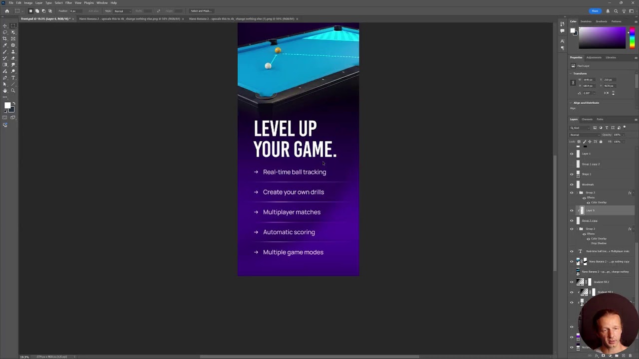
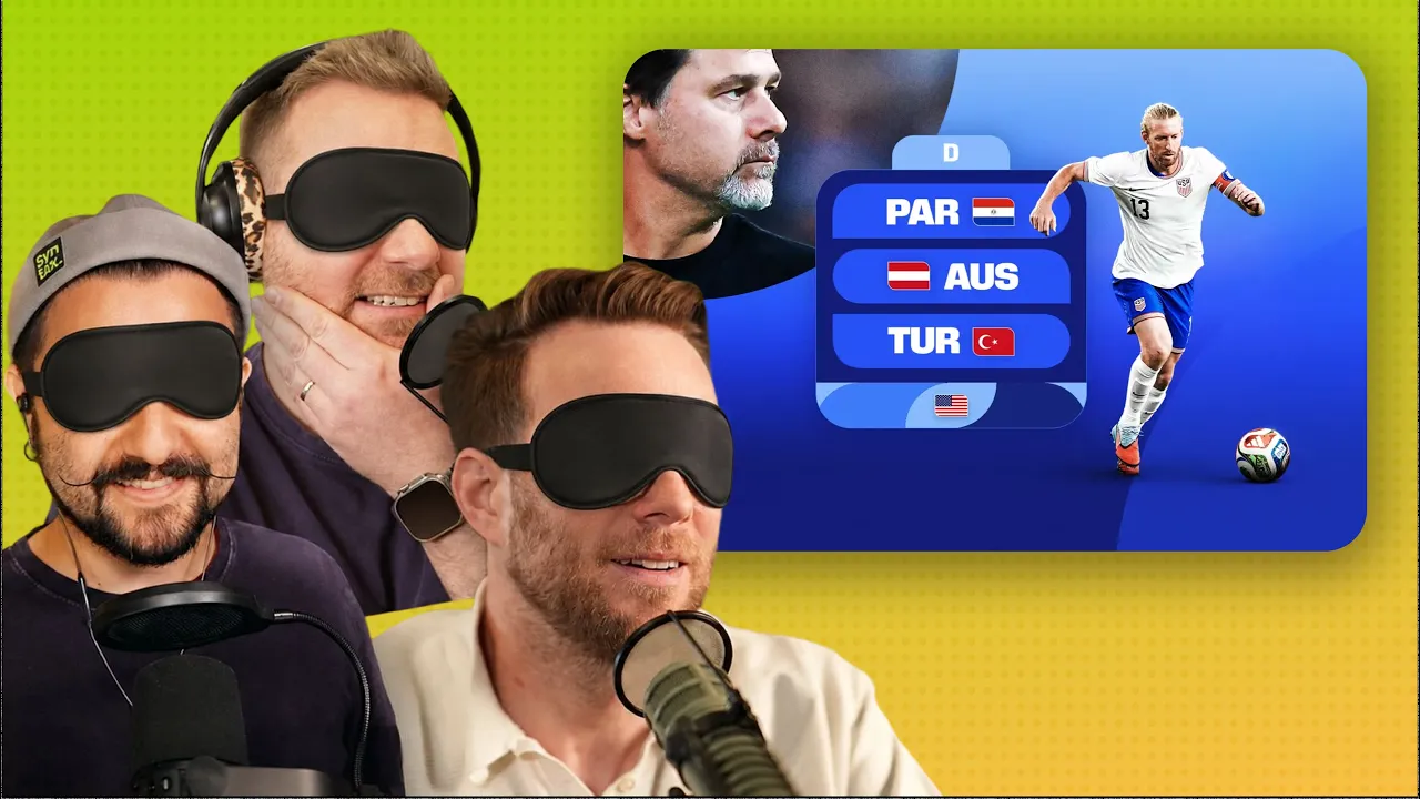
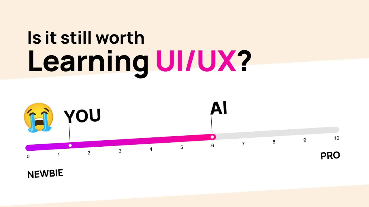
Get daily recaps from
Dansky
AI-powered summaries delivered to your inbox. Save hours every week while staying fully informed.