When AI Can't Design
Chapters8
The host announces a spontaneous live design session focused on creating a large print banner for Fusion Q and setting expectations for AI outputs.
DesignCourse’s Gary reveals real-world limits of AI-generated design, then demos a hands-on Photoshop workflow to craft a high-res print banner for Fusion Q.
Summary
Gary from DesignCourse goes live with a raw, unscripted design session focused on a print banner for Fusion Q. He tests Claude-generated Figma agents, rejects the results as “AI slop,” and pivots to a Photoshop-based workflow to achieve a print-ready, high-resolution layout. The session covers practical decisions like using RGB for initial work and switching to CMYK for final output, plus the rationale for choosing Photoshop over Illustrator or pure vector tools. He imports a pool-table image, converts layers to raster or smart objects, and uses clipping masks, gradients, and blend modes to craft a purple-toned, staged landing-zone composition that echoes Fusion Q’s real-time ball-tracking tech. Gary walks through typography decisions, layout hierarchy, and the need to keep text legible from a distance on a six-by-two-and-a-half-foot banner. He also shares backstory about Fusion Q, his pricing ambition (around $300 for the software), and his stance on open sourcing the AI model. The video blends candid critique of AI outputs with a practical, iterative design process, finishing with a reflection on what still works and what needs refinement before printing. For viewers, it’s a vivid reminder that human design judgment and traditional tools remain essential for high-stakes print work, even in an AI-assisted era.
Key Takeaways
- AI-generated banners from Claude were not usable in this print context due to color, composition, and realism issues.
- The banner is sized at roughly 2.5 feet by 6.5 feet, requiring high-resolution output and careful raster/bitmap handling in Photoshop.
- Photoshop was chosen for direct access to raster tools and a single interface, enabling precise control over textures, masks, and glows.
- Use of smart objects, clipping masks, and layer styles (blends, outer glow, and gradients) helps simulate lighting and depth for a projector-like banner aesthetic.
- The designer emphasizes legibility from a distance and prioritizes left-aligned text blocks over centering to maintain a clear visual hierarchy.
- Fusion Q is positioned as a real-time ball-tracking system with a planned price around $300 for the software; the creator is cautious about open-sourcing the AI model.
- Even with AI tools, iterative manual adjustments and visual experimentation remain essential to achieve print-ready results.
Who Is This For?
Graphic designers and UI/UX pros curious about how to blend AI drafts with traditional tools for large-format print, plus developers and marketers following Fusion Q’s product journey.
Notable Quotes
""AI AI is hit or miss. It really depends a lot about the model you're using and the context you're passing it.""
—Gary chillingly admits AI outputs aren’t reliable without careful context and evaluation.
""This is slop. This is what they call AI slop junk.""
—Direct critique of Claude-generated banners to set the stage for manual redesign.
""The reason being, I want access, direct access to all the raster tools so that I can do everything from within one interface.""
—Rationale for sticking with Photoshop over other tools.
""We have to have high enough resolution or your output is going to be a pixelated piece of crap.""
—Print reliability and the importance of resolution for large banners.
""If I do bad, everybody's gonna hate me and then my business will fail.""
—Live-stream humility and stakes of attempting a live design session.
Questions This Video Answers
- How do I evaluate AI-generated design outputs before using them for print materials?
- What are best practices for turning raster assets into print-ready, CMYK banners in Photoshop?
- Why would a designer choose Photoshop over Illustrator for large-format print projects?
- What is Fusion Q, and how does real-time ball-tracking influence its branding visuals?
- How can I simulate lighting and depth in a banner layout using Photoshop layer styles and masks?
Full Transcript
All right. What is up everybody? We are going live here and I'm going to let a little bit of time go by to for people to filter through, but I'll be doing some live design today in a very archaic old piece of software. I'll save that uh surprise here for a little bit. Um go ahead in the chat if you wish. say hi. Although I don't expect there would be too many people here because I did not schedule this. It's kind of just a on the whim type thing. And let me just get started here.
What I want to do is um okay so a lot of you are familiar with my upcoming app called Fusion Q. And Fusion Q is um my pull app projection live ball tracking AI integration. This thing I've been working on for a long time. We're getting really close. And what's up? I see a few people in here. This guy's laughing at me. What is up, fashion? in and essentially um in this video here specifically, I asked AI Claude specifically to use uh to spawn like four different Figma agents, right? And to design an upright banner, not for display, but for print.
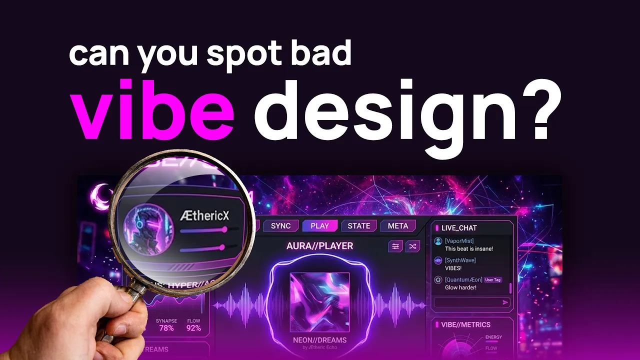
Like you know those you go to vistaprint.com or whatever, you go to an expo and you see these big, you know, upright banners. So, this is a printbased project and these suck. I'm going to tell you these blow. Um, and of course, you know, AI AI is hit or miss. It really depends a lot about the model you're using and the context you're passing it. In this case, Claude had access to my design system. Um, but I asked it to do this this printbased banner design and it just sucks, you know. Um, like look at this.
What is this crap? This is slop. This is what they call AI slop junk. And I could I could go over the reasons why here, which I will in a little bit. Um, but I like, you know, I'm looking at each one of these. This one's okay. So, if we compare these two, this one on the right's better. You can see the text easier. better color contrast. Still sucks. Uh like like if if you just went home and print if I asked them to print this, this would be the lamest thing ever. This one, okay, has more color.
Look at the dumbass uh pool table. Who has a square pool table? Apparently Claude does and that's what it designed for. Um and then this just just too many damn colors, you know? So it screwed that up. um looking at this same crap. I mean just just absolute slop bull crap. Okay, so what we're gonna do is um so again this is print meaning you know this thing's going to be like six 7 feet tall 2 and 1/2 ft wide. It's pretty large. And if you've ever if you're ever been a graphic designer, you understand that, you know, when it comes to print, you have to have a high enough resolution.
Otherwise, your your your output, whatever gets printed is going to be a pixelated piece of crap, right? So, what we want to do is ensure that you know what we produce is going to be large enough so that it's nice and crisp and all the lines are clean. Um, now where would you typically design something that is based on a print, right? Well, almost everybody's going to say Illustrator. Um, you could use Figma because you can make everything vector if you wish. I you could use anything vector, any type of vector tool. But you know what you can also use, and this is where people's head's going to fly off.
I you can use Photoshop. As long as the resolution's high enough, you can use Photoshop. And the reason I would use Photoshop is because I want access, direct access to all the raster tools so that I can I can do everything. I can handle everything from within one interface and that's it. So that's what I'm going to use. And I always like having excuses for using Photoshop because, you know, me and Photoshop, we go back since, you know, like 1996. You know, it's kind of like this weird love affair. and I just keep going back to it for the fun of it.
So, that's what we're going to do. Um, what is up? Just tuning in. How are these gener? Yeah, cloud codes. Cloud code Figma agent. That's what these were. All junk. Um, so I have a little bit of an idea of what I'm going to produce. And I have Photoshop already open. This is a print document. And notice I'm I'm at 55 50% zoomed up. So all the way zoomed up. I mean, we're we're talking about high resolution here. This is going to be large. All right. So 2 and 1/2 ft by 6 and 1/2 ft.
All right. So this is where I'm going to design. And again, I'm doing this live. I hope it doesn't suck. I don't really have an exact idea of what I want. It's been a while since I've done live design. Um, you know, if I do bad, everybody's gonna hate me and then my business will fail. So, you know, we got to up the ante. We have to do at least better than this crap. Okay. Uh Okay. Um yeah, the live is always automatically added to the YouTube channel. Um it's automatic so it gets released within like I don't know shortly after the live stream ends.
Okay. So, the first thing I'm going to do is I'm going to show you something that I used I prepared beforehand. Um, this is Runway ML. I have an old account that I pay for and what I needed was an image upscaler and Runway has one. So, it made this. I asked it for some pool balls and look what this stupid [ __ ] thing did. Yeah, we play with pool balls that large. AI is [ __ ] sometimes. Um, but really I'm just going to use this one and um I already downloaded it. It's multi. I think it's 11 megabytes.
So, it it's it's a large file and it's large enough. Okay. So, let me um let me let me take this guy and go back and I'm going to get open the file and I'm going to drop that sucker in. Now, first I'm going to take the rectangle tool and just give ourselves a black background. Is this completely black? I don't know. I have um some weird color mode going on here. RGB 32bit. That's fine. Whatever. Um, now another thing, a caveat about that is a CMYK. Um, at the end we'll adjust the colors for CMK and we'll see how that turns out.
But a lot of times you could still even just print RGB. Okay. So, what I'm going to do is we're going to get that pull table, which let me go to my downloads. I'm I'm on the other screen here. And we're going to drag this sucker right in. Now, that looks small, but that's only because it's fitting it within the context of here, but really, we want this sucker larger. Now, if I hit control one, this gets us to 100% zoomed up. So, this is how freaking large this thing is. And that's good. So, what I want obviously here is to have a real pool table, but we're going to really modify it to to make it look extra cool and such.
So, what I'll do is probably right click and create a backup of that. And let me uh let me get my zoom tool out here. I'm going to check the comments in a second here. One second. Hang tight here. Let's go to recording. We're going to go to freaking uh zoom it. Okay. So, now I can kind of zoom up and stuff. So, for instance, what I was trying to tell show you is right here, this little icon in the layers panel of Photoshop. That means it's a smart object. Um, we want to rightclick and rasterize that.
And the reason being, I want to be able to make some modifications. I'm not the best Photoshop. My Photoshop skills are very rusty, but we'll we'll get by. We'll make this work. Okay. So, um, let me check the chat real quick. Better than doom scrolling. That'd be sick if you could project your UI onto the banner. Yeah. Well, yeah, that would be kind of cool. Um, but anyhow, what I want to do here is get the logo up here. So, the at the top will be the logo. We're going to make some a lot of adjustments to this pull table and then we're going to have information beneath it.
Um, so for the logo, let me get my project folder out here because I exported some assets just so we could get this thing up and running. I think this is too tiny. No, it's not. That's perfect. Okay, good. We'll scale that sucker down. Actually, I kind of wanted to have um rounded corners. So, what I'll do is take the rectangle tool and let's go ahead and give it just uh just some purplish color for now. All right. And I'm going to control control shift N. Um, and use previous layer as a clipping mask. Hit enter and paste that.
Oh, I can't paste it in because I didn't copy it first. Let's see here. There we go. I just wanted one with rounded corners. Now, I'm not going to have it be that big because remember, nobody gives a [ __ ] about your logo. You don't want it to be that large and front and center. That's good for now. Now I'm going to take those. I'll just group them up. Call this logo and scale the whole thing down. There we go. My computer is really kind of suffering right now because I'm streaming and all this other crap.
Um, I do also want to have the word mark in here. Is this too small? Yeah. One second. I got to get the SVG version. Now, I don't want to have the logo twice. So, I'm going to remove that. I'm going to right click and rasterize. Get the hell out of there. Move this sucker up. And again, I may play around with the the scaling. I think the the this top part Well, yeah, maybe we can take the word mark slightly up. Okay. Okay. Now the next part someone said uh if someone is not using Photoshop or Illustrator for design they are missing something because I mainly do Figma for like all ads creatives.
Well I don't really understand your comment exactly but yeah I mean listen just use whatever you works for you. Uh what's the function of rasterizing? Okay. So, like whenever you pull in an external asset into like an existing document, Photoshop will um import it as a smart object layer. A smart object layer um it has limited abilities for you to um work with it. Like for instance, if you wanted to use the eraser tool to like remove some of it, you can't do that. Um but when it's a smart object layer, it has the ability to be kind of like non-destructive editing.
me, I don't really care if I destruct this. So, I just take them and I rasterize them. So, rasterize kind of just means that it it converts everything to actual pixels, raster values. You could do what whatever the hell you want with it essentially. That's my crappy explanation. So, um now I don't want to just have a pool table with the legs. I kind of want to fade this off. So, to give it and infuse some of our our purple color here, I I'm going to put in another rectangle right behind the pool table. All right.
Now, it's black on black, so it doesn't see anything change, but we're going to do that. Ah, I forgot that this this uh pool table graphic has um a background a black background. So all I have to do is click this. Control shift I will invert the in select the yeah the selection. And then you can just hit delete. And there we go. Okay. So now we have this situation. All right. We're getting somewhere. You kind of start to see a little bit of a flow occurring, but we're going to make this [ __ ] so much so much more cool.
So next up, I'm going to let's see here. Let's create a clipping mask. Again, I know my my my UI is so tiny you can't even see what the hell's going on. Plus, my dome is in the way of the layers, but uh this is a clipping mask. We click on this white part. And then if I take over here the eraser tool, like with a large feathered brush, that's 1,800 pixels, by the way, because we're working with a large document. Um, and then I make sure black is selected. Well, this is what this allows me to do.
My computer is like so lagging right now. Oh, wait. No, we want to use the uh brush tool. Sorry. There we go. So, what this looks like it's doing it it looks like it's literally like painting and infusing this purple brush on there, but that's actually not what's happening. Um, it's because it's a mask. Anything that's just uh black gets treated as though it's just, you know, disappear appearing like this. So that's why this kind of occurs up there. So this this thing, this kind of like cool phase haze, I kind of like that, but I kind of want it to be darker and have a gradient that's kind of like a dark purple to this purple that extends further.
So there's multiple way, you know, when it comes to Photoshop, there's more than one way to skin a cat, right? So, there's a bunch of ways to do this. So, I can just create a new layer and just create a clipping mask with that new layer, which means it bounds down. See, you get how it's how it's pointing down to that rectangle one, the purple layer. And then now I can just use the gradient tool up here. And I can use black for the foreground. And then make sure that the gradient layer selected is solid foreground to a transparent um fade essentially.
So, if I go like this. Ah, so I'm holding shift and I'm I'm scaling down. I kind of just create more of a nice little fade in that way. There we go. Oh, yeah. If you want to see what the AI Let me go back here real quick. Somebody asked uh if they wanted to they wanted to see what the AI did. This is what the AI did, by the way. Um, for those of you who are just tuning in late, you know, it's typical slop crap. And again, I'm not an enemy against I, anybody who follows me knows I use AI like crazy, but you have to be honest with yourself.
When it sucks, it sucks. And in this case, all of these sucked. So, I I wasn't really able to use anything from these. I didn't like them. So, we're making our own. Just like Bill O'Reilly said, he said, "Uh, [ __ ] it. We'll do it live." Okay. So next up, we have to think of um you know what I want to do. I really want to emphasize something in here on the table design in terms of projection because it's what the software is. So I'm thinking about doing like landing zones um and which is a part of my system.
In fact, I'll probably be able to show you um for those of you who you who are unaware of what the system even is. So if you go to fusionq.com, by the way, this product's not ready. This is a vibe design layout. looks like garbage. Don't judge me because this is all changing. Um, but you can see videos of the actual system right here on top and my table and it has real-time camera tracking. And this is the thing that I'm going to be selling for about 300 bucks um for the software alone. And so my goal is to kind of um yeah, see all the landing zones right here.
I kind of want to create that but really stylize it beyond looks like here and make it look really cool for the uh the banner. Um I'll let you all watch this for a second. Come on. Move forward. What are you doing? Ah, there we go. You can at least get to see what this system looks like and what it does. Yeah, fun stuff. Okay. So, that's what I'm going to try to um emulate here. Okay. So, how would we do that? All right. Well, let's think here. I could take the pen tool in shape mode.
So, the pen tool in Photoshop, that's like the original pen tool everybody learns or used to learn back in the day. Um pen tool shape mode because it also works in path mode. Um that's what we want for this to work. And we're just going to use probably like a stroke for now. And I'm just going to recreate kind of like a I'm going to get up nice and close here. Yeah, I forgot some of the um shortcuts have changed. Okay, so now if we can't see anything. Ah, there we go. We had to drag it above.
That looks like crap. I don't want a fill for this. So, we're going to get rid of that. And then I'm going to give it a for now, a white fill, but maybe we'll play with a blend mode. And we have to make sure this sucker is it's it's at zero. That's why you can't see it. All right. So, here's 10 for a thickness. And um that obviously doesn't look cool at all. Um now, what I can do, one of the things I like doing is just experimenting with the blend modes right here. Usually like overlay could be cool.
Oh, that's interesting. Let me go back here. Interesting. It is showing all these um like overlay as being dimmed out. I can't choose overlay. That's kind of strange. I've never came across that. But then again, it's been a long time since I've worked within um Oh, that's okay. No big deal. What I can do is just change to the color that I want for now. That's an interesting uh issue there. Let's see here. Uh, what I'll do is take this. We'll work with our primary color, but I'll make it lighter, I think. A lot lighter.
So, we'll come over here and then I'm going to come over here and we're going to see about trying to blur or add a glow rather. So, we double click the layer, get this sucker over here. Let's do outer glow. noise is on on that preset. This looks like crap. Trust me, I know. Don't worry. We're going to try to see what we can do to fix this up with the settings. And you know, again, a lot of this is about playing with the blend mode. So, for instance, if I come over here as the blend mode drop down, I'm using my keyboard arrow key.
Um, really I'm trying to look for something that's That's right. That's still overlay and all that stuff is being um kind of ignored. Well, let me try this. We're going to go back. Color overlay. Oh, not color overlay. Outer glow. Get back here. Let's experiment. Huh. It's still not showing. I rasterized the damn thing and it's still not showing me overlay. What the [ __ ] Interesting. Oh, I'm going to back up here. I'm going to go thicker, I think, on this. All righty. Now, I'm going to just temporarily duplicate that. Duplicate that. This time, I'm going to get rid of the stroke.
All right. And then I'm going to reduce the um opacity of this one. All right. Nowhere near the aesthetic that I want just yet. Is that why? You're right. It's because it was 32bit. Yeah, that was okay. There we go. Okay, now we got something interesting occurring here. Thank you, chat. All right. So, these are both overlay at the moment. There we go. That's what I wanted. I And I'm also going to I also want to kind of lift it up a little bit and create like I don't know almost like light streaks as if it's coming down from like a central like projector location onto the table.
Um, another thing I'm going to do here, let's see if this will work decently or not. Ah, okay. I don't even know why it was on 32bit. Let's see here. So, what I'm going to do is create kind of like a uh let's see, where's this at? Okay, I'm going to duplicate this. Um, for this one, I will take the opacity, I think, all the way down. My goal is just to create kind of like um a checkerboard sort of not a checkerboard pattern but a repeating pattern of the um landing zone strips that I showed from the actual system.
Now there might be a better more modern approach to like creating a pattern like this but whatever it is I am unaware. Uh let's see here maybe um just a few more. Okay. So, I'll take um all those. Now, I'm going to for now I'm just going to group these up. Right click and duplicate it. So, in case I screw it up, I'll have a backup. And then I'm going to let me see here. I'm going to take a look at Oops, I have auto select layer on. That's why that happened. I'm going to take a look at the uh transform tools that I have.
So if I select the entire group and hit CtrlT, I can choose to distort and change these. So I'm going to let's see here put these over here and maybe add them as part of a mask of some sort. But if I change perspective, we'll see kind of a what this might look like. That might be cool. And of course, we can make further adjustments as we wish. Okay. And then what I can do is let's see here. Going to duplicate that again. I'm going to rightclick and rasterize. Oopsie. Merge group. There we go. Now, where's my pool table?
Or rather, where's this graphic at? Create uh clipping mask. Yeah. here. Let me do this. All right, let's see here. Where's my shape? Hang with me. Let's see. Edit. All right. So, now I can take this. I like that um that that blend mode right there. Okay. Okay. So now this kind of creates a um you know kind of recreates the landing zone strips that I have. And again I'm going to be working with this a lot more. So now what I might want to do and this could be potentially cool. Let me see here is is create kind of like the light streak effect coming from a projector maybe that's emanating down.
This isn't the only thing I'm going to add. This is like the first one. Um, so let's see here. Merge. There we go. Now, for this one, I haven't played with this tool in so long. Oh boy. We'll see how this works. Or, you know what I do as a filter? Um, blur, motion blur. We'll see if this at all works. to like how I would imagine it. All right. So, one problem is is because we have this on overlay, you can't see it in the background. No, I want to do distort. I think I may have to use just a single gradient.
I think that's probably what I'll do. Maybe. Don't mind me. I'm just uh screwing around here. Hold on. This This has a potential. It looks like crap now, but hold on. Hang with me because that's way too It sticks out way too much obviously. Um the white is just like no, you don't want to do that really. Um let's see here. Next up is um let me let me go to color overlay. We'll try to match it with our our color here. There we go. And again, um, then what I'll want to do is probably create a clipping mask with a paintbrush.
Maybe not at 100%. And I might want to highlight the edges of that a little bit better. We'll see. I I'll come back to that part. I'm not sure if I like that that much. Maybe come off the edge. All right. I'm gonna I'm gonna have to do a couple more things on here like may trying to think of what would make sense in terms of um composition right here to really fill out and balance it because we have this edge doing something interesting, but we need to show like a Q ball perhaps and then maybe a tangent line coming off of it.
That would be kind of cool. Um, so let me go back to runway this junk. What the what was that? Somebody asked, uh, do I have any plans of open sourcing Fusion Q or release the AI model used by Fusion Q? No, because I'm trying to make money with this. That's why, you know, I put so many so many like my idea with this like I started two years ago. Um, and I put so much work into this and then also figuring out how to do the AI model correctly for ball recognition. I'll be charging about 300 bucks for the software possibly.
The competitors do only about 20% of what I do with the software and they're charging way more. So, okay. Um, let me um let's do this. I think I find that let's do Gemini. And what I'm going to do is copy this. Place a CQ ball onto the table with appropriate size. Change nothing else. Okay. Well, we'll find out if I we'll find out how well it does that. And what I literally plan on doing is just uh copying and pasting the ball. Like assuming it's, you know, it keeps the same likeness. It's just going to be blue around it.
So it shouldn't be That's actually not bad. Let me remove this and we'll have it do a 4K There we go. We'll have that generate. Yeah. I mean, hey, I I gave away by I made a video showing how I made the mo the model for uh ball recognition, and that should be sufficient for everybody else. All right. So, let's uh It's 27% done, so I'm just waiting. Let me go back here to Photoshop real quick. I'm not really too happy with these little light streaks. I I'll probably definitely fix that. Let's get some type going on here, though.
So, I want to select everything that we have. I don't want to select the logo. Where's that? Where is that purple thing going? That's why my problem like not uh naming my layers. Which one is that? Oh, there it is. Yeah, we're good for now. Okay. Um, let me go back here. It still looks like it's not quite nice and crisp. There we go. That's better. Okay. Now, if I hit download, I can get access to the original Now what I can do is just fade that off the edges just slightly. Probably could have just replaced the entire thing, but no big deal.
Here we go. Okay. So, we have our pool ball on there now. Um, and now what I'll do is maybe simulate a um, let's see, a Q ball path of sorts. Maybe showing the tangent line. So what I'll do is take um my ellipse tool. So when you part of the um thing that you can request from the app is a what do you call oh let me do copy layer style if I have that. There we go. Right click, copy layer style so I don't have to redo it from scratch. And then we'll select my ellipse, which is right here.
Paste layer style. Oh, it didn't actually have the uh the stroke. Okay, so I think it was 15 that I used. There we go. Now, of course, that is overlay for now. Now, I don't want to have a fill on this, honestly. So, let me go back. All right. Now, you'll see kind of how this maps up. I have to figure out where it makes sense to have the ghost ball position. Actually, it doesn't even make sense to have a ghost ball on a freaking queue. I'm not I'm not thinking correctly. Let's see here. Let me go back.
I think we're gonna have to add another ball on the table for this to make sense. Letting this run. Hold on a second. I I have to turn on my air conditioning. I'm sweating over here. One second. All right, I'm back. That one ball looks stupid, but you know what? We can make it work. Why is it such low quality? Jesus, Gemini. All right, so that one was so stupid. Let me go back and exit. All right, we'll redo this just to get the one ball. So, we'll have a um another ball on the table and then I can do the uh tangent line stuff to kind of like get it going here better.
Now, I have to think of a good headline and then we'll have kind of like just bullet points. So, let me delete this. We'll use a left click and drag. All right. Um, what was the uh ad copy that Figma had here? See every shot, score every drill. I don't know if I like that. We'll use it for now. Think I used a bolder condensed font for Oh, okay. And then increase the size. Think we'll go down a little bit more. See 680 or 260 rather. Now, one thing I'm looking at is just good good hierarchy here.
Logo's pretty large. Trying to determine what I want to do. should just be moved up slightly. Feels like this can be a bit larger. Boy, my computer's like being slow. I might want to adjust the line height. Just get them a tad bit closer. So, let's try 240. All right, let's go back and check um runway. Yeah, the one ball's too large. I'm going to click on it. I'm going to download it. All right. And go back here. Better save this. Okay. Um Okay. Now I'm going to go back. I know that looks like crap right now, but hold on.
Hold on. Obviously, it's too large. Just trying to get an idea. I don't want these to be too incorrect. Okay. So, now I'm going to take that ellipse, put it in above it, and get this sucker like get these aligned so it makes sense where the contact point would be. A ghost ball would be perhaps right here. I'm going to take this. All right. Don't worry. I know it looks like crap still. Okay. All right. Um, so now let's see here. What would make sense? I'm going to take the line tool or the pen tool rather.
And we're going to create a dash line that goes all the way, I think, offscreen this way. Okay. And then we're going to add a stroke of 15. And again, this can be overlay as well. And this time we're going to change it because in the actual app, it's a dashed line for Q ball paths. So, um, overlay. And then I will go up here to dashed. Not sure if I want to do the ghost ball thing. Let me see what that looks like here without it. I'm going to do numb. Let's think here. Do I want to do another one?
Yeah, I'm going to do another one. That one ball's too big compared to the uh Q ball. Kind of looks weird. Does like it's like dark in front of it. I could touch that up later. Um and then what I'm going to do is uh let's take one that goes like from here. Let's see. Have to imagine where it would be. I'm just using the pen tool and kind of aligning this up here. Now I'll have to take this and modify the corner so it doesn't do that little scragg scraggly thing. There we go. And then what I'll do is change this to overlay as well.
Get rid of the fill. I don't want that over overlapping the Q ball. Obviously, get that kind of uh moved up into position. Let me adjust the anchor point. Again, I'm just doing fine-tuned adjustments here. It's not too bad right now. Um, but I I don't like this part. I think I'm going to just delete that that idea. Definitely better without it, but I do I am going to want to experiment. I don't just want to have a black background here. Could definitely stand and move this down. Oopsie. Where's the other part? Oh, come on, Gary.
Okay. So now at this point, see in my mind I have an idea of what I want to do with like the projector kind of lines. Um, another h Let me think Also not sure if I want to go all black up there. Let's go ahead and do this real quick. Maybe like a dark purple and then create like a um arrays like some things that I Yeah, I think I know what I'll do. All right. So, what I'll do is this. I'll take the um the gradient tool. We're going to use white for the foreground.
There we go. And then I'm going to create a new layer at the top. Actually, yeah, top's fine. All right. And then I'm going to go like this. Oh my god, my computer's like dying right now. Uh oh. Come on, bro. It's not wanting to work. All right, we'll have to go the other route then. This is stupid. We'll make that 100%. Now, this isn't what I'm keeping, by the way. Don't don't judge me yet. All right. Um, perspective. So, the idea is to create kind of like this idea that there's a, you know, an overhead kind of a what do you call projector kind of like casting light essentially.
And then we can make it a little bit more or stand out a little bit more. Let's see here. That might be cool for part partial. Um, let's do image. Let's do filter blur. Gajian blur. that that by the way this looks like crap. I'm not keeping this color. I'm just kind of uh experimenting here. All right. So, that's color dodge. Again, I just like I like to go through all these to see if there's something that really stands out well for the the blend modes. Might be cool to have like the outer one, something like that.
And then I'll duplicate this And this time the next one, let's do um what was it? Linear dodge. I can't remember. So we can layer these to create like a more interesting effect. Except let's change this here. Why are these all like not responding? One second here. Where'd that vibrant color go? The hell? That's a little bit better. All right. One of the cool things I I haven't messed with this tool forever. Oh, maybe I shouldn't have. My computer's already getting choked out. And I just used uh what was that tool? The smudge tool. Um yeah, let's undo that.
Now I guess what I could do is this. Hit control T, right click, and warp to be able to pull some of uh this down. Kind of create like a It It's kind It's getting there. Um, let's do this. Right click. Let me delete that. Um, let's take this here in the middle. Let's take the Yeah, I don't want that affecting that area too much. So that's we got to go larger. You don't want this to look hand modified too much. 1500. Go larger. Let's try 2500 or 2800. Let me duplicate this. Now we can take the the lower one and probably I hold shift kind of it's giving us like this little cool, you know, kind of like again, I really have to play around with the um each of the individual layers and really try to fine-tune it.
Another thing you can do is take the eraser tool and maybe remove some of the edges. Again, this is all about just experimenting and kind of having fun Okay, I don't want to harp on that too too much. Hey, what what are you laughing about? You laughing at my design? Okay, All right. Um, let me think here. How do I want to handle this this next part? Maybe I'll take this, duplicate it, rasterize it. All right, we're going to put it on the top. All right. So, let me go to filter blur motion blur. Move this up.
Not very obvious. Let me duplicate it a little bit more. That looks stupid. Hold on. Let's see if we can work with it. Oh, my computer's dying. Stop it. I'm hearing the GPU like go crazy in the background. See if I could possibly work with this. Might be cool to um let's see here. I think I'm I'm going to revisit that idea for now. I'm going to leave it like this because I don't want to harp on this too much. I don't have to get it absolutely perfect. I might want to take this actual pull graphic slightly brighten it up.
Okay, I think what I'm going to do now is start focusing on the um what do you call the features list where I list probably like five different features and then that's it. Um remember people are going to be looking at this from a distance. You want to You don't want to have tiny text. That's the one thing it really screwed up. Like the AI generated one. Like look at this. Like nobody's reading this tiny text on a six sixoot banner. Like it's just too small. Um so let's see. We have to emphasize benefits over features.
All right. That's the name of the game here. Benefits. Um, well, I don't know. Let's see. Um, well, for now, I'm I'm probably just going to come up to what this will not be the final. This is almost like Lauren Mipsum text really. Um, I'm just going to put real-time ball tracking. I know that's a feature, not a benefit, but that that stuff's a little bit harder to come up with on the spot. we have to think of a good size that is legible from far enough away but also doesn't compete um in a hierarchical sense compared you know too much with this uh title here.
So they have to be scaled down appropriately. Probably somewhere around there is looking decent. But I also kind of don't want it just to be bunch of flat text. We have to figure out a way to like lay this out and make sure it's all good. Um, I think what I'll do is just put these on one line at a time. Real time ball tracking. create your own drills. Let's increase this to 190 for now. No, we're going to go like 250. Create your own drills. Um, what else? Online multiplayer matches. I know this looks like crap right now.
I was just trying to get the text on here. We definitely want to um format it and structure it and, you know, add layout to it essentially. Online multiplayer matches. What are what are some of the million other things that this thing does? Um yeah. Um stats. Let's see. Automatic scoring. Multiple game modes. I don't know. This isn't what I'm going to use, but okay. So, do we want to use the same font? You don't have to. Um, we can test out. Yeah. I I don't think I don't I don't want these to be all uppercase.
I think what I'll do is um let's do real Oopsie. That's Spongebob case there. Now, these are too large. I'm going to hit control T. Scale this down a bit. Okay. Create your own drills. Multiplayer matches, automatic scoring, and again these are all too close. Again, not multiple game modes. Might even want to make this not bold. create a further distinction and then yeah not sure let's see here what we'll do is increase this line height even more now I need to think about how I want to approach the structure of this section here. I might go further on that line height.
Ah, that's still it's still too large. We need to scale this text down. Now I kind of want to figure out how I want to separate these visually. So um could take a simple linebased approach. We'll see what that looks like. So I'll take a you know this is just a a single white p well it's not white. Let's see here. take my line tool. We can always make that probably thicker because we're dealing with That's interesting. It's not even treating as a stroke. The hell is that about? Let's see. Remove that. And we'll do Let's try Let's try like eight pixels.
All right. And then what I'll do is experiment with the color. This is going to be dumb. I know it's going to be bad looking. No, it needs to be um a shade of our purple, but a lighter. And we can make that cooler. By the way, I think I'm going to have like little arrows next to these. Um, what I could do, right click, is I'll just rasterize this and then fade off the edges. Not everything has to be flat these days. It's exciting. Might want to make that a little bit brighter. Okay. Um.
All right. Where's my Oh, this, by the way, for us to demo this, we have to take and modify a rolling TV stand where the PC is going to be sitting here. The TV is There's going to be a projector and then a boom arm that has a camera that goes over the table so we can easily set it up for demonstration purposes. Anyway, that's an aside note. Um, let me go here. I'm going to rightclick. We're going to go to iconify and I'm going to go to arrow. Trying to think of the type of arrow I want.
Yeah, we'll just throw that in there. Going to make that white and export it. All right. Arrow. And I'm going to drag that sucker in. Where we at? Fusion Q. All right, bear with me. It's a long, lengthy, annoying design process. Still not happy here with this, but let's just keep on adding and then we'll do typically I'll take a look at it and be like ah we got to change that that that that. But for now we're we're good here. One benefit of have using, you know, something like Figma for something like this is you can use auto layout to really structure this stuff a little bit better and keep these things easily in line.
But for now, I'm just going to put these out here the manual way. All right, just do one more. Should have done that to the dividers, too. Oh well, no big deal. Yeah, I don't like this is looking mid down here. I see it. Don't worry. See what we can do here. Just screwing around a bit. Get over here, [ __ ] All right, there we go. line. Yeah, we can make this way cooler. We're still in the fleshing out stage. Yeah, I don't like that one bit. Yeah, the color is off. That's one reason I don't like it.
I'm also not sure if I really like this idea of being this purple at the bottom. So, let me create a new layer here. I'm going to hit I to get this darker color. Or rather, I could just make that black with the gradient tool. Yeah, I think I like that better. kind of Oh, I haven't looked at the chat in like forever. Nobody's there. No big deal. Okay. Um, how do I want to handle this? I'm going to take all these dividers here, group them. Can easily change the colors here with color overlay. Let's try changing font slightly.
Oh, okay. Let's try that one. Ah, score every drill. That's a stupid type. I'm looking at the type, I'm like, man, that doesn't make sense at all. This is so mid. I don't like it. Um, let's go back. Yeah, that's a better font. All right. I want to have texture in the background. So pattern a pattern brush would make sense. So what I'm going to do is we have this right here. Okay. So I'm going to create another clipping mask layer. And I think I have some interesting brushes that I can use possibly. Let me zoom up.
What is this? Let's see here. Make this way larger. Oh boy, those are tiny. I was hoping to get something larger than that because the uh pattern itself is like freaking really small. Well, what I could do was just keep it Let me see here. Yeah, those are too those are way too um what do you call small? Let me see what else they have in terms of actual patterns. So if I take this just go here. Let me zoom up more. I know they have a pattern overlay. Look at that. What the hell? That is kind of cool, actually.
Um, trees, grass, water. I mean, can I just get a regular pattern? You can make your own patterns, too, of course. But this is dumb. Water. Like, what in the hell is going on here? Oh, boy. I don't even know where the hell I got those from. or if perhaps that shipped with Photoshop. How do you make a pattern? I forget how to make a pattern in Photoshop. Cuz really I just want like um what do you like a point pattern like a circular? Let's go do a Google shirt search. Uh yeah. I mean, if you ever do search for like Photoshop brushes and pattern brushes are so massive.
Like I should probably look more in my presets that I have already. Where they at? Let me zoom up here. Not sure how many more I have. I don't think I have too many. Kyle's concept brushes. Just kind of looking through these. I mean, you can do cool stuff like, let me see here. Like, there might be a cool um way to add like a a gritty pattern here. Let's see. Oh, I hate when you do that. Sometimes when you click on a preset, it changes the tool. So you have to hit control option or control alt to keep it.
There we go. All right. So let me let's experiment with this a little bit. Ah what is that? Let's see here. Let's go to like 4,000. That's not a good brush. I mean, you could you could definitely do this and get some texture, but it's not the right brush for it. Let me um delete that. Let's go even larger. I know what I want. And this isn't what I want, but you know, you could do cool stuff like uh add a little bit of um texture. I kind of already like that fade on how it's going.
Let's see. So it creates this like grungy sort of transition. But do I like that? Kind of. Here. Let's Let's move the text up first. Still not happy with the size or the type itself. Me, you know, I like to go smaller on this text, but at the same time, you really have to make sure that you're not going too small. You want people to be able to read this from a distance. You know what might be cool to create kind of more of like a dynamic effect is to have like this the part of this corner of this table cutting into the see every shot.
This sucks though. I hate this type. I'm trying I'd like to get just two words in at the top so we can make it larger. So I'm trying to think about the type that I want to use. New claw just released. Oh my god. Oh my god, we're all going to die. All right, track every shot makes more sense, but might be able to do something. Maybe something like level up your game. That's like a better I don't know. Level up. Oopsie. Level up your game. This would at least afford us the ability Oopsie. No, don't do that.
To um make this much larger. Okay. And then possibly do that idea. So, where's this table at? This table graphic is right there. Okay. So, I'm going to rightclick and just Oh, I see what's happening. Okay. Let's make a clipping mask out of this. It's probably not the ideal way to do this, but I'm just I'm messing around. Let's take this down a bit. And then I'm going to take maybe the pen tool. Oh, that's not applying it. That's fine. I'll just do this for now. This is not the ideal way to do it, by the way, but screw it.
Um my my Photoshop skills are a little bit rusty. I'm going to um edit. Oh, come on. It is so slow. Fill. There we go. Let's see what that looks like. where's my type? And it's a little bit too high up, I would say. So, let me do this. Yeah. What I do is just move the whole thing down. Oopsie. All right. Move it all down. And then simply take that mask and move it up slightly because I don't want it beveing too far into the text so it's not readable. There we go. Does that I don't I don't think I like that because it looks weird.
It's not obvious the table's on top of it. So it [ __ ] up the the the type and it looks stupid. So maybe that was the wrong approach. Don't worry though, we can get it back. Let's bring back as as well. That was a failed idea. Let me go back to um Oopsie. Where am I at? we're off alignment a little bit since I increased that type. Get this here. I'm still not happy with this section down here. Let's see here. I'm making it not quite white. Let me grab this color code. I'm going to overlay that color onto the arrows.
Color overlay. Where the [ __ ] are you? And then the big question is uh do I really want these dividers like like that? It might be better to have something else. I'm not sure yet. Let's I'm not liking Yeah, I'm not liking it. Hold on. Yeah, it's the weakest part right now is this bottom section. I like uh the top part. I might reduce this slightly. It's coming up coming up a little bit too bright in my opinion. Kind of want it to be a an afterthought in the background. Might also make sense, by the way, to take our logo.
Let me get rid of this stuff. Let me get this up higher. There we go. This needs to be above. Might make sense to put the.com right It sucks working when your computer is like dying from streaming and then you have this huge, you know, Photoshop [ __ ] going on. All right, let's get this up. By the way, everybody, um, I literally just finished the course I was working on for the last two months for landscape, the landscaping app. And so you can find that and take that. Now, if you wish at designcourse.com, but you can also check it out landscape.co lend daip.co.
I'm not liking this down here. All right, time to experiment just a little bit more and then we'll wrap this up. All right, where are those lines at? Oh, yeah. I put them in a group somewhere. I never name my layers. I'm terrible. All right, we got these. We got these. Oops. All right, let's get this back up. Can experiment with going darker possibly. Well, what I could do is um here, let's try this like that and then a drop shadow with a distance that's not zero. Oh, that's actually kind of cool. kind of gives us a little bit of a beveled effect.
Um, size. What's this going to do? That looks dumb. I'm playing I'm just trying to really fine-tune this to get something interesting. all the um what do you call subtle glows and stuff? It reminds me back in the day type of design we're messing around with. None of this flat stuff. Do I like that? Sometimes it's helpful just to come back with fresh eyes to get things kind of leveled up a little bit better. One thing I'm not liking is it looks My logo is being affected. This color right here, like something's still on top of it.
Oh, that's because something is all right. Oh, okay. That's the actual color. Yeah. I don't like the contrast around it because notice the lack of contrast here. That looks like [ __ ] So, there's a couple ways we could combat that. Um, one way would be to give it a stroke. Boy, this is a weird stroke. Whatever preset that was on there, it's outside. Where the hell's the stroke at? Sort of weird. Oh, that's why it was the wrong element I was targeting. There we go. All right, let's do this. We'll duplicate. We're going to certainly make adjustments on that.
We'll do outside or a glow, a dark glow. So we'll take a outer glow ugly. Now if I don't want to do this, I kind of don't like I don't want to do that. Yeah, we're not going to take that approach. I think what I'll do instead is reduce the opacity on these. Or at least I kind of do something like this. One second here. Let me adjust the uh opacity. There we go. Kind of separating that a I hate this section down here. That's interesting. I not notice. What is happening? I'm trying to find where I had these uh little what do you drop shadows and I can't find them.
Oh, it's on the the group itself. There it is. Okay. Yeah. The big question is, do I like those? I I don't know. Someone said I should change these with Q balls. Not sure if it would be that obvious. Sometimes you can do stuff like this, just kind of like random abstract treatments, if you will. So, what I mean by that is like um do I have anything on that layer? No, I don't. Okay. So what it could do is although this is like the old XP style stuff. Let's do this. Why does it look like ass?
Some type of weirdness going on with it. Maybe I blur it out a little bit. Going through the blend modes right now. It's real easy. Ah, I kind of like that. But let's see about going to filter or yeah, filter. Let's do a a blur a bit. Convert to smart object. Whatever. that way. It just kind of gives us a little bit of texture in the background. Now, let me zoom out to get a a bigger kind of picture. Let me bring back those other things kind of right click and I know you can rasterize layer styles themselves.
Um because I don't like how they go all the way across. Let's see. I'll just do this. Right click, duplicate the dam group. Um, hide it from this one. Right click and merge group. And then we'll do something like this. Now, another thing I might want to do is let's try this for the fun of it. All right, I'm going to hit um Edit fill. All right. Hit. Okay. I know that looks stupid, but what we can do is um let's see. Multiple ways. Let's see. Oh, my opacity was 54. Let's go back to 100.
Maybe make this a little bit smaller. Actually, I'm going to make this larger. There we go. And then I'm having fun over here just screwing around. Um, let's Yeah, look at that. We got ourselves a little highlight. Isn't that exciting? It's like this is reminding me of the old school design days. Again, I'm I would probably go over this with a fine tooth comb and maybe even scrap this section at the bottom. But I am happy with this uh section up here. Again, this is a large file. Um, and it's basically an upright banner that I'll be having printed.
So, let's do this. Let's take this. I'm just going to copy it. I'm going to go back. Where the hell is it? You can't paste. Can you not paste inside of here? That's weird. Hold on. Edit. Copy merged. Don't tell me you can't paste. Or maybe it's just too big. I guess I'll save it. Let's go over here. Yeah, I'm not happy with this. I'm not happy with the bottom. But you know what? Like I'm being simple right now. I'll come back to it. Maybe I need to do this. Take this and get rid of that.
There we That's a little bit better. All right. So, what I'll do is save this real quick. I don't need it to be anywhere now near that big. We'll just do like a 13 or500. All right, we're going to save that there called front. Let's go back to Figma. I'll check the comments here in a Um, yeah, there we go. Okay. So, here is uh here's the four that AI generated. Again, I didn't really like any of them. Like they all seem pretty mid. And then here's mine, which it's definitely a step up from what these produced, but I still want to improve this part.
I don't like this part down here. I think it might be just a matter of maybe choosing a different font uh and changing the layout slightly, but I really didn't want to put pricing in because you don't you don't want to tie yourself to a pricing on a b a print but something like this, yeah, I think is definitely improvement. um based on you know these four that are over here. Uh here's another comment. From a design perspective, since we have the logo and text center, shouldn't also the header and text uh below be centered?
Just wondering because I asked myself a design in this question. So, um it depends on the it depends on how you're uh you're approaching it, but when it comes to lists and stuff like that, you generally don't have to do that. I mean, you could do like if I go back into Photoshop, I mean, you could take this type and center it. This would be fine centered as well. Like this. You could do that. Oh, that's not centered. There we go. But it it doesn't reinforce this column right here where these are all left align because one thing I hate is when you have lists maybe like on a price comparison chart or something is where where people in this context will like just have these all centered and then it it doesn't have a nice flow to it in my opinion.
Um, so that's why I would want I I want to keep the uh the text left align so we have this nice solid horizontal, you know, column that's established right here. But again, I even for me, I'm not happy with happy with that section. I can't say that enough. But I I'll work on this on my own time. Sometimes it just helps to to kind of just step away and then come back with a fresh eyes if so to speak. So if I take this over here, get this background like this. I think that's pretty decent.
I could definitely improve it and and I will before I actually get these printed because we're uh we're going all out here um with this app. I'm I'm super excited because I've been we've been able to really make this um the app I Yeah, like right now we have a I have a $280 mini PC coming and I'm fairly certain I'll be able to get it to work on that. So, um it's not going to be extremely expensive for people to have the system. So, that's exciting. Um but anyhow, I think that's good for now.
And it's certainly an improvement on the vibe coded designs. I still think I can get mine a few levels up higher, though. All right. So, I thought I would just do a live stream here. Um yeah, very shortly. I yeah, I think I have a video coming out tomorrow and the next day as well. So, we're going to keep on keeping on and thanks for tuning in and I will see you all very soon. Goodbye. Wait, how do you end the damn stream?
More from DesignCourse


Get daily recaps from
DesignCourse
AI-powered summaries delivered to your inbox. Save hours every week while staying fully informed.