Dansky reviews your designs live - Ep 45
Chapters6
Hosts greet each other, acknowledge a long gap since the last design review, and set expectations for submissions.
Dansky critiques live design submissions, sharing blunt, practical feedback on logos, branding, typography, and presentation tricks that help designers iterate faster.
Summary
Dansky returns with a marathon live review, examining multiple branding projects from logo concept to mockups and typography. He starts by noting the need for clear client briefs and briefs the audience on how to structure a logo review, using Autosy’s car-dealership concept as a focal example. Throughout the stream, he dissects lettering tweaks, alignment, and optical balance, calling out inconsistencies in stroke width and cap heights, and he demonstrates how to test logo responsiveness across web and print. He also dives into presentation strategy, stressing the importance of context, colorways, and explainers that connect design decisions back to the brief. On the branding side, he evaluates the Hunger Hub identity, appreciating the custom H and the two-part mark while pushing for tighter typographic consistency and scalable, one-color versions. The livestream isn’t just critique—it’s a tutorial on how to iterate, prototype, and communicate design thinking to clients, with live experimentation in tools like Photoshop and even quick AI-assisted mockups. Viewers get a window into process: rough sketches, progression slides, and practical tips for balancing hierarchy, margins, and legibility. The show also leans into community engagement, inviting more submissions and promising more regular reviews. Finally, Dansky peppers the session with humor and real-world constraints (printability, legibility at small sizes, web headers), underscoring that good design is as much about disciplined structure as about creativity.
Key Takeaways
- Ask up-front questions in a client brief to align objectives and set a reference point for design feedback.
- When refining logos, adjust scale and optical alignment to ensure the mark lands correctly at different sizes and in headers, not just in isolation.
- Prefer single-color versions for logos to ensure legibility and scalable performance across print and digital contexts.
- Use mockups (website headers, packaging, signage) to reveal real-world issues (legibility, spacing, alignment) that aren’t visible in flat artboards.
- Custom lettering (e.g., H and A) can elevate a brand, but must maintain typographic consistency in weight, height, and overall balance.
- Communicate your design thinking to clients with clear context slides: explain the rationale behind color choices, typography, and how the brief informed decisions.
- Leverage rapid AI-assisted mockups for quick exploration, then refine the concept in traditional tools (Photoshop/Illustrator) for polish and precision.
Who Is This For?
Essential viewing for graphic designers and branding specialists who want practical, field-tested strategies for logo reviews, typography decisions, and client-focused presentations. Helpful for freelancers and studio teams looking to speed up iteration cycles without sacrificing quality.
Notable Quotes
""The design you come up with has to flex across all those different use cases.""
—Dan highlights the need for logos to work in multiple contexts (print, web, signage).
""Optical alignment... you have to train your eye to balance things optically.""
—Emphasizes a key design principle when refining marks.
""I would definitely have a solid version because sometimes gradients don't always print or reproduce well.""
—Notes on logo practicality and reproducibility.
""It’s very easy if you don’t have any typographic knowledge to muck stuff up... take it slow.""
—Warning about font customization pitfalls.
""The hierarchy here is the bit I’d really tighten up.""
—Feedback on layout and information priority in a flyer/banner scenario.
Questions This Video Answers
- How do you evaluate a logo's scalability across web and print?
- What are best practices for presenting branding work to clients?
- How can you use mockups to expose typography and spacing issues?
- What should you consider when customizing lettering for a logo?
- What role does a client brief play in logo design and critique?
Live design critiqueBranding and identityLogo designTypographyCustom letteringMockups and presentationsPhotoshopIllustratorAI-assisted design
Full Transcript
Heat. Heat. Heat. Heat. Heat. N. Heat up here. Heat. Heat. Heat. Heat up here. Do we not go around again? Whoops. Round and round we go. Oh, goodness me. Hey everyone, how's it going? What day is it? Oh, no. It's not Friday, is it? It's Saturday. Whoops. Right. Oh my goodness. I did not realize until earlier it's been like what? Since February since we did a design review. Bloody shameful. What's that like? February about Oh my goodness. Yes. About maybe three three months, give or take. Terrible. Hey Nick, how's it going? Good to see you.
Two steps away. Good to see you as well. Andrea, right? I know it's been a while. I'm doing very well. How are you? Yes, the never ending two minutes. Hey K, what's up? Right. Um, yes, if anyone would like to submit some work for a chance to have it reviewed, there is a link at the bottom of the chat. Thank you to everyone who's submitted so far. I've got we've got a few, but uh yeah, we'll see if anyone wants to submit some more. Working on my Psyduck army. Nice. The army of Psyduck. I need some headphones.
Oh, there it is. looking for my bag and it's underneath the child's blanket and the Pikachu obviously cuz of course it is. Oh dear, I'm tired but alive. Oh no. Oh no, you got me. Can't be tired. It's only like three in the afternoon. Get some tunes on first. I'm looking forward to this. This is going to be fun. I'm not sure. I just literally just put some Billy Eyish on because it was the first thing that popped up on my iTunes. I don't think I can do like like the orchestra dramatic cello stuff. That's a bit more when I get into like the creative process.
Sometimes if it's cyberpunk style music, I feel like something with a catchy tune. It has been a while. My bad. My bad. Right, let's get the screen recorder going. microphone. Yeah. Oh, I listen to anything. Yeah. It's not even like artists. It's particular songs. Like I'll listen to like whatever this album is I'm listening to and I'll just like most of the songs except two. Huh? How did we end up with the Pokémon digital drawings? I don't know how we ended up with them. Just Yeah. No, they were they were fun to do. No. No more techno pirates.
Do you know what, Ka? Do you know what? We're going to switch it up. You're right. You're right. We need techno sea shanties 100%. What was I thinking? Billy isish mental. Where is it? Yeah, this is the one. Oh, this is this is this is the vibe today. That all wants to uh join the party. There's the link. Good lord. Yep. It begins. Oh dear. We will do these a bit more regularly. I didn't realize it had been so long. Um, it's been fun doing lots of artsy stuff, but I think it's like a bit of a balance as well.
You know, there obviously there's a lot of us that are designers as well. And as much fun as I have painting Pokémon, I think there's other other aspects that definitely should be covered. Oh my goodness. Well, don't ask. Don't ask. Right now, we got Technop Pirates on. Let's load up our first design. Right. I'm missing a few fonts. Okay. Oh, we got a logo. Right. I sent a logo questionnaire. Okay. To chat GBT for an imaginary online car dealership. And on that basis I tried to design a logo. Here's the result. Included the questionnaire brief.
Good. As well as mind mapping the process also good. Sketching and the final result. Having got to the mockup stage. Okay. And face is say sra. Syra. However you say that right. What names you wish to use in your logo? Autosy. Autosy. Yeah. Autozy. Autozy. Autozy. Drive smarter. Yeah, short and snappy tagline. Love it. Do we have free reign to use upper and lowerase characters where appropriate? Probably not the sort of thing I would include in the questionnaire. I think that's something that unless the client specifically asks for that. I think I would probably take the lead on that and make a recommendation on upper or lower case etc.
based on x y and zed business sector. Cool. Yeah, this is good. What kind of products and services do you provide? Where do you intend to apply or use the logo? So, print, offline, online, social media. So, the design you come up with has to flex uh across all those different use cases. Target market, 39 years old, I'm still I'm still in the target market. So, this is all really good stuff. This is probably one of the most important parts of the entire process because if you don't ask the questions up front and have a solid understanding of what your client's business objectives are, which is usually why people want a logo or a redesign in the first place, you know, it's not it's it's not often that you get a company ask you for a a logo or redesign for funsies.
You know, there is a purpose to it. And these questions help ask or they help tease out the the answers from the client. Um, and it it also gives you something to come back to later. So when they're giving you feedback, you've kind of got the brief that you can point them back at and go, so like the feedback you've given me, that's really good. How does it relate to this? If you could expand on that. So, the brief is kind of like a I don't want to say a shield, but it can be very very useful if you don't have a solid um written example of questions and answers to sort of check you're both aligned at the beginning.
It makes it h you can end up you can end up having to deal with a lot of feelings and opinions that don't have anything concrete to relate to other than just I like that. So it can make uh the process harder. This is really cool. Always good to explore different ideals ideals ideas. Um we got keys, handshakes, mirrors, cars, and because it is a what is it? A car dealership. Yeah. Yeah, the obvious thing is to Well, it has to include a car. Well, of course it doesn't. Apple don't sell apples and Nike don't sell ticks.
So, and I love the design approach here. So, obviously some rough sketching. And I like to see this as well. You know, sketching does not have to look glamorous. I know on Instagram everyone's got perfectly done sketches and all that. My sketches are rough. They are very rough. Not particularly sexy. But these these sketches here, they do enough to showcase if an idea is worth pursuing or not. So I could look at a bunch of these sketches and go, "Yeah, love that. Not that." Because you don't want to sink time into an idea that isn't really going to be worth your time.
So we've got what we got? We got a check there, a check here. Okay. Yeah. So sketching loads of ideas and then just putting checks against the ones that have potential. And then we go over to the final design. So yeah, mock-ups to come. Loads more stuff to be added here. I got to say, I love this as a concept. I think this is so interesting as well. instead of just going the car route, leaning into the car keys. Because I think as a as a customer, when you're buying something, whether it's a new house or a new car, whatever it is, getting the new keys is like a really special moment.
You've just bought the thing, which is usually a lot of money, and you've got the keys. And I think to lean into that moment rather than just having a picture of a car or something else, I think that's really cool in terms of the execution as well. I think it's pretty good. Pretty good. It's clean. It's minimal. I don't know how well it's going to scale because if I zoom out quite a lot, there's a lot of smaller details that I think would become harder to distinguish at smaller sizes. So, what am I talking about specifically?
Kind of around here, possibly even the width of this line. Yeah. And and this is a little bit more uh what's the word? Penikity being very particular. We've got a rounded corner here. We've got a squared off corner here. And then we've got rounded corners in here. So, we're sort of mixing a bunch of different styles. I think in terms of here, this curve here doesn't look particularly smooth. I know it's kind of based on this, but it there's something there that just doesn't look as smooth as it could. So, I think this the idea of the key ring here is really really cool.
I would just question the overall thickness of some of these cutout details. Maybe the key ring could be a bit smaller as well. Just a little bit so it's not too large. Yeah, this bit around here, it sort of feels a little bit like there's just too much going on. You got one line, another line, another line, another line. I don't know. Yeah, just lots and lots of detail. I wonder if having it just in one color might help because it feels like here we've got these colors, the brand colors, the blue and the black, they feel like they're a bit randomly applied.
So, I don't know, maybe the icon this just becomes black. I don't know. Just a little bit more streamlined possibly. I think the blues are different as well actually here as well. Yeah, obviously same blue. And I think I'd probably if I just undo that a sec. Let's move this up. So, we'll just make a copy. I think I would just adjust the size a bit as well. This music is so good. Hey, Reco. So, I think at the minute, if we do some lines, you could see the alignment is just way too high up.
That's what I meant about that metallic part of the the circular part of the key ring being so big. If it was smaller, it would bring this down a bit, but I think overall the size needs to be just a little bit smaller. So, we could probably do something like this. Now, it's not going to be like a like for like as in we need to get it exactly centered and bring that down. Because if I do that and zoom out, you can see now it looks like it's hanging too low. And the reason for this is it comes down to optical alignment.
If we had a square, this would be really easy because a square is just it's symmetrical. Um, you know, it's really easy to work with. Here we've got the bulk of the shape down here. So this big solid area carries more weight in terms of alignment than this part at the top. But also the icon is at an angle as well, which throws throws things off even more. And if you had the A here as a capital, just that first letter, that would throw things off again. So it's not alignment can be very very simple and it can be really complex and you have to train your eye to learn to balance things optically.
So let me know if that makes sense or if you can see what I'm talking about here. So in terms of alignment what I've done is I've just reduced the size a little bit. And by reducing the size it just kind of brings that that top part that ceiling down a little bit. I've got an iced coffee. Ice. Oh, very nice. I've got my cherry Pepsi here. My techno techno c shanty music. Yeah, exactly, Raquel. That is design indeed. Sometimes things can have a knock-on effect. Especially challenging when you've got feedback from a client and they're like, "Oh, yeah.
Could you just do this?" And then you have to explain that well if you do that it's going to knock onto that which is going to then affect that. So those conversations are always barrels of fun. There we go. Barrels pirate puns. Uh so hopefully that makes sense. Hopefully you can see the difference there by just bringing that down. Another reason why you'd bring that down as well is if we kind of, you know, just use your imagination and pretend that this is a website, the best website you've ever seen in the world. It's really not going to be the best website.
So, this is the car dealership website. There you go. Bunch of links. Awful design. If we take this logo into the website header as it is and shrink it down, we're going to have a problem because the alignment's off. You see? Do we center the text? Well, no. It doesn't fit. So, then we have to make it smaller, which makes it harder to see. Or we bring it up and we center the tag. And now the text is too low. So, immediately that creates a problem. And with this website header depth, I've been pretty generous.
Some websites are pretty pretty slim. Whereas if we bring this one up and scale it down, you can see it's a little bit closer to what we'd like. And in fact, this is what I would probably do when designing. I would do a webspecific version that might actually align a little bit more. And then the size might be even smaller. You see the difference there? So, it's very it's very all very well setting up a landscape version and then you got your portrait one where you might stack them, but then sometimes doing a web version as well is pretty good.
A lot of times your landscape version covers that off, but sometimes depending on the logo, it might need a few slight tweaks. But yeah, that'll be uh my feedback on that one. I think the styling here, I love the the double arrow design and the idea. I think it's just the the corners, you know, the rounded stroke here, the rounded corners, the squared off bits. I think it just needs a bit more consistency and maybe being a bit thicker so there's not so many smaller little details. This is this is I like this. This is really well done here.
The all caps tracked wide. Really like that. The the uh tagline feels intentional. So you see here even the it's almost not quite but it occupies the full width as well. So, you could pull that to the left ever so slightly. Um, it's quite small, but you're probably not going to have that on the website header, for example. So, as long as when you're mocking this up on, I don't know, a business card or a folder or whatever signage it's going to be, as long as this text here is visible where it's going to be used and not too tiny, I'd say uh it's fit for purpose and it's practical.
It looks good, but it's got to be legible where people are going to see it. So, that would be the only thing to just bear in mind. But yeah, really cool. I'm uh I'll be interested to see how that one develops. This is really cool as well. It's always This is great seeing the process. It's so interesting. You imagine if I had didn't have any of this. And I was just looking at this design. It's just so much more interesting to to me as a designer, to clients, to anyone to see that process. All the rough stuff we never like to show anyone.
Oh, awesome, Jerry. Hopefully uh hopefully you enjoy it. If you've got anything you'd like to submit, there is a link in the bottom of the stream. Just submitted my work. Hope you get a good critique. Oh goodness. No pressure, Dan. Right, let's move on to the next one. So, right, this one's a PDF. I struggle with PDFs to navigate though. I pressed the wrong key half the time. Okay, hopefully you can see that and my head isn't in the way. Yeah, cool. So this next one is Jimha Lifestyle Lounge brand presentation. Okay. Hima is a premium lifestyle lounge designed to blur the lines between productivity, realization, self-care.
Very nice. Rooted in its and I didn't know what this was actually. I had a quick look at this before the stream. Rooted in its elilongo meaning, brand focuses on elevating daily routines into moments of divine joy. By integrating three distinct industries, co-working, specialtity coffee, yes, and salon services. So, the main word mark and then you got the full name with the tagline as well. Or not the tagline, sorry, just the full name. So, this is really cool to see. So, you have those those two different versions. What do I like about this? I really like the lettering.
I think as we'll see in a minute, the H and the A's have been customized and I think they're pretty consistent. I would probably I don't know if the H is a bit steeper. I would probably be tempted to take the path work and the same angle and the height and see if that could be mirrored from both. But they look pretty similar. I think I prefer the crossbar on the A to the crossbar on the H. I think if I go zoom in, if I try and figure out how to zoom in. There we go.
Yeah. See this one here? It sort of slopes down. This one, the tapering feels a little bit more inconsistent. So, if I show you what I mean, if anyone wonders why I'm bobbing my head around, it's because I'm listening to technocenty music. Yeah. So, what I'd probably do in this instance, you see the tapering here isn't happening as consistently. So, I'll probably be tempted to do Whoops. just so the tapering off is happening a little bit more consistently. Something else you can also do to guarantee that you get a consistent taper. Love this music so much is use the width tool.
something like that. It doesn't always give you a perfect result, but at least you've got something that you can then tweak, make it a bit thinner and have it just sort of falling down a bit more. I think that's probably the problem with the width tool actually. Yeah, it doesn't always give. Maybe that's what they did here. I'm not entirely sure. Sometimes what I've done in the past is I'll adjust one side with alter option. But yeah, as long as you get like a consistent tapering, that's the the main thing. Just trying to do this freehand.
Yeah. So, you just get something consistently tapered down. Whereas sometimes what you'll have is it will start really really thick and then go really sharp. So, it'll start sharp and then it'll accelerate quite rapidly. or it'll start pretty slow and then taper off. So, you kind of want that that tapering to be not all the time, but I think a lot of the time logos would benefit with a slightly more consistent tapering. Anyway, back to PDF. But yeah, generally really like the lettering. Um, I've just realized actually that some of these letters are different heights.
I don't know if there's a reason for that. It looks odd now that I've known noticed it. Yeah. Like I don't know why the eye is shorter. The A now looks incorrect because it's the same height as the N. So, what I would probably do is have the H the same size and then have these as caps, but just all have have the other five letters consistent as well. I do them well, I used to do them semi-regularly. We've not done one in three months, but we will be doing them a lot more regularly. So yeah, I would adjust the the height of the other five letters.
And there's a gradient version and a solid version, which is actually no, this is this is gradient as well. Almost looks like a solid color version. I would definitely have a solid version because sometimes gradients don't always print or reproduce well. Yeah. So the the logo mark stands on its own which is quite good. You can separate it from the text. So for example, you might have this might be the logo on the website header and then when you go to mobile if you don't have any space you could then have that you know or you could have an app or a web app that could be the uh icon that is used.
One thing I will say about this presentation is I think it needs more context. So this is um this is really good. It labels what it is. I know what a word mark is. I know what all this means. But I think for a client seeing this, they need a bit of an explanation. So these four colorways here, what am I looking at? Like obviously we've got the full color version, but I would explain what it is. Why why do we need this? Why do we need a reversed out version? Just a bit more context.
These are the two down here. I've got no idea what they're for. And we've got these two different colors. Why are there two different colors, you know, unless I'm being a bit dense? Yeah. I don't know. And this bit as well. So, the customiz HDA. So this is where there's a really good opportunity when you have these explainer slides in a presentation to communicate your thinking to the client or the other people in the project, stakeholders, whatever. And it's a good chance for you to get your thought process in there so people don't just think, "Oh, this is just like that's a cool font.
That's a cool letter. No, there's a reason why I've done this." And usually that reason ties back to the brief. And if you can verbally create that link demonstrating that this design has got some thought strategy and thinking back to the brief behind it, it gets harder for a client to um contest it with just personal opinions. So the custom H and the A here, I can I I can see that. I appreciate it. Good. You've done custom lettering. Why? Why is that relevant? Why have you done custom lettering? And you can relate it back to that questionnaire at the beginning.
Oh, well, because you in your questionnaire, you said blah blah blah blah blah. So, I've ch chosen to do custom lettering because hey, Moo. Uh, Mark and Ailen. I don't know if those are two people. I don't think they were mentioned in the brief. I'm guessing they're maybe the clients. I'm not sure. I mean, yeah. I mean, it's it's nice that these letters are highlighted. I don't know if that's something I'd really call out. Maybe you could do. I think that I don't know if they've connected the letters here deliberately to show that there's a connection between these two people to me.
I not sure if that looks a bit odd. All the other letters are disconnected and the M and the A are tight. So that area there feels a bit off. If it is kerned correctly, which it doesn't look like it's too far off, I don't know. Maybe it's okay. Maybe I'd be tempted to try a version with the letters all tracked a bit wider so they all have a separation. Yeah. I'm not sure. What do you think about the M and the A? I'll be curious to know what other people think about that. Oh, yes, please do, Moosh.
I want to see. Yes, it is the weekend. I wasn't sure either. I was like, is it Friday? Wait, no, it's Saturday. The Zed here as well. Um, I think that's a bit of a reach. And I don't know what this halo thing is. I'm guessing I'm guessing divine joy. I'm guessing that's the sort of divine element in there. Halo. I unless I missed it. I don't know where the Zed comes into it. Yeah, the cutout styling is really good. And this design does work as one color, which is also a really good an important thing to consider.
The H looks Oh, yes, you're right. Oh, good eye moosh. You're right. The H is thicker, the I's thinner, and the M and Yeah, the thickness of the letters is very inconsistent. Interesting. Wow. Oh god, now I see. I can't see that now. the font is uh what was the font? Syra s a i. It's a Google font as well. I'm going to download it and see what's going on. Right, let's install these fonts. We'll have a look. We'll see what's going on. Oh, I love a good technoc shanty. Poppy's going to be home soon and all chaos is gonna ensue, I think.
Uh, okay. That's That's not the That's not the Sarah font I was told it was. Was that a different project? Hang on. I'm mixing up projects. I'm mixing up projects, aren't I? Shut up, Dan. Okay, ignore me. I'm not entirely sure what this font is. Great. There we go. I've got absolute clarity. I'm downloading the wrong font. Butler medium. Okay. Right. Uh this is interesting. So this font has come from daffont.com. Free fonts are sometimes questionable in their quality. I think there is an element of you get what you pay for with fonts. And sometimes the free fonts aren't all made to the same professional standard as fonts that we have to pay for.
Let's have a look. Ah, right. No, I take it back. This is It does look a little bit off. This is very odd. It is nice. Some of it does look a little bit rough around the edges. These drops aren't very nice. Look at the drop. You see this? Oh, go away. This thing here should come like that. Instead, it's kind of got this. It sort of comes around, then it balloons out. So, it's just a bit sloppy there. It's the same on this one. Yeah, not not on that one. But yeah, little bit rough, but I think I see what's happened now.
I think they've customized it and unfortunately made a few different changes that have mucked it up typographically, adjusting the weights, the letter heights. So, I think you got to be Yeah, it's a bad drop. I think you got to be careful when you get into customizing fonts because it's very easy if you don't have any typographic knowledge to as I say muck stuff up without realizing. I'm not a typographer but when I start customizing fonts I do it very very slowly and very carefully and I use other fonts uh professionally done fonts as a reference.
So if I'm trying to do like a nice swirly swoosh on something I can sometimes find a similar font and go okay this font does that. So, I know that it's it's good typographically, it's probably correct, but there's so many little nuances on widths and things that if you start playing around too much, it can make things uh look a bit off. Again, this is cool. Um, I just a bit more context as to what this is. you know, logo mark and headers and body makes sense to me, but just a bit more descriptive text throughout the a client or a non-designer would understand.
Thank you. And sometimes at the end as well, you can say, "Thank you for taking the time to look through the thing. If you've got any questions or feedback, I'd love to hear it." And you could even usually they've got contact information at that point. But yeah, I think just a little bit more elaboration on everything is I don't think this works here either. What's this for? This is like the full logo. I think this would benefit from a different type face style because the text here is tracked very close together, but also it's got certain elements that are very thin.
And this is great if you want something that looks elegant, but when it's really small and it's like the the kind of subp part of the logo at a smaller size, those thin bits, they're just going to break apart, you know. And if it's really small, good luck printing that. It just some of those lines are too thin. They're a bit too brittle. So you could use a sand serif um that could balance quite well against that. I think there are other weights actually. Yeah. I mean it could even be as simple as just using a different weight, but I think some of these thinner bits you're still going to have the same problem.
They're pretty thin. They don't change that much as you go through the different weights. So you know what is the what's the tagline? Lifestyle lounge. Let's just let's just do a couple variations and I'll show you what I mean instead of me just waffling on. So, we got version one. We could do another one that's tracked a bit wider. And then this makes the text a little bit smaller. You could run this end to end as well so it lines up. Or we could deliberately have it smaller so it's kind of a bit more inset.
That would be my go-to at the minute. That's my preferred approach. And then we could try a sans serif. What's a good one? Something like that. That works pretty well. And then depending on the size, uh, sorry, the weight and size, I could bump that up a little bit. You see the difference? This becomes with so so many thin elements and it's so tight packed together and it's just serif everywhere and it's lots of smaller text. It becomes a lot harder to read. This one here bottom right would probably be my pick if you said to me right now which one you're going for.
Oh, thanks amigo. Appreciate it. Raquel says sans surf. They're stepping on each other's foot. Yeah, they are. They are a little bit. Yeah. So, that would be something that I would consider for that. It's just kind of Yeah. a different font I think. I'm just adjusting how it's presented. Anyway, right. Thank you very much. Hopefully that feedback was helpful. Let's move on to the next one. We got a few here. This is another logo and branding project. Got a bunch of different mockups here. Let me try and figure out the order. That's the main one.
So, we'll put that first. Yeah. Okay, cool. Right, this is the hunger hub. I do like this. This is very cool. This one has a very clear visual identity. It knows exactly what it is. So, we're going to zoom in here. This is kind of one of those one pages um that just gives you like an overview of the whole business, the whole brand, the style, everything. Things that I love about this. Love the type. The type is doing a lot of the heavy lifting here. I think this is really cool. These guides are good to see as well.
I know we designers like to put the guides on things. The purpose this serves to a client, even if they don't really understand the particulars of it, is it shows that this person knows what they're doing. They're paying attention to details. That's what it will subconsciously convey to someone. So like here, I'm looking at this and I'm I'm going, "Oh, let's get a normal brush." There we go. So, I'm looking at this and I'm going, "Oh, yeah. This line here and this width here, they're consistent." So, the widths are consistent height, but it feels intentional.
The H is custom, so it kind of curves around the U there. There is a bit of a weird mix of giant letter U and then tiny B. This bit here feels a bit odd as well. Um I don't know. I don't know if there's a way that don't know how I could do it typographically that this could just slot into there. I don't know if that would work because you got the B that kind of tapers in a little bit here. That would be perfect if you could get that to work. It feels a bit random at the minute, but but yeah, it looks really cool.
Uh I tell you what, I don't like this bit here. Get rid of that. Just that needs to go. It's so tiny and insignificant. It'll just look like a smudge by the time you actually see that printed on something. It just I Yeah, I It's not on this version. So, no. Get rid of it. It's too small. Way too small. This thing here, I don't really like it. But I think it could potentially add some sort of character or some sort of energy or something coming out of it. Um, if this were going to be kept, the point here is was bang on because it's like a a nice width from spacing away from both letters.
So, the placement of this first point is great. The way that these taper out feels weird. So, what I would do in this instance is probably do I don't know something like I mean, the width, the gap between them is not even consistent either. So, and it's the kind of thing that like, well, you might say, well, why do you have to make it consistent? It's just like, well, why would you not? It just makes things look a little bit tighter. And what I've gone for here is I've tried to cut this off so it kind of runs around in a semicircle whereas otherwise it just feels totally random.
And of course the widths here as well they're different. So I I would just make them consistent. It doesn't change the creative idea. It just tightens everything up a little bit. Hey pixel. Yeah, exactly. If you could get that G around the B, it would just be Oh, it'd be brilliant. It'd be brilliant because here when it comes in as well, like you see the this part of the G coming in, it is actually higher than this bit here. So, ideally, all of these this line would just sit completely flush, whereas the G feels noticeably higher.
So, personally, I would, even if it's some extra work, I would shift a lot of the letters down. Maybe bring this part of the B here down lower just to make room for that G to kind of come in, connect, and then line up with the other letters. That would be the main thing for me. Um, what about grab this? Yeah. So, that's pretty pretty tight. And it's cool as well, you know, having it go up on the angle. Um, it's very slightly leaning to the right, so there's that slight uh italicized style to it.
So, it kind of it feels like it has energy, movement, some sort of motion, which is cool. This thing here kind of accentuates that even more. Obviously, red food, red and yellow, very useful colors for hunger. There's a cafe in Bristol that's closed down now. Shocker. That used to Oh my goodness. Their branding. It was what was it called? It was just like it called Corner Cafe or something. And the branding on the big sign outside, the big graphics and everything was blue with black text. It was awful. You couldn't get more unappetizing colors. And there's a reason that a lot of cafes will use your reds, your oranges, and your yellows and things because those colors do instigate a hunger.
I'm sure there's a psychological reason behind that stickers. Yeah, these are cool. The the character of these icons, it feels like it fits with the the vibe of the logo and everything. They're pretty cool. They feel a little bit more they're like they look well executed and precise, but they feel a little bit more freehand. Yeah. So something like uh these ones here, they just feel a little bit more less straight, angular, perfectly geometric. Yeah, I feel like they've they've sort of straddled the balance between being clean and technically well executed with like a slightly more free form handdrawn feel in a few places.
I'm never a fan of white strokes. That is a personal preference. I would lose the white stroke and just have it as it is or go with an outlined version. I flipping I don't like white strokes. Hey Reys, how's it going man? How's life? The two use sitting on the curve is very satisfying. Yes, the there's a lot about this that I really do like that just Yeah, you look at it and it is satisfying. And the I haven't even mentioned the H as well. You've got the H that's kind of doing the work of both lines.
So you read it as hunger, but you've only got one H. Yeah. So we've got a breakdown here of the different fonts. Yeah. So now we can see it in in action. These mock-ups are great, not just for clients, but for us as well when we're working on projects. It's very easy to have a logo in isolation, but when you actually start mocking it up, it can show areas where it either does and doesn't work. So, it can be very helpful. So, here you can actually see the icons on the packaging. This looks really cool, actually.
I like this. They've pulled one icon out in particular. You've got the H working as an icon there. This is cool. Yeah, I love this mockup. This is really good. Yeah. So, you got the hat, the clothing, the apron. Yeah. It's just so good. Yeah. Same again here. Icons all over it. Boom. And then the inside is green and yellow and orange, which feels um somewhat inconsistent. Uh I don't know if these are real photos or a real place. I I'm not entirely sure. I'm not entirely sure if these are AI or what. Um, GPT 2 image gen 2 can do a pretty insane job lately of doing uh AI images for Yeah, this is really cool.
What other ones have we got? Oh, I think this is just ah these are just the individual images. Oh, I love that. I love sharpen in focus and then out of focus here. Such a such a cool cool visual. Yeah. And I like seeing this whole presentation. It's just kind of like a like a a bit of a sort of style guide overview showing you the colors, the fonts, the the logos, the icons, the applications. It's really really cool. It's the kind of thing if you do want to show your work on Instagram, you can slice this up into like a bunch of carousel slides and it just gives people like a really good overview of the project.
Um, I think Instagram slides these days, the carousel slides are 1080 wide by 1350 high. But, um, yeah, that's a that's a good one. I like that. Thank you very much for sharing that. Right. You keep whacking the microphone with everything. Oh no, I've run out of C shanty music. Cosmic Crunch, new graphic designer. Right, go on then. Where's Cosmic Crunch? I can't see cosmic crunch. Where are you? Cosmic Crunch. Have you uploaded it at the link or let me know what the file name is and I will try and find it. All right, this is great.
Oh, I need to do some more stuff like this. This is so cool. No idea what this is. No context, but it's kind of like those micro worlds. You get a slice of a world. Do you know what would be a fun one for everyone to do? Would be for us to take the first letter of our name and you have to turn it into something like That would be really cool. I think the main thing that stands out here is the perspectives off um the perspective between the different elements. So this one here, the ship, we are not seeing the deck on the ship, we're seeing the bottom.
So this is a very low camera angle. Yeah. And this shark here as well. It would fit if it was in this segment, but because it's in this segment around the side here, I feel like there would be some sort of distortion on the shark. It feel Yeah, it kind of feels like there's distortion here on the uh light reflections on the surface. The shark feels just flat, like it's been plonked there. And I feel like it would have some sort of angle distortion or something going on. And the colors between the two as well.
This one feels a bit more blue. This one feels slightly more green. And what else have we got? This bit here. It feels a little bit like this is nice and bright. And then this island here is quite dark and in shadow. You can see the the light So the light I think is coming from this direction and that would mean that all of this area is in shadow which would cast a shadow over here on the water espec es especially around here. You see here it goes from black down the bottom to everything being super bright.
So you'd want to just cast some sort of shadow out there a little bit. So, the lighting between the different elements, it has to make sense. I love the way you got the clouds coming out. I would try and beef the clouds up a bit more so you don't have the transparent element coming through. So, they sit on top. That would just help sell it a bit more. And this one here, this one looks like it's got a bit of transparency. So, just make that a bit whiter. Same here. You don't want to be able to see the edge necessarily.
This bird is massive. This bird is ginormous. Not that that's a problem, but And I feel like some of these lines, some of them kind of go to nowhere and some don't. So, I feel like up here, this one and this, like I'd expect this line to go to that corner. Do you know what I mean? So, I'm all for being creative and removing parts of the geometry and keeping parts in all in the name of creativity, but I think it's the geometry's got to line up. So, I think setting that up in Illustrator first, 3D text, wireframe, boom, in Photoshop, that's going to give you a solid basis to to build everything over.
Yeah, I think Yeah, I love that. Moosh. Follow our own personalities. that'd be really cool. That'd be so good. So, you might get someone that's very fiery and they'll just light their entire letter on fire and someone else might make their letter turn into something lovely like a sunset or a or a bunch of puppies. I don't know what I'm saying. Ra, my brain was like, quick, think of something lovely. Puppies. There we go. That'll do. Oh, I I got you. Sorry. Yeah, I got you. Week three. Sorry, it's just me being a donut. But yeah, this is really cool.
This sort of stuff is a really nice mix of um kind of part design but part photo manipulation as well. And that's why I like doing all the photo manipulation stuff, digital painting. it seems more artistic, but actually when you come to doing a lot of graphic design work, being able to integrate more um Photoshop, photographic editing abilities, it just expands what you can create. So, yeah, Photoshop and Illustrator for me, they're my go-tos. That's what all my course is about, those two apps, because they just they're the perfect combination for me. Uh, right. Oh, by the way, if you want to learn design with me, dansky.com, I've got courses for Illustrator and Photoshop, beginner stuff, advanced stuff, it's all there, we have PDF by Christopher Archer.
How long have you been designing, Christopher, if you don't mind me asking? The perspective seemed a Yeah, the perspective was a little bit off. Oh, nice. Awesome, dude. Are you still doing design work these days, Ree? I wasn't sure if you were like still doing a bit or if you've stopped all of it or I hope not cuz your work's flipping sick, man. Might have a be dumpster fire in the shape of an M. Yes. Just light it all on fire. Okay. Right. Arch Media Labs selected work 26 branding packaging. Okay. So, we've got your logo there.
AML. AML. That rolls off the tongue. Very nice. Yes. The design creator director with Hickory Football Club here in town and also back into youth ministry. Nice. Yes, I saw I saw one of your posts on Instagram about that. That's why I asked. That's so cool that you get to do both though. I like that. Cool. Oh, hello. I wasn't expecting that. I'm Christopher Archer, a graphic designer and creator of Archers Media Labs, a design studio focused on branding, packaging, and power graphics and visual identity systems. Nice. Oh my goodness. I wasn't expecting a table of contents.
Oh my god. That is amazing. So, is this a is this one project or lots of different projects? Right, let's start from the beginning before I get carried away. a universe of flavor in every bite. I mean, again, going back to what I said a second ago about Photoshop, this is really this is where you have that advantage because you can design the packaging, the flat packaging in Illustrator or whatever you're using, and then you can Photoshop together the full ad and do all the retouching and obviously lightning effects and planets and the entire cosmos.
I really like this graphic. I think my least favorite part, if I'm honest, is the text here. Crunch into the cosmos. And possibly the colors here on Cosmic Crunch. It feels a little bit co I like the the font is a really good choice. It feels fun. It's chunky. It's got the angle. I feel like the colors have just they look a bit dull. Like the gradient towards the bottom, I feel like that should pop a bit more. The yellow stands out and it's clearly got its visual identity just dialed in. But the actual gradient on the letter lettering itself, it just feels a bit dull.
And I feel like this font would be better over here. This one here, it feels to me like it's just aerial typed bomb. It's got the brightness here. This one's got the brightness, but not the personality of this. And this one's kind of a bit duller, but doesn't have the brightness. So, I feel like that sort of combination. Yeah, this this bit on the the left could be a lot more fun. I think this is really cool. One thing that I mean I don't know what do you think about this? The double the bowl feels doubled up.
One one thing you could do is take the bowl off the packaging and then move this over to the left so it almost looks like the bowl is coming out of the box and so you've got a few I don't know what nuggets and some milk splashing out the edge of the bowl. That could be a really cool way to create some sort of depth as if the cereal is quite literally coming out of the bowl uh out of the box. More blues, pink, and purple galaxy style. Yeah. So this is the flat artwork and this is the Yeah, like here you see this this green text on the back that is like jumping out.
It's a lot more punchy. It just needs that punch at the top there inspiration. Yeah, I can see that. Yeah. Again, this is this is awesome. I love seeing this kind of stuff. what I'd love to see more. So, there's lots of sketches here with ideas. I'd love to see the final sketch because there's this thing here with its little antennas kind of similar, but I'd love to see that progression. At the minute, I'm just seeing a bunch of sketches with no journey. Seeing the first version, which is like maybe one of these, and then this fell second, and seeing that progression towards this guy on the front of the box here.
That's what I'd love to see, the progression, the iteration, and then maybe even a couple of annotations explaining the thought process, why this evolution happened. And I think generally actually is a point when presenting work and this is something that I've noticed with my own work is you can have the descriptive text at the bottom and that's fine. But if for example this slide here if this had like four key steps rough sketch then version two version three and then the final sketch and then the end result. So you had it presented horizontally. I think having the annotation next to each step, so the annotations are around the actual designs, maybe with arrows pointing to them, I think that could help the descriptive text feel more connected to the stuff on the page.
Whereas at the minute, does that make sense? at the minute is just like lots of illustrations, couple paragraphs at the bottom. And I feel like showing the progression and then connecting the text to the different steps would probably be quite helpful for someone reading What software did you use to create the graphics? We talking like Photoshop or Illustrator or or some other app. Yeah. So, again, just like we we looked at earlier, mockups of this are good because they show you how it could potentially look. Yeah. Same again here. Crunch into the cosmos. That's got like a different color and type style to the one on the very first slide.
So, I feel like just a little bit more. Yeah, I know. We're all big kids at heart, aren't we, Reese? We're all just adulting pretending, but we really want we really want the cosmic crunch bowl with the bright colors and the little character. Yeah. So, I think there's lots of fun and character in here. I think across all the different elements, it just needs tightening up in terms of consistency with the fonts, the type, style, the effects. There's lots of glows and things. So, I would just try and tighten up everything. Hopefully, that's helpful. Anyway, the bold is really cool.
Yeah. Rattlesnake. Rattlesnake. Roundup. And I'm loving the type style here. This is really cool. Nice colors as well. Oh, we've gone into a dry shampoo. Reset is a conceptual shampoo bar brand created to explore modern packaging Cool. All right, we'll stick to the first one anyway. Love the uh the highlights and the glow on there. Hello, Poppy has entered the chat. Majesty has arrived. Thank you very much for submitting that. That was uh really cool to see. Now we need Cosmic Crunch cereal in the house. Actually, we don't have cereal in the house, but I do weirdly want some Cosmic Crunch.
Do you want some Cosmic Crunch? Yeah. Well, you can have any. I don't know. I'll think of a reason. Everyone's like, "Puppy." Um, I think it might be too much cheese. Too much cheese. Um, cuz I was counting it 600 g of gorgenola and I was like, that's a lot of gorgonola. So, they only come in like 150 grams. So, we got four lots of them. And I'm just like, this seems extortionate. Extortionate. Or excessive? Both. It's really windy outside. That's the wind. No, that sounded like the children causing mischief. They always cause mischief. But they sound like the wind.
My children are the wind. Pocahontas song. I don't know. I don't know. Pocahontas. Look, Disney. I don't know all the things. All right, it will come to me. Also, a panicotta fruit punch pan cotta cuz I thought that's a little bit more healthy than a chocolate brownie. It's panak cotta. I'm so glad you got the salad for dinner. M can't wait to eat this salad. Yes. Quick, go. They're going to see cheese in the panakotta. I also gotakia. I don't know what. No, forka. Oh. Why are you in your pajamas? Cuz it was wet. Quite hungry.
Got glass. Oh, awesome. Gladful. Madhouse here. Oh, goodness me. I'm trying to be a professional here. I want to see it is a mad house. It is a mad house. They just want cheese. Don't worry. There's no such moose says there's no such thing as too much cheese. Okay, cool. Yeah, they're my go-to go-to apps as well. I blew up the Discord with work I've been doing. Where? Hang on. Where's the work? Oh, Rael, have you sent me something? I also got scared that the quarter wasn't enough, so I got some elderflower. Shut up. Shut up.
Jelly. Oh, Dan. I also bought a cheesecake. No, quick. Kill the stream. Oh, dear. Goodness me. Yeah, that salad looks great. Anyway, the salad we're definitely going to eat aside. Let's do something. What am I saying? yes. What am I looking at, Ra? I've got your I can't disclose what the logo's for. Secret project. Oh, you secretive little sausage. Sorry, but I'd really love to have your insight on what font could match this. Oh, interesting. All right. Raquel being a secretive little cupcake. Would you like one of these? Oh, yes, please. I'd love to trade this.
You're in diamond blob. Thank you very much. Let's see how long it takes me to knock the full bottle everywhere. Okay, so right. So, this is the logo mark, correct? And then you're looking for a tasty tight face to match it, Let's Let's have lots of um canvas. By the way, if you have submitted something and I don't get to review it today, we're going to do more of these. We're going to do more and it's definitely not going to be months before the next one. So, don't worry. Right. There we go. Let's uh smart object that.
Oh, okay. Right. Well, let's open it up. Suggestions. This is what's it for? PC pixel clash. I want cheesecake now. Do you live near a cheesecake factory? Moosh. The place. Oh. Have you been before? It's Is it in It's only America, isn't it? We can't have Cheesecake Factory in this country. It'll explode. I'll be on like a a reverse diet when you eat as much as you can. Pixel Clash. Interesting. Okay. So, you've kind of gone for something. I don't not sure what the style is. It's very like angular. Actually, I don't know. How would you describe that style?
It's very like, do you know what I mean? Like, it's not like uh consistent. The angles shoot in all different directions, but then you've got the pixels where they meet. So, interesting. I mean, you did do a Let's just try it. You did a pixel font. This is a font Raon made. should have it installed. What was it called? L was it what was it called? L Pixel or something? I can't remember. Yeah, you tried it already. It doesn't look good there. Okay, so maybe not not an actual pixel font then. H maybe you want something like the actual not pixy but the lettering.
Oops. I mean let's just throw like a not Ariel. We could do better than that. Let's just throw a sand serif in. Sometimes trying just the right getting the right style is part of it because then it's like uppercase or lowerase. I feel like maybe uppercase. Is this a variable font? I don't know if it is. No, I've got a variable. I've got a variable one. Yes. I feel like it needs to be chunky. That's the right direction. Gut feeling. No, I got to be honest. That doesn't for me that doesn't feel a million miles away.
Your next question is probably why? Good question. I can't I can't tell you right now. It just something about that feels right. So whether you'd explore similar fonts that have got just a little bit more personality. Mixed case could look cool, especially with the square on top of the eye. mixed case. So we Okay, so we could try mixed case can be quite handy if you've got um difficult words with ascenders and descenders and things because you can then stack this on top. Oh, I love the way the L and the H line up. That is rather tasty.
Yeah, not sure. Not sure about the mixed case personally. Let's reduce the leading. That is the space between the lines. Leting is basically line height. This could work cuz then it stops it being so long horizontally. I think I'd probably lean a bit more towards towards that to be honest. Keep it nice and tight. Make the dot of the eye square. Yes, that's a good good shout. Let's try it. Actually, let's um I mean to be honest, this this version here, you could have it one line or you could have it stacked two lines. One line could be the the web version as well, just to kind of fit in the website header like we did earlier.
But if we did being so laggy lay out a mask. Let's go. This is obviously going to look noticeably sharper than everything else. What about if we did pull a color, not the yellow? I don't know. You could pull it just so it has that connection, but I'm not sure about that. And I'm not saying that is the right font, but I definitely think personally that case, that weight, if you could get something that's just got a bit more fun to it, maybe some sharper angles so it kind of leans into this a little Um, and then maybe we do our stacked version.
Are we looking centrally aligned? Oh no. Quick, I've messed up my my eye. Let's Oh, wait. Hang on. All right. Forget the square dot for now. That's great. But just for simplicity, I'm going to just use the rounded one because I can then do the alignment and stuff. So then maybe for like a vertical stacked version, you could do something like this depending on where it's going to be needed. I think I might be wrong. This might be because it's rasterized, but I think just double check that the border width around the edge is consistent.
It might be the whole the fact it's rasterized, Raquel, but this bit what's going on Photoshop, what you're doing. Yeah, this bit on the left here looks wider than the bit on the bottom. So, just check that the border all the way around the edge is the same width. It's pretty close and it might be a raster issue, but I just double check it. Also, something else I'd do is possibly just maybe in for scalability, I would just bring the C not so far out and I' extend the P a little bit more so that these kind of gaps of negative space on both of them, they feel a bit more balanced.
If it's if it works from a typographic point of view, I think extending this one down here a bit will give it more of a P look. And then I think pulling this one back will keep it away a little bit further away from this bit, just so it's not too close in terms of scalability. But then you might get these two negative space elements having a little bit more balance in terms of their size. and a corner radius as well. I think this corner radius here might need to be rounded off a bit more.
Um, so you get the the width here is then consistent all the way through. All the way around the corner the width stays consistent. Whereas here at the minute, because this radius on the outside uh isn't quite rounded enough, you get a thicker part here. We're getting very penikity now, but I thought just worth mentioning we are getting very very picity. I think it looks a bit better on this corner. And it might be just because the width isn't consistent. So maybe when this bottom width is like a tiny a few pixels uh deeper, it might fix that.
But um just wanted to mention anyway. So this version here, you've then you know the logo does flex quite nicely. You've got your web website version as well if you needed it on one line. Uh so in terms of font that would that would personally be the direction I would go in terms of it being chunky and um some type of sans serif type face and that would be the case that I would use personally. I mean let's just mo let's just mock it up with uppercase as well. It depends on the font. You could you could go uppercase and you could find a font that's just got like a little bit more character because I feel like the logo marker has got so much character.
If you could find a font with character, I think it Yeah, you could I mean you could definitely find something that's similar to this but with I don't know just a few more angles that are like unpredictable that aren't you know they're not traditional um they don't conform to traditional typographic norms. You know, maybe part of the A is a bit thicker down the bottom and this part isn't all lined up or don't know, something that just kind of is reminiscent of the P and the C. So, yeah, you know, uppercase could work. Obviously, I've got limited context, but that would be my direction Is that actually Is that helpful?
Hopefully, it's helpful. I wonder if you could use the same negative shape in the P as the C with those adjustments. Oh, I see what you mean. So, use the exact same shape. That's an interesting one. Yeah. Yeah, that I mean, if that works, if you could do that, I suppose you possibly could do that actually because this isn't like a normal P and a C. It is very kind of much more abstract. kind of looks like it's like cut out, like it's been cut out with a pair of scissors. So, I suppose you could in theory, yeah, style those those bits that are cut out however you like.
I like it. Lower case, too. Lower case looks. Okay, cool. Yeah. What's that font? It's called Just Sands. Uh, but there is a variable version as well. Obviously variable's great because you get your different weights that you can choose from the drop down, but then you've got your wherever the hell it's gone, your slider as well. So you've got 50 trillion different weights and everything in between. Um, actually just kind of playing on what Reese said about mixing case. Instead of mixing case, we could mix weight just as something to play around with. Yeah, I'm not I'm not sure whether I'd do that or not, but that in terms of typography for the brand, this could be something quite fun to play around with.
So, you might have, you know, a sentence, I love pixels and they are my friends. So you might have something like this and then we could go and choose like a super lightweight but then we pull out a few different keywords. So it can kind of give you like a really cool style. We're not we're not going to do yellow. That would be if we if we could do yellow that would be really cool. Um, but you got to be careful with yellow. But yeah, I don't know. Just playing around now. You don't like mixing weight.
Oh, is that your logo, Kyle? The Himalaya one. Hey, go for it. You throw loads of context in there. All the context. What was Where did the zed come from? So, I'm not sure if I missed that. Nice. Really good choice on the font and the customizations of the H and the A were really good. Just be careful when uh customizing lettering from a typographical point of view, Uh, okay. Marco and Alien are the owners and their daughter's name is Zed. Okay. So, yeah, I would I would say if you can get it in there, that's nice.
And if you do have like that subtle personal connection to your clients, the reality is that like it depends how how far you want to go into Personally, if I can get something in like that, it's just it's a win. I love it. And it does make it easier to pitch that idea to the client because if you go to a client with a design, um, oh, I did one. I did one. Where did I do one? Where is it? Uh, let me find it. Yeah, I did one for uh local medium zero rose and love this font.
And the bird I forgotten what kind of bird it was. It's not a pigeon. Is it a dove? I forget. Magpie. No, magpie. Of course it's a magpie. You bloody idiot. Pigeon. What are you on about? The pigeon had a personal significance um for her. So to get the pigeon into the design perched on the letter that um had that personal connection to her and I think if you've got uh their initials in there and even their daughter's initial I think it becomes much easier to sell that idea to someone and it also shows that you've really you've really thought about it on like a deep level and you've really gone out of your way to subtly get it in there.
What I would say is what as lovely as it is, don't just try and force it in there if it doesn't fit, you know? So, like when I said about the Zed, I think the Zed was reaching a little bit. I I don't think that's like the right execution for the Zed. The Halo's cool. I think if it was a maybe streamlined and simplified a bit more, but I think trying to get a Zed in with the Halo, it might have just been too much of a stretch if I'm being completely honest. They wanted it to have a personal touch.
Yeah. So that that's the way that's the way to do it is to try and get those elements in there. Oh, they actually used it and commercialized it already. Oh, nice. There you go. If if they like it, happy client, that's that's a win. Okay. Yeah. Again, I think that's a really, you know, you've clearly nailed the personal connection. What I would do personally is I would take the drawing from the daughter who may or may not know anything about typography and I would just tighten it up so that typographically it works in terms of weight, height of the letters, X height, cap height, all that stuff.
Um, so you take the essence of what the the daughter's done, but make sure that it covers all the bases from a design and typographic point of view. Um, is that helpful, Raquel? I think Sorry if I missed you. Uh, hopefully it's helpful. Oh, I run out of music again. Oh dear. Do you want to go back to sea shanties? I don't know if I can do another 45 minutes of sea shanties system down. Can I do that? Can I do system down and talk at the same time? Let's try it. let's do another one.
Right, we got two designs here and then a PDF explaining them. So, I think there's three in total, but I'm going to focus on two. Um, right. We'll start with Afro West South. This is the ticket. No, the banner. So, they're very similar. The goal is to create a vibrant and energetic visual identity that captures the spirit of a music festival. The design focuses on excitement, celebration, community, bright and dynamic colors used. Yeah, as you'd expect, live entertainment, music, cultural celebration, bold, festive, and welcoming, fun movement, and a memorable festival experience. Okay. Well, it's definitely vibrant.
First impressions are there's a lot going on. There's a lot going on and I think it would benefit from a bit more structure and hierarchy. Yeah. So, at the minute the logo is well the logo is the biggest thing but actually in terms of hierarchy nothing's jumping out at me. everything is. And often times that's a problem because I think design isn't just about creativity. Design usually has a a purpose, a function. And we are designing a visual solution to some kind of challenge or problem. So when I land on this on this uh what was it a banner, there's information that it needs to convey to me and I need to be guided through that.
So, I think your first thing that you want to shout out is the New Year festival. So, let me get a color and you guys can tell me what you think to this as well. this can be on there and you can make it prominent, but I think this is the bit that is going to be more relevant because it's a festival. Everyone understands what a New Year's festival is. So immediately I see this, I land on it and I go, I understand what this is. It's something about a festival. If I see this first, I don't know what that Um, so I think I would make that the most prominent part.
So what is it? And then you've got when is it and where is it. So those details all need to be answered on there. Yeah. So the whole thing needs a needs a shift around. I think the fonts as well. I wouldn't say that this one is necessarily the best font choice. Uh definitely not this one. and it feels properly rough and they don't really work together. Yeah. And this font here being used across everything. It's just it's a bit too decorative to be used everywhere. You could use it as a title. I'm not saying you couldn't use it as the main title.
You could, but a lot of the smaller bits of information need to be something that's a bit more simple because the whole double kind of line drop shadow line thing is just not going to work at that smaller size. Yeah, exactly. Moo. Yeah, decorative font shouldn't be used as body. Much more suited for headlines as well. And I feel like here as well, this text has been distorted and stretched vertically, which is a bit of a no no. Unless there is a vertical version of that, but I don't know if there is. So, what I'd be tempted to do is I mean this this picture here of the stage, this feels more like a like the isolated picture feels more like a product rather than a festival.
I think you could probably switch out all the imagery, the background, everything for one good photo of this stage lit up, lights, music, everything, all singing or dancing. One good image because there's a lot to get on here and there's not a lot of space. So, you have your one your New Year festival title, your one clear image, a bunch of different genres, and then you have the lineup. Doom doom. it's tricky because I'm sort of looking at this and I'm marking things up and scribbling, but the whole thing needs a restructure on a fundamental level.
And that's before you get to the design, you know, like I could I could comment on designs and say the the red going into the white and the the shadow styling and the gradient and the icon overlapping here crashing into the white, the alignment here, the spacing, the margins or lack thereof. I could critique all of that, but I think it would kind of be a waste of time until the fundamental structure is corrected. And that's such a fundamental thing. So that would be my main bit of feedback is lay everything out using aerial as the font and no styling.
Wireframe the whole thing first of all. That's what I would do. This this would be an interesting one actually to redesign because it's like if you don't have like a hierarchy and a structure on a fundamental level then everything else that comes after it is is kind of redundant. you know, you're like you're building a big house, a palace, and you're building it on a foundation that's made of sand, you know, and that no matter how much creativity you apply, if the foundation's not rock solid um and hasn't been like properly structured and thought out, your house is going to sink.
Your palace is going into the ground. Yeah, that's a good point. Moo says, "Very busy. Use either texture or gradient." Yeah. And I'm all for something wild and almost a little bit psychedelic. You know, there's a lot going on here. Images blended into each other. Um, but I've got to be able to consume this information. I need to understand what's happening. I can just tell when you're behind me. My my spider sense is tingling and it's just like you're about to be attacked. Request sound. Go to that. Do the carb. What's the carb? Do you mean the crab?
Quick, do the carbs. Yeah. Where's that noky? I thought you were cooking. Oh, yeah. D 600 gram of gorgonzola. Is that blue cheese? don't even like blue cheese. I do, but if I have a lot, sometimes I make a super quick sketch to place the info I think I'll look that'll look best and then I go to the computer. What's happening? To read Moo's feedback as if I was explaining to you to confuse you. Ah, I win. Yeah, that's a good idea. Yeah, just a sketch or a wireframe or something. I want all the Corona.
Someone needs to tell us what that says. Guess what? I know what it says. Dad knows what it says. You need to let us know what's it say. Hang on. Yeah. Hang on. Is it No. Is it going to be backwards on the camera? on the thing over there. Is it going to be backwards? Hang on. My left ear. No. Chris Webbby. He's got a song called Queso. Oh no. She flipping got me out of bed with that song the other day and I just my my brain was like, "Oh, you just [ __ ] off and leave your lane.
I'm trying to sleep." But then it was like just couldn't help it. Did you tell everyone about our table that it shattered? Yeah. Tempered glass. Tempered glass. We came back and it broke. Shattered everywhere. I have no idea what's going on. No idea. It's It's a little bit like we'll be like, "Oh, yes. So, what I do with this design?" And then Poppy comes along. You're trying to stay here and have the fun one. Um, right. We have another one. Coffee. It's a coffee ad. Um, so what I would do here is I'm going to scribble this one has a slightly better hierarchy because it has and it's got less on here.
It's got the thing front and center. So, that's good. Grand opening of a cafe. I'm not a massive fan of the logo. I think that the the dripping lettering mucks it up typographically. I could be wrong. I think the accent is going the wrong way for cafe. Um, this bit needs to be removed. And then this bit here needs to be built out into a standalone mark over there that doesn't wrap around the B, isn't too tall, and doesn't have gradients. Do it in a solid color. Um, but yeah, so bunch of things on the logo and don't have it contained in a rounded box as well.
I would make Yeah. Grand opening front center, buy one coffee, get one free. Again, that's going to be like a really good pull as well. Like, and it relates to the grand opening, so it makes sense that they're together. Fresh coffee, pastries, atmosphere. Depends how you do it because you got the grand opening up here and then you got the date down here. So, I'm kind of wondering, do you want to put the grand opening with the date the date up by the grand opening so it's a little bit closer together? So, you might need a slight restructuring here.
I have no idea what's going on with this text. This gradient thing. Lose that. It doesn't work. in terms of the photo, I would cut this out a little bit cleaner on the edge so it's clean. The idea of the cup and the beans is cool. Uh, I just think that again the cutout around the edge just needs to be a little bit cleaner. Get rid of that halo around the edge. The coffee needs to look, if you're going to go for the splashing coffee look, it needs to look like it's splashing. And the splash is behind the coffee, which doesn't really make any sense.
The splash needs to come from inside the mug. So, you'd need to have the splash coming from inside the mug and possibly even add a bit of motion blur towards the parts that are moving quickly. So there'll be a lot of Photoshop work around there to get that looking like a cut with a splash coming out. And then you could even add like a, you know, a shadow. Oops. A shadow. Nope. There we go. A shadow down here. Having things cut out like this with no shadow, you're trying to ground it in the space, it can look a bit odd, unless you're going for an intentional cutout style, but I would probably put some some shadowing in there and lighting.
So, that graphic there is a whole Photoshop project in itself to get the splash looking good. And in terms of alignment as well, the there's no consistency to the alignment. You know, this is in the center. Um, this is in this space, but it's not quite central. The text isn't central in the box. Uh, this text here is doesn't line up to anything either, and it's left aligned. This is then central. Spacing between related elements is all inconsistent. So, I would just tighten that up. The spacing here should match the spacing here. The icon, I'd probably simplify that and lose this bit at the bottom.
Get rid of that. And then the icon should be brought down a bit so it's aligned with the text. At the minute, it's sitting too high. And I wouldn't have the contact number blur into this box. So this this element here, this obviously there's a box around here, I would just not have that blend because otherwise you end up with this strange shape that kind of comes down here and then you got the box and you end up with this kind of almost like a a top hat kind of shape and the the WhatsApp icon being right up against the edge cut off is a massive no no.
Got to give the whole thing some breathing space and space from the box as well. And the the textures in the background as well. You could have watermarks, but these at the minute just they're not really adding anything. Just just get rid of them. If they add something, then um yeah, keep them. But at the moment, they just feel quite sparse. and a bit random. So hopefully that's a lot. Hopefully that's helpful. The good good news is that actually this is quite easy to fix. I wish I had the file so I could kind of do it.
The quickest wins for this one would be tightening up this section here because you could tighten the alignment, center everything, adjust the spacing, and balance it in literally a minute. Nudge that down. Give that some breathing room. It would take a literal minute and it would just clean up that whole information side on the right. Even if you didn't do the Photoshop work over here, that side would um make a big difference. You could even actually do you know what I'd be tempted to do? Have buy buy one coffee, get one free on two lines.
You could squish this bit here into two or three lines. And that's going to move all the text over. So the text kind of comes there and it's going to give you more space to make this bigger. So you can make the image of the cup, the coffee cup much, much much bigger. So it's more eye-catching because this information on the right hand side doesn't need to occupy that much space on the width. It really doesn't. Going over a coffee graphic makes me happy I've got a fresh cup. Delicious. Thanks for the feedback. Working again.
Oh, is that you? Is this one yours? Awesome. Hopefully it's helpful. I know sometimes it sounds like a lot, but I'm looking at this, you know, as someone who's been designing for over 20 years. So, and I'm very detail obsessed and oriented. So, it sounds like a lot. Please don't be put off by it. It's um I think the concept and the colors here do work. The fonts can work as well. But I think there's a lot of details in terms of alignment and spacing. Uh you know, regulars here know that this is the sort of stuff that I pick up on like I'm like a hawk with this stuff.
So, and it it's one of those things that once you get used to it, um like with Poppy as well, Poppy used to do her Canva graphics and the spacing would be all over the place and after repeatedly grinding her down, her spacing and alignment and everything, it's actually pretty good now. And it almost becomes second nature as well. So, it's it's just the kind of thing you can learn. I was born with it. Okay. No, you you weren't. Yeah. Yeah, that is a good point. Yeah. So, the date in the grand opening Yeah, I think I mentioned earlier they are sort of related, so they could go together.
So again, a slight a slight rework on the structure. It's part. I'm just debating whether to try and attack this one now. Do I do that? Yeah, possibly. Just thinking of time if I if I use AI to generate me a coffee graphic because I haven't got time to go and Photoshop the whole damn thing. But I think in terms of the layout, that's the bit I could probably attack relatively quickly, not even a finished design, just fundamentally. Let's do it. Let's do it. All right, let me chuck this into GPT. I'll see if it can generate me a decent image and maybe we could work with that.
We'll see. Let me just show you what I'm doing. We'll see what it does. Right. While it does that, um, we'll do it in Photoshop. We'll do it in Photoshop just cuz we are. Uh, right. What sizing? Oh, it's a square, right? Makes things nice and easy. Uh, I'm going to double it. 180* 2. No, I should know that, but my brain's malfunctioning. Uh, right. Um, we'll call it. So just it's going to be a little bit higher res and I can scale it down if I need to. Right. So first thing I would do is I would just get the text in.
So like we're going to play the the Tetris game. We'll just stick with that font because it's delicious for now. So uh Bloom and Brew Cafe. So, we'll try and just speedun this. Lots of bits of text. Grand opening. Buy one coffee. Get one free. Fresh coffee. Goodness me, I can't type today. Delicious pastries. Cozy. I'm going to go British spelling atmosphere. Um, right. Saturday, June 20th. We don't need to write the word date. It's pretty self-explanatory. 8 a.m. to 8 p.m. We can change the formatting. We'll just go 8 a.m. And it just it streamlines everything as well.
It just streamlines everything that if we can present the same information with less then it just makes us have less to get on the page which gives us more space which is delicious. Uh right can you can if thing then we got the WhatsApp as well plus 220 700 one two three 4. All right let's check in on that image. That's actually no that that is an improvement on this, right? Um, good. But I need the splash slash splash to be coming out of the cup. Also remove tan and brown colored background and have everything on a not white.
We'll say light gray background because if I have it on white, it's going to be hard to get a cutout even though Photoshop is really good now with its selections. So I'm going to go light gray. Don't do it on a black background because what it might do is take into account lighting. With a dark background, you might get lots more shadows. So, you cut it out, it's got all those shadows, and then you stick it on a white background and it will look weird. Does that make sense? Pistachio. Right. So, try and figure this out.
So, where are we going to put this coffee cup? Maybe maybe there. Grand opening. You're obviously going to be really big. The date, we're going to put that there. We could have this on one line, which again saves us more space. Got the address and the contact number. Delicious pastries. Yeah, that's a tricky one. Where does that go? Where does that go? And if you were doing this, I'd recommend like finding some inspiration online. Like go and look up loads of stuff and get inspired. We're not going to do that here. We're just gonna dive into it.
Fresh coffee, pastries, and atmosphere. You could do this in a list. I don't know if that looks too not fun. Having it in a list does make it easily scannable. You could put icons alongside each one as well. Buy one get one free. that might benefit being a badge or a circle or something. So you see with alignment we're deciding left or center. We're going to pick one. Or what we could do is we could left align all this. Go for some asymmetry. So we could do something like this. Although this does create some weird gaps, so having it centered at the top does at least balance it out.
Let's have a look at our image. There we go. That'll do for now. So, we'll copy that. We'll bring it into Photoshop. We'll paste it in. We'll do a select subject, and we should be able to get a pretty decent cutout. Insane. Insane. which is good. Let's get rid of my crappy sketch. And we can make this bigger as well by cutting some of it off. Now, where do where do we want to put this? I'm maybe tempted to put it on the right. Do you know what would be really good, actually? Grand opening. In Costa, they have those cups that have a…
Transcript truncated. Watch the full video for the complete content.
More from Dansky
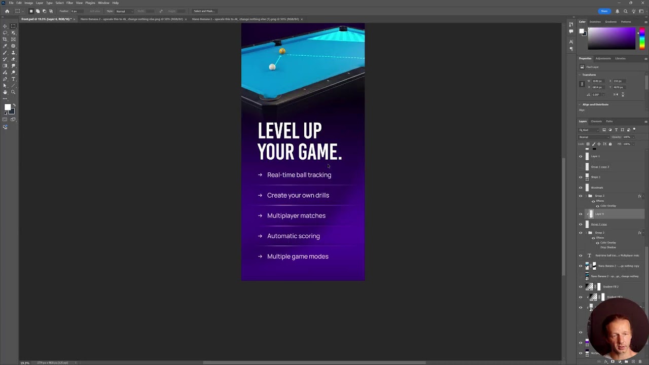
Get daily recaps from
Dansky
AI-powered summaries delivered to your inbox. Save hours every week while staying fully informed.