The All in One AI Design Engineer - Kombai
Chapters9
Host revisits Comby and outlines the goal of building a live landing page with in browser edits and production ready output.
Comby now blends in-canvas design, AI-assisted code, and live refinements to generate production-ready landing pages in minutes.
Summary
DesignCourse’s review of Comby shows a mature tool that goes beyond simple Figma-to-HTML. Cory from DesignCourse walks through installing Comby, connecting it to Cursor, and selecting a design-inspiration from the library to seed AI-generated layouts. He demonstrates toggling intelligence levels, multi-variant prompts, and a high-creativity mode tailored for hero sections and landing pages. The walkthrough highlights how Comby extracts a design system from your codebase, then generates multiple design variations that can be opened in-browser for instant feedback. After picking a favorite, Cory refines it with a familiar property inspector (like a Figma-style panel) to adjust strokes, colors, and typography, and then extracts a style guide automatically. Finally, he uses the code-design feature to export HTML/CSS into the dist folder with an npm build, validating the end-to-end workflow from canvas to production-ready code. Throughout, he notes the tool’s ability to keep everything in sync and stresses the value of using inspiration assets to shape brand identity before finalizing the page. The video concludes with a nod to Comby as a sponsor and a reminder that the platform has evolved significantly in the AI era.
Key Takeaways
- Install Comby via comby.com/install and connect it to your preferred IDE (e.g., Cursor) to start a project or open an existing one.
- Use the inspiration library to seed designs; selecting a preset like neon provides context that guides AI-generated variants.
- Generate multiple designs (two variants) and refine in-browser, leveraging a familiar design-system extraction for consistency.
- Refine design through the property inspector (adjust strokes, colors, typography) and then extract a style guide that captures colors, typography, spacing, and radii.
- Export production-ready code with the design-to-code feature, then build (npm run build) to produce HTML/CSS in the dist folder.
- Comby supports a synced workflow from canvas to production, enabling rapid iteration for landing pages and hero sections.
Who Is This For?
Essential viewing for frontend developers and UI/UX designers who want a rapid designer-to-code workflow and a scalable way to produce production-ready landing pages with AI assistance.
Notable Quotes
""What's up everybody? So, today I'm reviewing a tool called Comby and I actually reviewed them 2 years ago.""
—Opening remarks and baseline context for Comby's evolution.
""With Comby, you can design on a canvas, code it for production, make edits and refine it in the browser, and then all of this is just kept in sync.""
—Core capabilities of Comby highlighted.
""The goal is to use Comby to create a actual landing page that you can use and edit, and they have a lot of really cool features""
—Stating the end-to-end goal of the demo.
""Open in browser... this is actually pretty sick""
—Immediate live preview of AI-generated design.
""Now at this point, once you have, you know, what you want and you like it, I'm going to click code design here""
—Exporting AI-generated design to production-ready code.
Questions This Video Answers
- How does Comby's inspiration library influence AI-generated layouts for a landing page?
- Can I extract a style guide from a Comby design and reuse it across an app?
- What are the best practices for refining AI-generated UI using the property inspector in Comby?
- How does Comby export HTML/CSS, and where does the code live after 'npm run build'?
- Is Comby suitable for production-grade pages or primarily for rapid prototyping?
CombyAI design toolsDesign to codeCursor IDEinspiration librarystyle guide extraction3js waveformslanding page designUI/UX automation
Full Transcript
What's up everybody? So, today I'm reviewing a tool called Comby and I actually reviewed them 2 years ago. Back then, it was just Figma to HTML CSS automatically, which is really cool. But, obviously, they've leveled up a lot since then, obviously in the AI era, and I'm doing another review and I'm going to show you how you can use the tool or how I use the tool [music] to create a landing page specifically for a new project that I just started in the musician era. So, with Comby, you can design on a canvas, code it for production, make edits and refine it in the browser, and then all of this is just kept in sync.
The goal is to use Comby to create a actual landing page that you can use and edit, and they have a lot of really cool features, so let's get started. All right, so the first step, go to comby.com/install and choose your IDE, whatever you're using. I'm going to go ahead and choose cursor, installing cursor, and then once it's installed, um you either have to open up, you know, a blank uh project folder with nothing in it if you're starting from scratch, or open up an existing project. Now, I've opened up an existing project already, and this is, like I said, for the live band app.
And the way you access Comby is to come up here and then click right there, Comby. Okay. So, this is what the actual UI looks like, and down here we have several different options. Uh you have your mode right here. Um you have like the intelligence level level right there. Uh you have variations like number of variants to create for each new design. Um I'm going to leave this at two, um and then passes of refinement, I'm going to leave at three. Um there's some other uh options here. I'm not going to go over these too much.
Um this it has a design system right there that it can extract from your code base. Um and you can also toggle on this high creativity little bar. Um I'm going to do that. We're going to toggle that on, and that simply means that it's best for landing pages and hero sections. Since ours is going to be a hero section, or one of the things that includes at least. Now, the one thing I wanted to show you before we actually initiate and send a prompt is the canvas gallery. So, if I click this, right here, you want to go to inspiration library.
Now, right here, this has a bunch of predefined designs. Now, you don't have to use this, but you can use these as references, or basically you're passing in these designs as context to help shape and mold the design. It's not stealing, it's inspiration, it's something we did well before AI. I've been doing this for 30 years. Um it's always a good idea to get an idea, a feel for, you know, what how your brand identity, um like how you want to present it. So, you can go through these, and you know, if one stands out to you, like you know, perhaps you want like a neumorphic aesthetic, uh you want, you know, neo-brutalism, you know, you want all that different stuff, you can go through, and if something really catches your eyes, like, "Hey, that's kind of similar to what I want, and we want to make it unique to our own," then we can go ahead and click that.
So, I think this one right here is actually cool. Um I like the dark UI aesthetic for it. And so, if I just uh click on this right here, and just hit view details, it'll give you an overview of what this is, and this is essentially the uh you know, the context that we get passed in. And there's like a video preview of what it looks like. So, I'm going to click on use as inspiration for this. And notice, when you click on that, it will add it right here into the context of the chat.
The name of this one happens to be neon. So, here's the actual prompt. I'm not going to read through it all. If you're interested in reading through it all, you can pause and just read it. But essentially, what we're doing is initially, I'm just describing what Live Band is. I'm telling it to take a look at the current code to get an understanding. And then also, the actual specifics, you know, we want to generate uh how many designs did we choose? Uh two different designs, and we want to just style them differently, just give us options, essentially, um based on that template and on that overall look and feel.
And then we'll kind of narrow in on one and then make some adjustments. All right, and here it is. This is what you get after it's um, you know, it created the output in the designs, essentially. So, what you do is you click on it, and what makes most sense to me is just to click on open in browser. So, when you click open in browser, you're going to see here it is. This is actually pretty sick. Now, in the uh prompt I did request it to create a 3js waveform in the hero section somehow in some way, shape, or form.
Um, this is actually pretty cool. It's kind of like a abstract waveform. Um, but that's what how, you know, that's why I did it. If I didn't tell it to use 3js, then it wouldn't have used 3js. It'd probably be a little bit more simplistic than this. Now, of course, we do have some things like the telltale signs of a Vibe Co design like this little tag section up here. We always see this sort of thing. If I zoom up, you'll see what I mean, but of course, we can make modifications and make this all custom as we wish.
Now, scrolling down here, this is really nice. I like these little scroll-based border animations. In terms of just UI design fundamentals, what I see here so far is really solid. I But, we can definitely make a refinement. Now, checking out the next one, we'll see this one. I'm not a fan of the massive headline, although that's simply a matter of just changing the font size if you wish. I didn't see a 3js element here, so I'm going to skip that one. This one, open in browser real quick. Again, pretty large hero section that's centered. Um, you can see the 3js in the background.
This is more again, more of like an abstract approach on, you know, a waveform. I think it could also stand out a lot more. Yeah, right here I'd probably change this hover hover color to something that's a little bit less light. Um, but yeah, I think for me the clear winner is this one right here. Um, once once Once I'll click open in browser. This one for sure is the clear winner and I'm going to use this as a base. Now, just because you like the layout here and things it doesn't mean that you're stuck with these colors, of course.
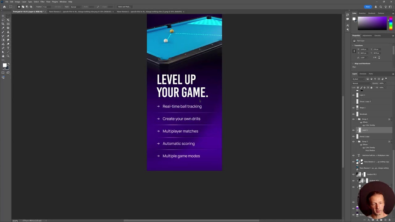
We can make further refinements and adjustments to this, which is what I'm going to do. If I come over here with this selected and choose edit design, you'll see we have this property inspector and this this will be very familiar to you if you've used any tools like Figma or whatever. These are all very standard and we can actually update the design as we wish. So, let's say for instance, we want to adjust um this secondary button right here. As you can see, the property inspector shows up, very familiar if you've used Figma or anything like that.
Um and I'm just going to give this or adjust rather the stroke here and the stroke or the border rather is solid white at 20% but I'm going to change it to that primary green color and make it 100%. And then that way the I the actual secondary button kind of stands out a little bit more. Um if you wanted to, we could also take it and maybe make this just a little bit thicker in terms of the actual stroke weight. There we go. I kind of like that better. If we wanted to, we could change the uh the font All right, there we go.
So, now that's a better secondary call to action in my opinion. So, of course, you can make many other adjustments as you wish. And once you're done adjusting this design, this starting point, we can then go ahead and have it generate a style guide for us. And to do that, we click with our canvas selected right here, the style guide section, and we want to create a new style guide right here, create new. So, then we click right here and we want to choose import from design and you could see we have it already selected.
So, we're just going to type in or hit rather extract style. And here it goes, it's done. So, right here we have our actual style guide. It's extracted basically all the colors, all the typography, I it has the body typography, it has spacing and radius, everything that you would expect from an actual style guide, which is actually important. If you're new to this stuff, you want to have a consistent application of the UI design across all pages of the app, and that's why you want to create a style guide from the beginning. So now, under style guides right here, we can select it, and this style guide is now passed into the context for any future adjustments that you make.
So now I can say is finish this landing page with the features in mind and end it with a footer. All right, let's go ahead and hit open in browser. I've not checked this out. I'm not expecting everything to be perfect. I you know, that's unrealistic for the most part, but let's scroll down here. Um again, I really like this UI. Like it's pretty dark. Some areas I might want to lighten up just to get, you know, a different little, you know, more texture essentially. I but this design, I really like the typography here. Everything is really nice.
Oh, it added I nice little animation here. Now this of course, I would probably you want to put in like real like product screenshots, which don't yet exist. I but yeah, this is solid. I'd probably want to I maybe make the labels a little bit more separated with either color, maybe make these 100% white just to create a little bit visual hierarchy between label and buttons underneath in menu. But yeah, this is really solid. So, now at this point, once you have, you know, what you want and you like it, I'm going to click code design here.
And so all that does is just pass, you know, code this design along with this canvas, and it'll go ahead and code it now. All right, it is done. I'm going to run npm run build as it's suggesting right here at the end of the prompt here. And I have not checked it out yet. Let's see how well it did. All right, and here it is actually in HTML CSS. It's actually coded into the project now. Um if I go back, the actual new code here is in the dist folder, the distribution folder, index.html, and here's all the markup, and you can obviously modify this stuff yourself.
And at this point, obviously, I'm hearing cursor. If I hit control shift L, or control L rather, I can get the chat up, and now we can actually, you know, have it start working with the actual Comby produced design and system. All right, and there you go. So, that's how you can use Comby to generate designs on the fly, along with their in-canvas editor. They also obviously have a lot of other features that I didn't cover in this video specifically, but definitely check them out. They're the sponsor of this video. I like I said, I reviewed them 2 years ago, and they've really come a long way since then.
Give them support, and I'll see you soon. Goodbye.
More from DesignCourse


Get daily recaps from
DesignCourse
AI-powered summaries delivered to your inbox. Save hours every week while staying fully informed.